 In this lesson, let’s see how to use qplot to map symbol colour to a categorical variable.
Copy in the following data set (a medical data set relating to patients in a randomised controlled trial):
M <- structure(list(PATIENT = c("Mary","Dave","Simon","Steve","Sue","Frida","Magnus","Beth","Peter","Guy","Irina","Liz"),

GENDER = c("F","M","M","M","F","F","M","F","M","M","F","F"),

TREATMENT = c("A","B","C","A","A","B","A","C","A","C","B","C"),

AGE =c("Y","M","M","E","M","M","E","E","M","E","M","M"),

WEIGHT_1 = c(79.2,58.8,72.0,59.7,79.6,83.1,68.7,67.6,79.1,39.9,64.7,65.6),

WEIGHT_2 = c(76.6,59.3,70.1,57.3,79.8,82.3,66.8,67.4,76.8,41.4,65.3,63.2),

HEIGHT = c(169,161,175,149,179,177,175,170,177,138,170,165),

SMOKE = c("Y","Y","N","N","N","N","N","N","N","N","N","Y"),

EXERCISE = c(TRUE,FALSE,FALSE,FALSE,TRUE,FALSE,FALSE,TRUE,TRUE,FALSE,FALSE,TRUE),

RECOVER = c(1,0,1,1,1,0,1,1,1,1,0,1)),

.Names = c("PATIENT","GENDER","TREATMENT","AGE","WEIGHT_1","WEIGHT_2","HEIGHT","SMOKE","EXERCISE","RECOVER"),

class = "data.frame", row.names = 1:12)

M
    PATIENT GENDER TREATMENT AGE WEIGHT_1 WEIGHT_2 HEIGHT SMOKE EXERCISE RECOVER
1     Mary      F         A   Y     79.2     76.6    169     Y     TRUE       1
2     Dave      M         B   M     58.8     59.3    161     Y    FALSE       0
3    Simon      M         C   M     72.0     70.1    175     N    FALSE       1
4    Steve      M         A   E     59.7     57.3    149     N    FALSE       1
5      Sue      F         A   M     79.6     79.8    179     N     TRUE       1
6    Frida      F         B   M     83.1     82.3    177     N    FALSE       0
7   Magnus      M         A   E     68.7     66.8    175     N    FALSE       1
8     Beth      F         C   E     67.6     67.4    170     N     TRUE       1
9    Peter      M         A   M     79.1     76.8    177     N     TRUE       1
10     Guy      M         C   E     39.9     41.4    138     N    FALSE       1
11   Irina      F         B   M     64.7     65.3    170     N    FALSE       0
12     Liz      F         C   M     65.6     63.2    165     Y     TRUE       1
Now we create a scatterplot of patient height against weight before treatment. We map both symbol size and shape to GENDER using factor() . Enter the following syntax:
qplot(HEIGHT, WEIGHT_1, data = M, xlab = "HEIGHT (cm)", ylab = "WEIGHT BEFORE TREATMENT (kg)" , size = factor(GENDER), color = factor(GENDER)) + scale_size_manual(values = c(5, 7))
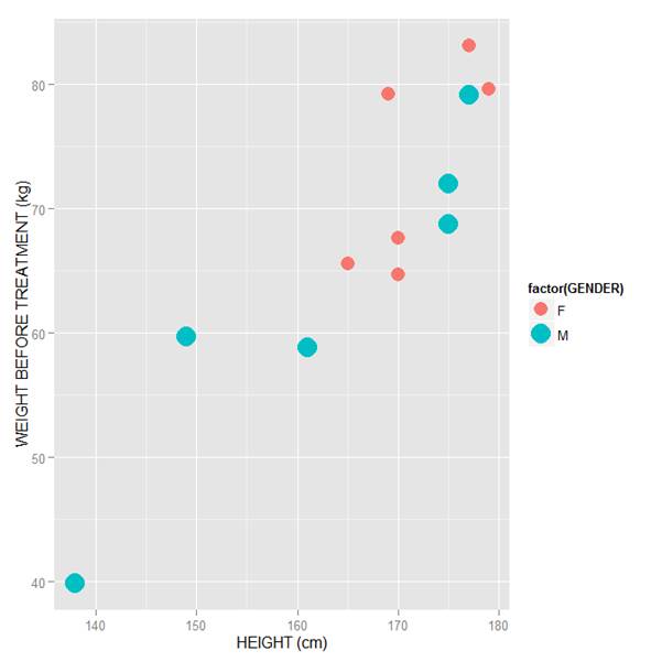
Note how we mapped symbol size and colour to GENDER using the syntax:
size = factor(GENDER) and color = factor(GENDER)
Also note how we controlled symbol size using the layer:
+ scale_size_manual(values = c(5, 7))
In this example I have chosen symbol sizes of 5 and 7. You may select different sizes, depending on your preferences. Very quickly you will gain experience and select the symbol sizes that suit your graphs best. Of course you can experiment with the above syntax yourselves, each time changing the symbol size values. For example:
qplot(HEIGHT, WEIGHT_1, data = M, xlab = "HEIGHT (cm)", ylab = "WEIGHT BEFORE TREATMENT (kg)" , size = factor(GENDER), color = factor(GENDER)) + scale_size_manual(values = c(2, 9))
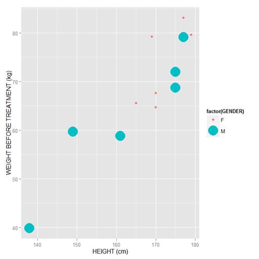
The difference in point sizes is now rather extreme, but you now see how to control symbol size. Soon we will learn how to control symbol colour too.
That wasn’t so hard! in our next blog post we will learn the rest of what we need to colour scatterplots in qplot.
About the Author: David Lillis has taught R to many researchers and statisticians. His company, Sigma Statistics and Research Limited, provides both on-line instruction and face-to-face workshops on R, and coding services in R. David holds a doctorate in applied statistics.
See our full R Tutorial Series and other blog posts regarding R programming.

How would you change the assigned colours. Right now male is blue and female is pink. How could you change the colours to something else like green and purple or something.