An incredibly useful tool in evaluating and comparing predictive models is the ROC curve.
Its name is indeed strange. ROC stands for Receiver Operating Characteristic. Its origin is from sonar back in the 1940s. ROCs were used to measure how well a sonar signal (e.g., from an enemy submarine) could be detected from noise (a school of fish).
ROC curves are a nice way to see how any predictive model can distinguish between the true positives and negatives.
In order to do this, a model needs to not only correctly predict a positive as a positive, but also a negative as a negative.
The ROC curve does this by plotting sensitivity, the probability of predicting a real positive will be a positive, against 1-specificity, the probability of predicting a real negative will be a positive. (A previous article covered the specifics of sensitivity and specificity. It reviews what they mean and why it’s important to know how accurately the model is predicting positives and negatives separately.)
The best decision rule is high on sensitivity (true positive rate) and low on 1-specificity (false positive rate). It’s a rule that predicts most true positives will be a positive and few true negatives will be a positive.
Decision Rules and Models
I’ve been talking about decision rules, but what about models?
The thing is, predictive models like logistic regression don’t give you one decision rule. They give a predicted probability of a positive for each individual based on the values of that individual’s predictor values.
Your software may print out a classification table based on a default probability cutoff (usually .5). But really it’s up to you to decide what the probability cutoff should be to classify an individual as “predicted positive.”
The default isn’t always the best decision rule. Chance is only .5 if positive and negative outcomes are equally likely.
They usually aren’t.
Likewise, sometimes the cost of misclassification is different for positives and negatives. If so, it can be reasonable to increase one type of misclassification in order to avoid the other.
And the optimal cutoff point isn’t always obvious.
Different models may do better at different decision rules. It’s hard to compare models as doing better or worse than each other if one performs better at one decision rule and the other does better at another.
The ROC Curve
Enter the ROC curve.
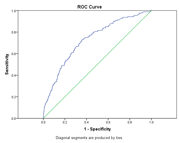
The ROC curve plots out the sensitivity (True Positive Rate) and 1-specificity (False Positive Rate) for every possible decision rule cutoff between 0 and 1 for a model.
This plot tells you a few different things.
A model that predicts at chance will have an ROC curve that looks like the diagonal green line. That is not a discriminating model. It’s basically guessing which individuals are positive and which are negative.
The further the curve is from the diagonal line, the better the model is at discriminating between positives and negatives in general. It results in more true positives and more true negatives (and therefore fewer false positives).
There are useful statistics that can be calculated from this curve. The Area Under the Curve (AUC or sometimes just “c”) tells you how well the model predicts. It’s very useful for comparing two competing models. The Youden Index tells you the optimal cut point for any given model (under specific circumstances).
Although you can use ROCs for evaluating and interpreting logistic regression models, they’re not limited to logistic regression. A common usage in medical studies is to run an ROC to see how much better a single continuous predictor (a “biomarker”) can predict disease status compared to chance.

Concerning:
In its current usage, ROC curves are a nice way to see how any predictive model can distinguish between the true positives and negatives.
You refer to common ROC. They do not refer to prevalence.
Please compare predictive ROC, to SS/PV-ROC plot. (you find it in internet).
Best regards,
Peter
Hi Peter,
Why not just use Cohen’s Kappa to adjust ones accuracy in an F1 score? Or instead of sensitivity in the ROC, use detection rate as a basis of a prevalence based ROC? Simply adapted by combining ideas from:
https://www.machinelearningplus.com/machine-learning/evaluation-metrics-classification-models-r/
Keith