MANOVA is the multivariate (meaning multiple dependent variables) version of ANOVA, but there are many misconceptions about it.
In this webinar, you’ll learn:
- When to use MANOVA and when you’d be better off using individual ANOVAs
- How to follow up the overall MANOVA results to interpret
- What those strange statistics mean — Wilk’s lambda, Roy’s Greatest Root (hint — it’s not a carrot)
- Its relationship to discriminant analysis
Note: This training is an exclusive benefit to members of the Statistically Speaking Membership Program and part of the Stat’s Amore Trainings Series. Each Stat’s Amore Training is approximately 90 minutes long.
About the Instructor

Karen Grace-Martin helps statistics practitioners gain an intuitive understanding of how statistics is applied to real data in research studies.
She has guided and trained researchers through their statistical analysis for over 15 years as a statistical consultant at Cornell University and through The Analysis Factor. She has master’s degrees in both applied statistics and social psychology and is an expert in SPSS and SAS.
Not a Member Yet?
It’s never too early to set yourself up for successful analysis with support and training from expert statisticians.
Just head over and sign up for Statistically Speaking.
You'll get access to this training webinar, 130+ other stats trainings, a pathway to work through the trainings that you need — plus the expert guidance you need to build statistical skill with live Q&A sessions and an ask-a-mentor forum.
One important consideration in choosing a missing data approach is the missing data mechanism—different approaches have different assumptions about the mechanism.
Each of the three mechanisms describes one possible relationship between the propensity of data to be missing and values of the data, both missing and observed.
The Missing Data Mechanisms
Missing Completely at Random, MCAR, means there is no relationship between (more…)
Graphing predicted values from a regression model or means from an ANOVA makes interpretation of results much easier.
Every statistical software will graph predicted values for you. But the more complicated your model, the harder it can be to get the graph you want in the format you want.
Excel isn’t all that useful for estimating the statistics, but it has some very nice features that are useful for doing data analysis, one of which is graphing.
In this webinar, I will demonstrate how to calculate predicted means from a linear and a logistic regression model, then graph them. It will be particularly useful to you if you don’t have a very clear sense of where those predicted values come from.
Note: This training is an exclusive benefit to members of the Statistically Speaking Membership Program and part of the Stat’s Amore Trainings Series. Each Stat’s Amore Training is approximately 90 minutes long.
About the Instructor

Karen Grace-Martin helps statistics practitioners gain an intuitive understanding of how statistics is applied to real data in research studies.
She has guided and trained researchers through their statistical analysis for over 15 years as a statistical consultant at Cornell University and through The Analysis Factor. She has master’s degrees in both applied statistics and social psychology and is an expert in SPSS and SAS.
Not a Member Yet?
It’s never too early to set yourself up for successful analysis with support and training from expert statisticians.
Just head over and sign up for Statistically Speaking.
You'll get access to this training webinar, 130+ other stats trainings, a pathway to work through the trainings that you need — plus the expert guidance you need to build statistical skill with live Q&A sessions and an ask-a-mentor forum.
Hierarchical regression is a very common approach to model building that allows you to see the incremental contribution to a model of sets of predictor variables.
Popular for linear regression in many fields, the approach can be used in any type of regression model — logistic regression, linear mixed models, or even ANOVA.
In this webinar, we’ll go over the concepts and steps, and we’ll look at how it can be useful in different contexts.
Note: This training is an exclusive benefit to members of the Statistically Speaking Membership Program and part of the Stat’s Amore Trainings Series. Each Stat’s Amore Training is approximately 90 minutes long.
About the Instructor

Karen Grace-Martin helps statistics practitioners gain an intuitive understanding of how statistics is applied to real data in research studies.
She has guided and trained researchers through their statistical analysis for over 15 years as a statistical consultant at Cornell University and through The Analysis Factor. She has master’s degrees in both applied statistics and social psychology and is an expert in SPSS and SAS.
Not a Member Yet?
It’s never too early to set yourself up for successful analysis with support and training from expert statisticians.
Just head over and sign up for Statistically Speaking.
You'll get access to this training webinar, 130+ other stats trainings, a pathway to work through the trainings that you need — plus the expert guidance you need to build statistical skill with live Q&A sessions and an ask-a-mentor forum.
One of the nice features of SPSS is its ability to keep track of information on the variables themselves.

This includes variable labels, missing data codes, value labels, and variable formats. Spending the time to set up variable information makes data analysis much easier–you don’t have to keep looking up whether males are coded 1 or 0, for example.
And having them all in the variable view window makes things incredibly easy while you’re doing your analysis. But sometimes you need to just print them all out–to create a code book for another analyst or to include in the output you’re sending to a collaborator. Or even just to print them out for yourself for easy reference.
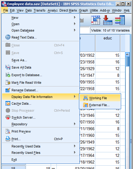
There is a nice little way to get a few tables with a list of all the variable metadata. It’s in the File menu. Simply choose Display Data File Information and Working File.
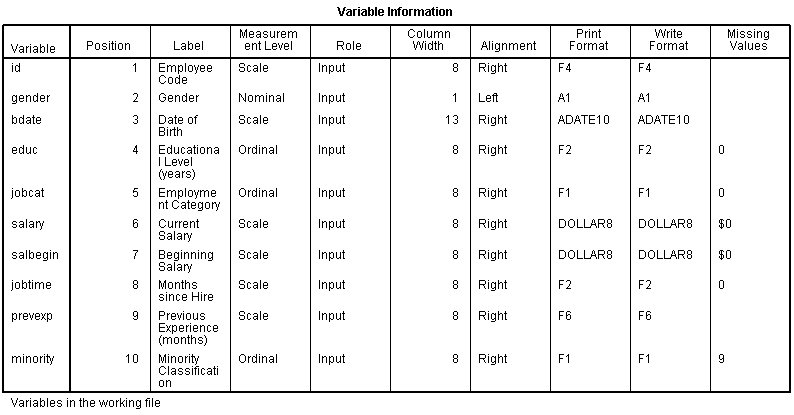
Doing this gives you two tables. The first includes the following information on the variables. I find the information I use the most are the labels and the missing data codes.


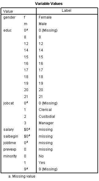
Even more useful, though, is the Value Label table.
It lists out the labels for all the values for each variable.
So you don’t have to remember that Job Category (jobcat) 1 is “Clerical,” 2 is “Custodial,” and 3 is “Managerial.”
It’s all right there.
Every statistical software procedure that dummy codes predictor variables uses a default for choosing the reference category.
This default is usually the category that comes first or last alphabetically.
That may or may not be the best category to use, but fortunately you’re not stuck with the defaults.
So if you do choose, which one should you choose? (more…)


