Once you’ve imported, examined, and cleaned your data, a common next step would be to make some visual displays or graphs. In this article we’ll go over the details of creating, naming, saving, and exporting graphs in Stata.
We will do all of this using syntax, rather than Stata’s “Graphics” menu. If you want a quick lesson on using the menus to make graphs in Stata, check out this article.
Setting Up
For all of the following syntax, we recommend creating and saving a do-file to hold it. This way you can easily refer back to this file when you need to make and save your own graphs.
If you need help setting up a do-file, check out this article.
Before you make a graph, you’re going to want to make sure you know where it’s going to be saved. In your do-file, change the directory to wherever you want graphs saved using the “cd” command.
For me this looks like
cd “C:\Users\james\OneDrive\Documents\Analysis Factor\Stata blog post datasets”
If your dataset is in a different directory than where you want to export graphs, you can change the directory each time you need to use the dataset. Then switch it again when you need to save graphs.
Help with Graphing
Now that we have our directory set up, let’s look at the most useful options available for us to graph. This is what we see after typing “h graph” in the command window.
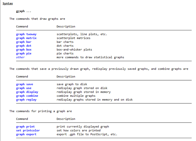
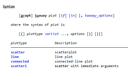
For each of these commands, we can click on it to see the individual help page. For example, we can look at the page for getting help on twoway plots.
You can see that graphs give us a lot of options!
Saving Your First Graph in Stata
Let’s start off simple. First load in the auto data by putting the following in your do-file.
sysuse auto,clear
Now let’s make an unlabeled scatter plot with price as a function of mpg, then save it with Stata’s graph save command.
We type the command for the graph we want (twoway scatter), followed by the dependent variable, then any independent variables.
twoway scatter price mpg
graph save firstScatter, replace
We saved this graph with the file name “firstScatter.gph” into the folder we specified at the start. We didn’t need to say which graph we were saving, because Stata will automatically use our most recent one if we don’t specify.
If we didn’t choose a graph name when we typed “graph save”, Stata would save it with the name “Graph”.
Creating and Retrieving a Named Graph
It’s also easy to name graphs as we make them. Below we make and name a scatter plot named “graph2” that plots headroom against trunk size.
twoway scatter headroom trunk, name(graph2, replace)
By default this option is set to be name(graph, replace). The replace option means that Stata won’t argue when you try to override a graph that already exists with the same name.
In the graph’s name, we can’t put spaces, quotation marks, or command words.
If we closed this graph and then wanted to look at it again, we can type
graph display graph2
The display command pulls up the graph stored in memory, so it doesn’t matter that we didn’t yet save it to the disk.
The use command pulls up a previous graph just like the display command, only this one takes a graph from your directory rather than current Stata session.
We can’t perform the use command until we save this though. This time I’ll save it as a png file:
graph save graph2 graphic2.png
Then we can load it back up
graph use graphic2.png
Since the graph is now saved to the directory, this command would pull it up even if we started a new Stata session.
Reminder: when you call a name like “graphic2.png”, Stata only looks for it within your current directory.
To get a file located somewhere else, either change your directory or type out the full file name.
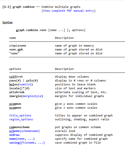
Combining Graphs in Stata
Stata has the ability to take two or more graphs and combine them into one file.
We already have “graph2” which plots headroom against trunk. Let’s make “graph3” which plots headroom against weight
twoway scatter headroom weight, name(graph3, replace)
Now let’s combine graphs 2 and 3
graph combine graph2 graph3
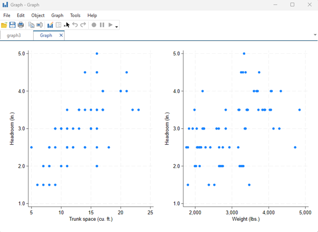
We see these side-by-side graphs. Graph2 lies on the left because we specified it first.
Since we didn’t specify a name for this combined graph, it was given the default name “Graph”.
There is no requirement that the combined graphs are of the same type; we can have a pie chart next to a scatterplot and a histogram if we wanted to.
Now to get an idea of what some of our options do, let’s make a third graph, this time a pie chart marking the distribution of the foreign variable. Make and save the graph with the code below:
graph pie,over(foreign) title(“pie chart”) name(graph4,replace)
graph save graph4 graphic4
This “graph pie” syntax is telling Stata “make a pie chart that uses the categories and frequencies within the variable ‘foreign’. Give the graph the title ‘pie chart’, and save its name within Stata as ‘graph4’.
The next line says to save it in the current directory with the name ‘graphic4’”. Within Stata, the name remains as “graph4”.
Now let’s combine the graphs we labeled 2,3, and 4 into one file:
graph combine “graphic2.png” graph3 “graphic4.gph”, rows(3) xcommon title(“Three Graphs”)
Note that in this command, I am taking graph2 as a png from the disk, graph3 from Stata’s active memory, and graph4 as a Stata graph from the disk. It is no difficulty to combine these different formats.
After running the command, we get this
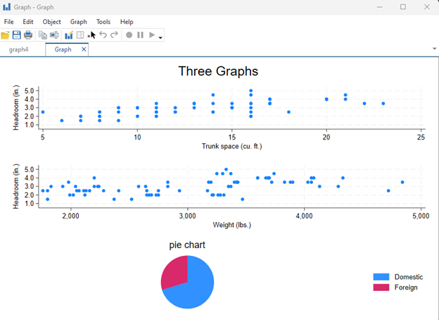
The “rows(3)” option changed it so the graphs displayed in 3 rows and 1 column, rather than the default 3 columns and one row.
The “xcommon” option would have forced all xy plots like scatterplots to use the same values for x axis. This option ended up not happening because it doesn’t work with the pie chart. Try removing the pi-chart and see what “xcommon” is doing.
The “title” option added a title to the combined graph. We can see that this title is able to exist in addition to any individual graph titles that were already made.
With that finished up, you should have a good picture of how Stata handles graphing. Make sure to check out some of our other articles and online video tutorials if you need details on making graphs in Stata.
by James Harrod
About the Author: James Harrod interned at The Analysis Factor in the summer of 2023. He plans to continue into a career as an actuary, and hopes to continue finding interesting ways of educating people about statistics. James is well-versed in R and Stata programming and enjoys teaching the intuition behind common statistical methods. James is a 2023 graduate of the University of Rochester with bachelor’s degrees in Statistics and Economics.

Leave a Reply