 You have probably noticed I’m not much into R (though I’m slowly coming around to it). It goes back to when I was in my graduate statistics program, where we were required to use SPlus (R’s parent language—as far as I can tell, it’s the same thing, but with customer support).
We were given a half hour tutorial and an incomprehensible text, and sent off to figure it out how to use SPlus on graduate level stats.
Not fun.
And since I was already fluent in SAS, SPSS, and BMDP (may it rest in peace), I resisted SPlus. A lot.
I actually wish R had been around, (more…)
Ever discover that your data are not normally distributed, no matter what transformation you try? It may be that they follow another distribution altogether. During this teleseminar, Karen Grace-Martin explained
- how these regression models differ from Ordinary Linear Regression
- the type of data for which each is appropriate
- how to interpret the coefficients and odds ratios from each
This webinar has already taken place. You can gain free access to a video recording of the webinar by completing the form below.
This free, one-hour webinar is part of our regular Craft of Statistical Analysis series. In it, we will introduce and demonstrate two of the core concepts of mixed modeling—the random intercept and the random slope.
Most scientific fields now recognize the extraordinary usefulness of mixed models, but they’re a tough nut to crack for someone who didn’t receive training in their methodology.
But it turns out that mixed models are actually an extension of linear models. If you have a good foundation in linear models, the extension to mixed models is more of a step than a leap. (Okay, a large step, but still).
You’ll learn what random intercepts and slopes mean, what they do, and how to decide if one or both are needed. It’s the first step in understanding mixed modeling.
This webinar has already taken place. You can gain free access to a video recording of the webinar by completing the form below.
Here’s what participants said about the webinar:
“Thank you. I was also impressed with the way of explaining and the selection of example chosen to explain the theory.”
– Joanna Konieczna-Salamatin
“Teriffic job! I learned a lot. Thanks. Way to reduce a challenging topic to managable bite-size pieces. The graphical representations of the models helped me understand the random slope and random intercept terminology in a way I never got before.”
– Rob Baer
“I found it a great example and clear explanation, an hour is much better spent watching this than reading through a text book as an intro to this form of modeling.”
– Matt Cooper
“It was my first webinar and I was apprehensive with my lack of experience with the tecnology but it was really easy, user friendly, and definitely an experience to be repeated! Thank you!”
– Vanda Roque
” Just terrific. Clear, at the right level for me, extremely helpful.”
– Amy D’Andrade
“The seminar was well presented. The speaking was clear and easily undersood. The presentation was paced well. I found many of the questions and answers at the end to be *very* useful.”
– Andrew McLachlan
If you’re in a field that uses Analysis of Variance, you have surely heard that p-values don’t indicate the size of an effect. You also need to report effect size statistics.
Why? Because with a big enough sample size, any difference in means, no matter how small, can be statistically significant. P-values are designed to tell you if your result is consistent with the null hypothesis, not if it’s big.
Unstandardized Effect Size Statistics
Truly the simplest and most straightforward effect size measure is the difference between two means. And you’re probably already reporting that. But the limitation of this measure as an effect size is not inaccuracy. It’s just sometimes hard to evaluate.
If you’re familiar with an area of research and the variables used in that area, you should know if a 3-point difference is big or small, although your readers may not. And if you’re evaluating a new type of variable, it can be hard to tell.
Standardized Effect Size Statistics
Standardized effect size statistics are designed for easier evaluation. They remove the units of measurement, so you don’t have to be familiar with the scaling of the variables.
Cohen’s d is a good example of a standardized effect size measurement. It’s equivalent in many ways to a standardized regression coefficient (labeled beta in some software).
Both are standardized measures. They divide the size of the effect by the relevant standard deviations. So instead of being in terms of the original units of X and Y, both Cohen’s d and standardized regression coefficients are in terms of standard deviations.
There are some nice properties of standardized effect size measures. The foremost is you can compare them across variables. And in many situations, seeing differences in terms of number of standard deviations is very helpful.
Limitations
But they are most useful if you also recognize their limitations. Unlike correlation coefficients, both Cohen’s d and beta can be greater than one. So while you can compare them to each other, you can’t just look at one and tell right away what is big or small. You’re just looking at the effect of the independent variable in terms of standard deviations.
This is especially important to note for Cohen’s d, because in his original book, Cohen specified certain d values as indicating small, medium, and large effects in behavioral research only.
While the statistic itself is a good one, you should take these size recommendations with a grain of salt (or maybe a very large bowl of salt). What is a large or small effect is highly dependent on your specific field of study, and even a small effect can be theoretically meaningful.
Variance Explained
Another set of effect size measures have a more intuitive interpretation, and are easier to evaluate. They include Eta Squared, Partial Eta Squared, and Omega Squared. Like the R Squared statistic, they all have the intuitive interpretation of the proportion of the variance accounted for.
Eta Squared is calculated the same way as R Squared, and has the most equivalent interpretation: out of the total variation in Y, the proportion that can be attributed to a specific X.
Eta Squared, however, is used specifically in ANOVA models. Each effect in the model has its own Eta Squared. So you get a specific, intuitive measure of the effect of that variable.
Eta Squared has two drawbacks, however. One is that as you add more variables to the model, the proportion explained by any one variable will automatically decrease. This makes it hard to compare the effect of a single variable in different studies.
Partial Eta Squared solves this problem, but has a less intuitive interpretation. There, the denominator is not the total variation in Y, but the unexplained variation in Y plus the variation explained just by that X. So any variation explained by other Xs is removed from the denominator. This allows a researcher to compare the effect of the same variable in two different studies, even if those studies contain different covariates or other factors.
In a one-way ANOVA, Eta Squared and Partial Eta Squared will be equal. But this isn’t true in models with more than one independent variable.
The drawback for Eta Squared is that it is a biased measure of population variance explained (although it is accurate for the sample). It always overestimates it.
This bias gets very small as sample size increases. For small samples, an unbiased effect size measure is Omega Squared. Omega Squared has the same basic interpretation, but uses unbiased measures of the variance components. Because it is an unbiased estimate of population variances, Omega Squared is always smaller than Eta Squared.
See my post containing equations of all these effect size measures and a list of great references for further reading on effect sizes.
Just recently, a client got some feedback from a committee member that the Analysis of Covariance (ANCOVA) model she ran did not meet all the  assumptions.
Specifically, the assumption in question is that the covariate has to be uncorrelated with the independent variable.
This committee member is, in the strictest sense of how analysis of covariance is used, correct.
And yet, they over-applied that assumption to an inappropriate situation.
ANCOVA for Experimental Data
Analysis of Covariance was developed for experimental situations and some of the assumptions and definitions of ANCOVA apply only to those experimental situations.
The key situation is the independent variables are categorical and manipulated, not observed.
The covariate–continuous and observed–is considered a nuisance variable. There are no research questions about how this covariate itself affects or relates to the dependent variable.
The only hypothesis tests of interest are about the independent variables, controlling for the effects of the nuisance covariate.
A typical example is a study to compare the math scores of students who were enrolled in three different learning programs at the end of the school year.
The key independent variable here is the learning program. Students need to be randomly assigned to one of the three programs.
The only research question is about whether the math scores differed on average among the three programs. It is useful to control for a covariate like IQ scores, but we are not really interested in the relationship between IQ and math scores.
So in this example, in order to conclude that the learning program affected math scores, it is indeed important that IQ scores, the covariate, is unrelated to which learning program the students were assigned to.
You could not make that causal interpretation if it turns out that the IQ scores were generally higher in one learning program than the others.
So this assumption of ANCOVA is very important in this specific type of study in which we are trying to make a specific type of inference.
ANCOVA for Other Data
But that’s really just one application of a linear model with one categorical and one continuous predictor. The research question of interest doesn’t have to be about the causal effect of the categorical predictor, and the covariate doesn’t have to be a nuisance variable.
A regression model with one continuous and one dummy-coded variable is the same model (actually, you’d need two dummy variables to cover the three categories, but that’s another story).
The focus of that model may differ–perhaps the main research question is about the continuous predictor.
But it’s the same mathematical model.
The software will run it the same way. YOU may focus on different parts of the output or select different options, but it’s the same model.
And that’s where the model names can get in the way of understanding the relationships among your variables. The model itself doesn’t care if the categorical variable was manipulated. It doesn’t care if the categorical independent variable and the continuous covariate are mildly correlated.
If those ANCOVA assumptions aren’t met, it does not change the analysis at all. It only affects how parameter estimates are interpreted and the kinds of conclusions you can draw.
In fact, those assumptions really aren’t about the model. They’re about the design. It’s the design that affects the conclusions. It doesn’t matter if a covariate is a nuisance variable or an interesting phenomenon to the model. That’s a design issue.
The General Linear Model
So what do you do instead of labeling models? Just call them a General Linear Model. It’s hard to think of regression and ANOVA as the same model because the equations look so different. But it turns out they aren’t.
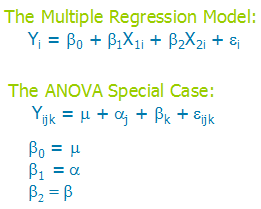
If you look at the two models, first you may notice some similarities.
- Both are modeling Y, an outcome.
- Both have a “fixed” portion on the right with some parameters to estimate–this portion estimates the mean values of Y at the different values of X.
- Both equations have a residual, which is the random part of the model. It is the variation in Y that is not affected by the Xs.
But wait a minute, Karen, are you nuts?–there are no Xs in the ANOVA model!
Actually, there are. They’re just implicit.
Since the Xs are categorical, they have only a few values, to indicate which category a case is in. Those j and k subscripts? They’re really just indicating the values of X.
(And for the record, I think a couple Xs are a lot easier to keep track of than all those subscripts. Ever have to calculate an ANOVA model by hand? Just sayin’.)
So instead of trying to come up with the right label for a model, focus instead on understanding (and describing in your paper) the measurement scales of your variables, if and how much they’re related, and how that affects the conclusions.
In my client’s situation, it was not a problem that the continuous and the categorical variables were mildly correlated. The data were not experimental and she was not trying to draw causal conclusions about only the categorical predictor.
So she had to call this ANCOVA model a multiple regression.
Knowing the right statistical analysis to use in any data situation, knowing how to run it, and being able to understand the output are all really important skills for statistical analysis. Really important.
But they’re not the only ones.
Another is having a system in place to keep track of the analyses. This is especially important if you have any collaborators (or a statistical consultant!) you’ll be sharing your results with. You may already have an effective work flow, but if you don’t, here are some strategies I use. I hope they’re helpful to you.
1. Always use Syntax Code
All the statistical software packages have come up with some sort of easy-to-use, menu-based approach. And as long as you know what you’re doing, there is nothing wrong with using the menus. While I’m familiar enough with SAS code to just write it, I use menus all the time in SPSS.
But even if you use the menus, paste the syntax for everything you do. There are many reasons for using syntax, but the main one is documentation. Whether you need to communicate to someone else or just remember what you did, syntax is the only way to keep track. (And even though, in the midst of analyses, you believe you’ll remember how you did something, a week and 40 models later, I promise you won’t. I’ve been there too many times. And it really hurts when you can’t replicate something).
In SPSS, there are two things you can do to make this seamlessly easy. First, instead of hitting OK, hit Paste. Second, make sure syntax shows up on the output. This is the default in later versions, but you can turn in on in Edit–>Options–>Viewer. Make sure “Display Commands in Log” and “Log” are both checked. (Note: the menus may differ slightly across versions).
2. If your data set is large, create smaller data sets that are relevant to each set of analyses.
First, all statistical software needs to read the entire data set to do many analyses and data manipulation. Since that same software is often a memory hog, running anything on a large data set will s-l-o-w down processing. A lot.
Second, it’s just clutter. It’s harder to find the variables you need if you have an extra 400 variables in the data set.
3. Instead of just opening a data set manually, use commands in your syntax code to open data sets.
Why? Unless you are committing the cardinal sin of overwriting your original data as you create new variables, you have multiple versions of your data set. Having the data set listed right at the top of the analysis commands makes it crystal clear which version of the data you analyzed.
I know you remember today that your variable labeled Mar4cat means marital status in 4 categories and that 0 indicates ‘never married.’ It’s so logical, right? Well, it’s not obvious to your collaborators and it won’t be obvious to you in two years, when you try to re-analyze the data after a reviewer doesn’t like your approach.
Even if you have a separate code book, why not put it right in the data? It makes the output so much easier to read, and you don’t have to worry about losing the code book. It may feel like more work upfront, but it will save time in the long run.
5. Put data manipulation, descriptive analyses, and models in separate syntax files
When I do data analysis, I follow my Steps approach, which means first I create all the relevant variables, then run univariate and bivariate statistics, then initial models, and finally hone the models.
And I’ve found that if I keep each of these steps in separate program files, it makes it much easier to keep track of everything. If you’re creating new variables in the middle of analyses, it’s going to be harder to find the code so you can remember exactly how you created that variable.
6. As you run different versions of models, label them with model numbers
When you’re building models, you’ll often have a progression of different versions. Especially when I have to communicate with a collaborator, I’ve found it invaluable to number these models in my code and print that model number on the output. It makes a huge difference in keeping track of nine different models.
7. As you go along with different analyses, keep your syntax clean, even if the output is a mess.
Data analysis is a bit of an iterative process. You try something, discover errors, realize that variable didn’t work, and try something else. Yes, base it on theory and have a clear analysis plan, but even so, the first analyses you run won’t be your last.
Especially if you make mistakes as you go along (as I inevitably do), your output gets pretty littered with output you don’t want to keep. You could clean it up as you go along, but I find that’s inefficient. Instead, I try to keep my code clean, with only the error-free analyses that I ultimately want to use. It lets me try whatever I need to without worry. Then at the end, I delete the entire output and just rerun all code.
One caveat here: You may not want to go this approach if you have VERY computing intensive analyses, like a generalized linear mixed model with crossed random effects on a large data set. If your code takes more than 20 minutes to run, this won’t be more efficient.
8. Use titles and comments liberally
I’m sure you’ve heard before that you should use lots of comments in your syntax code. But use titles too. Both SAS and SPSS have title commands that allow titles to be printed right on the output. This is especially helpful for naming and numbering all those models in #6.
9. Name output, log, and programs the same
Since you’ve split your programs into separate files for data manipulations, descriptives, initial models, etc. you’re going to end up with a lot of files. What I do is name each output the same name as the program file. (And if I’m in SAS, the log too-yes, save the log).
Yes, that means making sure you have a separate output for each section. While it may seem like extra work, it can make looking at each output less overwhelming for anyone you’re sharing it with.