Once you’ve imported your data into Stata the next step is usually examining it.
Before you work on building a model or running any tests, you need to understand your data. Ask yourself these questions:
- Is every variable marked as the appropriate type?
- Are missing observations coded consistently and marked as missing?
- Do I want to exclude any variables or data points?
(more…)
In our previous posts, we’ve relied on Stata’s pre-loaded datasets to perform analyses. But when you’re working with your own data, you’ll need to know how to import it into Stata.
To demonstrate how this process works, we will use the Iris dataset from UCI.
Download the dataset, then move it to whichever directory you intend to use for Stata files.
There are three main ways of importing data in Stata: either use the menus to import the data, call the dataset by its full file extension, or change your directory to the one with your data and then refer to the dataset by name. (more…)
If you’ve tried coding in Stata, you may have found it strange. The syntax rules are straightforward, but different from what I’d expect.
I had experience coding in Java and R before I ever used Stata. Because of this, I expected commands to be followed by parentheses, and for this to make it easy to read the code’s structure.
Stata does not work this way.
An Example of how Stata Code Works
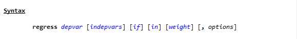
To see the way Stata handles a linear regression, go to the command line and type
h reg or help regress
You will see a help page pop up, with this Syntax line near the top.
(If you need a refresher on getting help in Stata, watch this video by Jeff Meyer.)
This is typical of how Stata code looks. (more…)
From our first Getting Started with Stata posts, you should be comfortable navigating the windows and menus of Stata. We can now get into programming in Stata with a do-file.
Why Do-Files?
A do-file is a Stata file that provides a list of commands to run. You can run an entire do-file at once, or you can highlight and run particular lines from the file.
If you set up your do-file correctly, you can just click “run” after opening it. The do-file will set you to the correct directory, open your dataset, do all analyses, and save any graphs or results you want saved.
I’ll start off by saying this: Any analysis you want to run in Stata can be run without a do-file, just using menus and individual commands in the command window. But you still should make a do-file for the following reason:
Reproducibility (more…)
In part 3 of this series, we explored the Stata graphics menu. In this post, let’s look at the Stata Statistics menu.
Statistics Menu

Let’s use the Statistics menu to see if price varies by car origin (foreign).
We are testing whether a continuous variable has a different mean for the two categories of a categorical variable. So we should do a 2-sample t-test. (more…)
In part 2 of this series, we got started on the various menus in Stata. This post covers an important menu that you’ll probably use often: the graphics menu.
What’s in the Graphics menu
The graphics menu provides an impressive variety of options for creating just about any graph you might need.
Take a look at the menu. It includes everything from univariate graphs like bar charts and pie charts to more complex, multivariate plots. Go ahead and explore some of the graphs available in the menu.
A comprehensive resource for a full understanding of the graphics you can do in Stata is the Stata Graphics Reference Manual, which is a free pdf download from the Stata web site. At nearly 800 pages, though, it’s not a quick read (it is excellent, though!).
A much quicker read is the Stata Data Visualization Cheat Sheet. Pages 5 – 6.
Browsing this two-page resource will tell you a lot about what you can do in Stata graphics. This includes not only which kinds of graphs you can create, but how to customize a graph’s appearance, apply themes, and save plots.
But first let’s explore how easy it is to create a simple, but customized plot using only the menus.
An Example of creating a Scatter plot using menus
To show an example, we’ll use the auto data. If you haven’t loaded up the data in your current session, type the  following into your command line
sysuse auto
Note that you could also open this data set using the File menu, but this is a command that is so simple, it’s faster to just type it into the command line.
As you’ll see, every time you use the menus, Stata fills in the associated commands for you into the command line
Now say we want to make a scatter plot with price on the y axis, and mpg on the x axis, but only for observations where the gear ratio is less than 3. We want this graph to have red triangles representing points, and we want it to have informative titles:
We click on Graphics -> Twoway graph. In the plots window click Create and select Basic plots -> Scatter.
Choose price as the y variable and mpg as the x variable; don’t press accept yet.
Under Marker properties choose Triangle as the symbol and Red as the color. Also notice you can also change the size or opacity of points or mark particular observations.
Click accept, then click accept on the next page.
Under the if/in tab, type “gear_ratio<3” so only observations with a gear ratio less than 3 are plotted; click on Y axis.
Under the Y axis tab type the title “Price”, and under the X axis tab type the title “MPG”. Note how you can also change properties of the axis.
In the Titles tab type an appropriate title for the graph – I chose “Price and Mileage”.
We don’t want to see a legend so in the Legend tab choose “hide legend”.
You can now press ok and should see the following graph:

You’ll also see that Stata put this code put to the console:
twoway (scatter price mpg, mcolor(red) msymbol(triangle)) if gear_ratio<3, ytitle(`"Price"') xtitle(`"MPG"') title(`"Price and Mileage"') legend(off)
Now you know how to make this graph and similar ones with syntax as well! If you’re ever having trouble creating a certain chart using code, the graph menu can provide an easier way to select the options you want.
Note: when you make plots in Stata menus, make sure to always make a new plot rather than layering on an old one. If you press create when you already have a plot selected, your new scatterplot will layer on top of the old one.
by James Harrod
Getting Started with Stata Tutorial #4: Do-files
About the Author:
James Harrod interned at The Analysis Factor in the summer of 2023. He plans to continue into a career as an actuary, and hopes to continue finding interesting ways of educating people about statistics. James is well-versed in R and Stata programming and enjoys teaching the intuition behind common statistical methods. James is a 2023 graduate of the University of Rochester with bachelor’s degrees in Statistics and Economics.