From the last posts in this series, you should feel comfortable using Stata’s data editor, changing values and types, and creating new variables.
We’ll now teach you to make your variables more approachable by adding labels.
The image below shows label information for the foreign variable.
(more…)
 There’s a common saying among pediatricians: children are not little adults. You can’t take a drug therapy that works in adults and scale it down to a kid-sized treatment.
Children are actively growing. Their livers metabolize drugs differently, and they have a stage of life called puberty that many of us have long forgotten.
Likewise, pilot studies are not little research studies. Please do not take a poorly funded clinical trial and try to sneak your inadequate sample size through peer review by calling it a pilot.
(more…)
Once you’ve imported your data into Stata the next step is usually examining it.
Before you work on building a model or running any tests, you need to understand your data. Ask yourself these questions:
- Is every variable marked as the appropriate type?
- Are missing observations coded consistently and marked as missing?
- Do I want to exclude any variables or data points?
(more…)
In our previous posts, we’ve relied on Stata’s pre-loaded datasets to perform analyses. But when you’re working with your own data, you’ll need to know how to import it into Stata.
To demonstrate how this process works, we will use the Iris dataset from UCI.
Download the dataset, then move it to whichever directory you intend to use for Stata files.
There are three main ways of importing data in Stata: either use the menus to import the data, call the dataset by its full file extension, or change your directory to the one with your data and then refer to the dataset by name. (more…)
Have you ever wondered whether you should report separate means for different groups or a pooled mean from the entire sample? This is a common scenario that comes up, for instance in deciding whether to separate by sex, region, observed treatment, et cetera.
(more…)
If you’ve tried coding in Stata, you may have found it strange. The syntax rules are straightforward, but different from what I’d expect.
I had experience coding in Java and R before I ever used Stata. Because of this, I expected commands to be followed by parentheses, and for this to make it easy to read the code’s structure.
Stata does not work this way.
An Example of how Stata Code Works
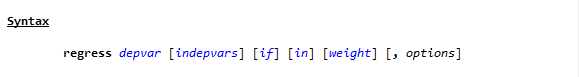
To see the way Stata handles a linear regression, go to the command line and type
h reg or help regress
You will see a help page pop up, with this Syntax line near the top.
(If you need a refresher on getting help in Stata, watch this video by Jeff Meyer.)
This is typical of how Stata code looks. (more…)