 Let’s create a simple bar chart in R using the barplot() command, which is easy to use.
First, we set up a vector of numbers. Then we count them using the table() command, and then we plot them.
The table() command creates a simple table of counts of the elements in a data set.
H <- c(2,3,3,3,4,5,5,5,5,6)
Now we count the elements using the table() command, as follows:
counts <- table(H)
counts
H
2 3 4 5 6
1 3 1 4 1
Now we plot the counts.
barplot(counts)
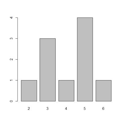
The horizontal axis records the values in your data set, while the vertical axis gives the counts of each value. You will see that the barplot() command does not perform the count directly, so we use the table() command first.
You can plot your data directly if we omit the table() command. Now, the height of the bars matches the values in the data set. This is a useful technique if your data are already in the form of counts or if you wish to plot the magnitudes of each element.
B <- c(3, 2, 25, 37, 22, 34, 19)
barplot(B, col="darkgreen")
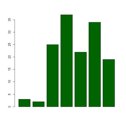
Here we have one bar for each element, and the height gives the value of the element.
Now, let’s create a more complex barplot using various arguments, some of which you have already met in previous blogs.
barplot(B, main="MY NEW BARPLOT", xlab="LETTERS", ylab="MY Y VALUES", names.arg=c("A","B","C","D","E","F","G"),
border="red", density=c(90, 70, 50, 40, 30, 20, 10))
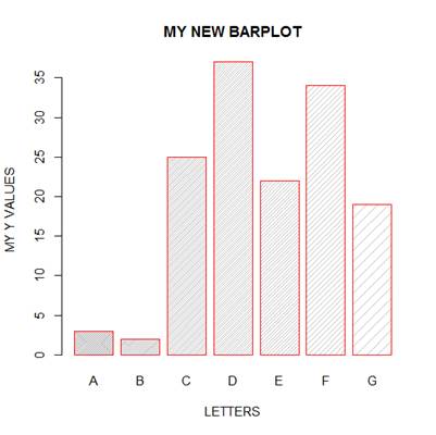
You have seen the following arguments before: main, xlab and ylab, but not the others. OK. What did the density parameter achieve? Try other values of the density parameter and see what you get. What does the command names.arg do?
OK. Let’s create a third, more complex, bar chart, based on several (four) variables. Let’s assume that you wish to plot the magnitudes of each value within each variable.
data <- structure(list(W= c(1L, 3L, 6L, 4L, 9L), X = c(2L, 5L,
4L, 5L, 12L), Y = c(4L, 4L, 6L, 6L, 16L), Z = c(3L, 5L,
6L, 7L, 6L)), .Names = c("W", "X", "Y", "Z"), class = "data.frame", row.names = c(NA, -5L))
attach(data)
print(data)
W X Y Z
1 1 2 4 3
2 3 5 4 5
3 6 4 6 6
4 4 5 6 7
5 9 12 16 6
Now we wish to create side-by-side bar charts for the four variables, W, X, Y and Z. First, we set up some colours, one for each of the five values within each variable.
colours <- c("red", "orange", "blue", "yellow", "green")
Now, plot a bar chart of the four variables, with adjacent bars, using the as.matrix() command and the argument beside = T.
barplot(as.matrix(data), main="My Barchart", ylab = "Numbers", cex.lab = 1.5, cex.main = 1.4, beside=TRUE, col=colours)
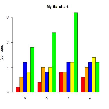
What did the argument beside = TRUE achieve?
Now we create a legend at the top-left corner. To create a legend without a frame, include: bty=”n”. The bty argument controls legend borders.
legend("topleft", c("First","Second","Third","Fourth","Fifth"), cex=1.3, bty="n", fill=colours)
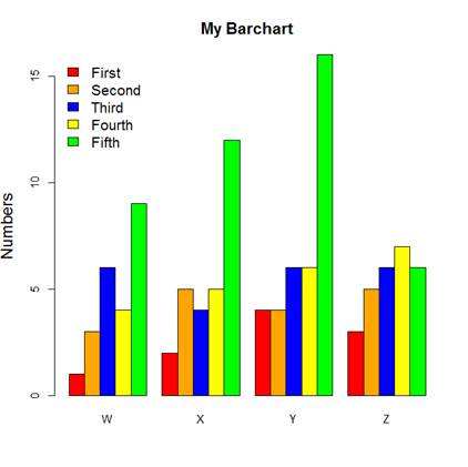
We used the topleft argument to position the legend towards the top left of the chart. Other options include:
"bottomright", "bottom", "bottomleft", "left", "topleft", "top", "topright", "right", "center".
Try these for yourselves.
That wasn’t so hard! In the next post in this series, we will look at further plotting techniques in R.
About the Author: David Lillis has taught R to many researchers and statisticians. His company, Sigma Statistics and Research Limited, provides both on-line instruction and face-to-face workshops on R, and coding services in R. David holds a doctorate in applied statistics.
See our full R Tutorial Series and other blog posts regarding R programming.
Thank you for your clear explanation. I really appreciate.
Thanks for explaining in simple way.
Hi, my name is andres I am working in my undergraduate thesis and I need to split categories within month for each year that I have.I have 17 years. Can you help me with this, also I need to transform categories in frequency and get SD and confidence interval
Thanks for this post.
I will appreciate if you can drop another on percentage component bar chart.
kudos to you for this work.
Thank you for this informative posts. Do you happen to have a similar tutorial with ggplot2?
Cheers.
Thanks for a very useful post.
I was wondering if it is possible to annotate each bar with a name or an asteriks (for indicating statistically significant values) in a similar way – without using ggplot2..
Thanks for the post; very useful. It would be great if you could include an example to plot numbers on top of bars.
Hola Buen dia
Antes que nada felicitaciones y agradecimientos por su pagina. En mi caso fue de gran ayuda gracias por compartir sus conocmientos.
Quisiera ver se me pudieran ayudar, como poder graficar dos variables por dato pero asu vez cada variable contiene dos datos
Haber si me logro explicar
Dato1 dato 2 etc
Mujer Hombre Mujer Hombre
barra1 barra2 barra1 barra2 juntas
divida divida dividida dividida
en dos en dos en dos en dos
blanco gris claro blanco gris claro
negro gris fuerte negro gris fuerte
es decir para cada dato tener dos barras (hombre, mujer juntas las barras)
pero a su vez cada barra es decir la de Mujer divida en 2, y la de hombre divida en 2. la barra de mujeres que tenga los mismos colores en cada dato por ejemplo blanco y negro y la de hombres gris claro y gris fuerte.
Perdon es que no se como enviarles una imagen.
De antemano gracias por sus comentarios.
Sin mas por el momento me despido enviandoles un cordial saludo.