 I mentioned in my last post that R Commander can do a LOT of data manipulation, data analyses, and graphs in R without you ever having to program anything.
Here I want to give you some examples, so you can see how truly useful this is.
Let’s start with a simple scatter plot between Time and the number of Jobs (in thousands) in 67 counties. Time is measured in decades since 1960.
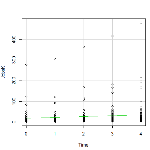
The green line is the best fit linear regression line.
This wasn’t the default in R Commander (I actually had to remove a few things to get to this), but it’s a useful way to start out.
A few ways we can easily customize this graph:
Jittering
We see here a common issue in scatter plots–because the X values are discrete, the points are all on top of each other.
It’s difficult to tell just how many points there are at the bottom of the graph–it’s just a mass of black.
One great way to solve this is by jittering the points.
All this means is that instead of putting identical points right on top of each other, we move it slightly, randomly, in either one or both directions. In this example, I jittered only horizontally:
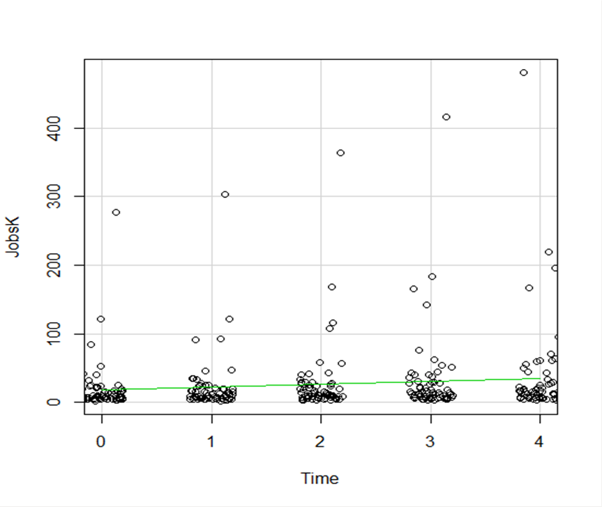
So while the points aren’t graphed exactly where they are, we can see the trends and we can now see how many points there are in each decade.
How hard is this to do in R Commander? One click:
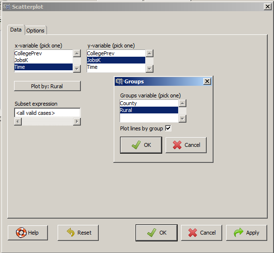
Regression Lines by Group
Another useful change to a scatter plot is to add a separate regression line to the graph based on some sort of factor in the data set.
In this example, the observations are measured for counties and each county is classified as being either Rural or Metropolitan.
If we’d like to see if the growth in jobs over time is different in Rural and Metropolitan counties, we need a separate line for each group.
In R Commander we can do this quite easily. Not only do we get two regression lines, but each point is clearly designated as being from either a Rural or Metropolitan county through its color and shape.
It’s quite clear that not only was there more growth in the number of jobs in Metro counties, there was almost no change at all in the Rural counties.
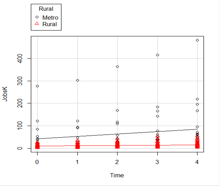 And once again, how difficult is this? This time, two clicks.
There are quite a few modifications you can make just using the buttons, but of course, R Commander doesn’t do everything.
For example, I could not figure out how to change those red triangles to green rectangles through the menus.
But that’s the best part about R Commander. It works very much like the Paste button in SPSS.
Meaning, it creates the code for you. So I can take the code it created, then edit it to get my graph looking the way I want.
I don’t have to memorize which command creates a scatter plot.
I don’t have to memorize how to pull my SPSS data into R or tell R that Rural is a factor. I can do all that through R Commander, then just look up the option to change the color and shape of the red triangles.