 In this lesson, let’s see how to create mathematical expressions for your graph in R. We’ll use an example of graphing a cosine curve, along with relevant Greek letters as the axis label, and printing the equation right on the graph.
Mathematical expressions, like sine or exponential curves on graphs are made possible through expression(paste()) and substitute().
If you need mathematical symbols as axis labels, switch off the default axes and include Greek symbols by writing them out in English. You can create fractions through the frac() command. Note how we obtain the plus or minus sign through the syntax: %+-%
Here is a nice example. Let’s create a set of 71 values from – 6 to + 6. These values are the horizontal axis values.
x <- seq(-6, 6, len = 71)
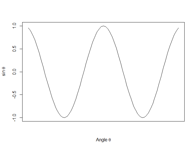
Now we plot a cosine function using a continuous curve (using type="l") while suppressing the x axis using the syntax: xaxt="n"
plot(x, cos(x),type="l",xaxt="n",

xlab=expression(paste("Angle ",theta)),

ylab=expression("sin "*theta))
. . . where we have inserted relevant mathematical text for the axis labels using expression(paste()). Here is the graph so far:
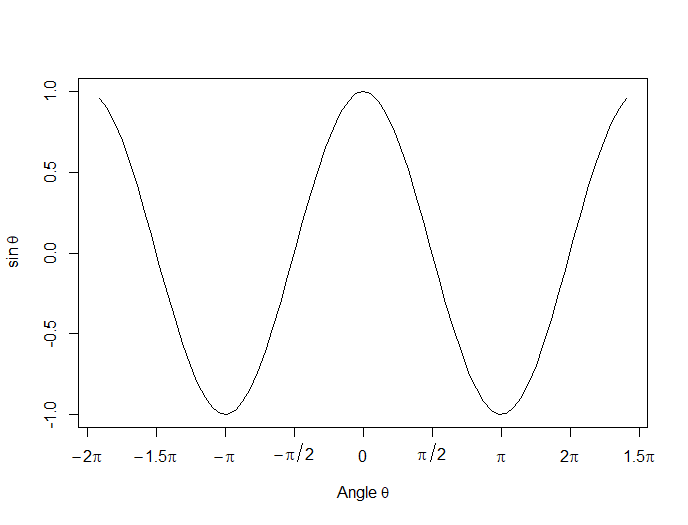
Now we create a horizontal axis to our own specifications, including relevant labels:
axis(1, at = c(-2*pi, -1.5*pi, -pi, -pi/2, 0, pi/2, pi, 1.5*pi, 2*pi),

lab = expression(-2*pi, -1.5*pi, -pi, -pi/2, 0, pi/2, pi, 2*pi, 1.5*pi))
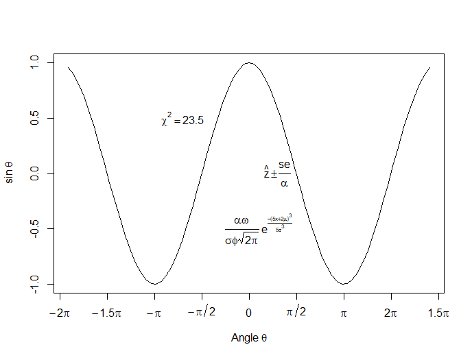
Let’s put in some mathematical expressions, centered appropriately. The first argument within each text() function gives the value along the horizontal axis about which the text will be centered.
text(-0.7*pi,0.5,substitute(chi^2=="23.5"))
text(0.1*pi, -0.5, expression(paste(frac(alpha*omega, sigma*phi*sqrt(2*pi)), ” “,
e^{frac(-(5*x+2*mu)^3, 5*sigma^3)})))
text(0.3*pi,0,expression(hat(z) %+-% frac(se, alpha)))
Here is our graph, complete with mathematical expressions:
That wasn’t so hard! In the next lesson we will discuss using qplot in R to create scatterplots.
About the Author: David Lillis has taught R to many researchers and statisticians. His company, Sigma Statistics and Research Limited, provides both on-line instruction and face-to-face workshops on R, and coding services in R. David holds a doctorate in applied statistics.
See our full R Tutorial Series and other blog posts regarding R programming.
In Part 2 of this series, we created two variables and used the lm() command to perform a least squares regression on them, treating one of them as the dependent variable and the other as the independent variable. Here they are again.
height = c(176, 154, 138, 196, 132, 176, 181, 169, 150, 175)
bodymass = c(82, 49, 53, 112, 47, 69, 77, 71, 62, 78)
Today we learn how to obtain useful diagnostic information about a regression model and then how to draw residuals on a plot. As before, we perform the regression.
lm(height ~ bodymass)
Call:
lm(formula = height ~ bodymass)
Coefficients:
(Intercept) bodymass
98.0054 0.9528
Now let’s find out more about the regression. First, let’s store the regression model as an object called mod and then use the summary() command to learn about the regression.
mod <- lm(height ~ bodymass)
summary(mod)
Here is what R gives you.
Call:
lm(formula = height ~ bodymass)
Residuals:
Min 1Q Median 3Q Max
-10.786 -8.307 1.272 7.818 12.253
Coefficients:
Estimate Std. Error t value Pr(>|t|)
(Intercept) 98.0054 11.7053 8.373 3.14e-05 ***
bodymass 0.9528 0.1618 5.889 0.000366 ***
Signif. codes: 0 ‘***’ 0.001 ‘**’ 0.01 ‘*’ 0.05 ‘.’ 0.1 ‘ ’ 1
Residual standard error: 9.358 on 8 degrees of freedom
Multiple R-squared: 0.8126, Adjusted R-squared: 0.7891
F-statistic: 34.68 on 1 and 8 DF, p-value: 0.0003662
R has given you a great deal of diagnostic information about the regression. The most useful of this information are the coefficients themselves, the Adjusted R-squared, the F-statistic and the p-value for the model.
Now let’s use R’s predict() command to create a vector of fitted values.
regmodel <- predict(lm(height ~ bodymass))
regmodel
Here are the fitted values:
1 2 3 4 5 6 7 8 9 10
176.1334 144.6916 148.5027 204.7167 142.7861 163.7472 171.3695 165.6528 157.0778 172.3222
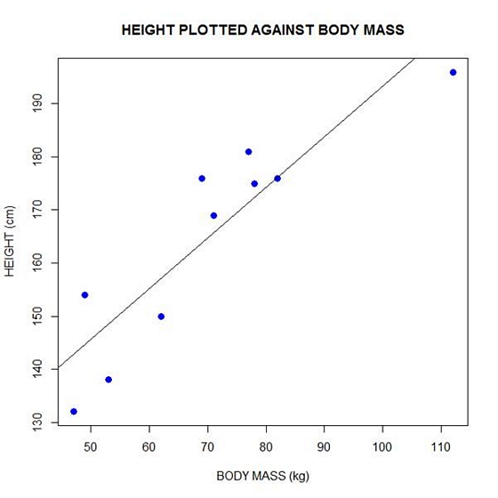
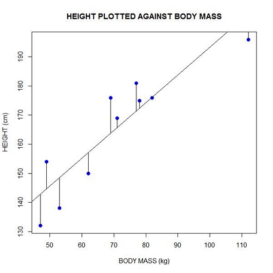
Now let’s plot the data and regression line again.
plot(bodymass, height, pch = 16, cex = 1.3, col = "blue", main = "HEIGHT PLOTTED AGAINST BODY MASS", xlab = "BODY MASS (kg)", ylab = "HEIGHT (cm)")
abline(lm(height ~ bodymass))
We can plot the residuals using R’s for loop and a subscript k that runs from 1 to the number of data points. We know that there are 10 data points, but if we do not know the number of data we can find it using the length() command on either the height or body mass variable.
npoints <- length(height)

npoints
[1] 10
Now let’s implement the loop and draw the residuals (the differences between the observed data and the corresponding fitted values) using the lines() command. Note the syntax we use to draw in the residuals.
for (k in 1: npoints) lines(c(bodymass[k], bodymass[k]), c(height[k], regmodel[k]))
Here is our plot, including the residuals.
In part 4 we will look at more advanced aspects of regression models and see what R has to offer.
About the Author: David Lillis has taught R to many researchers and statisticians. His company, Sigma Statistics and Research Limited, provides both on-line instruction and face-to-face workshops on R, and coding services in R. David holds a doctorate in applied statistics.
See our full R Tutorial Series and other blog posts regarding R programming.