by Steve Simon, PhD
The Cox regression model has a fairly minimal set of assumptions, but how do you check those assumptions and what happens if those assumptions are not satisfied?
Non-proportional hazards
The proportional hazards assumption is so important to Cox regression that we often include it in the name (the Cox proportional hazards model). What it essentially means is that the ratio of the hazards for any two individuals is constant over time. They’re proportional. It involves logarithms and it’s a strange concept, so in this article, we’re going to show you how to tell if you don’t have it.
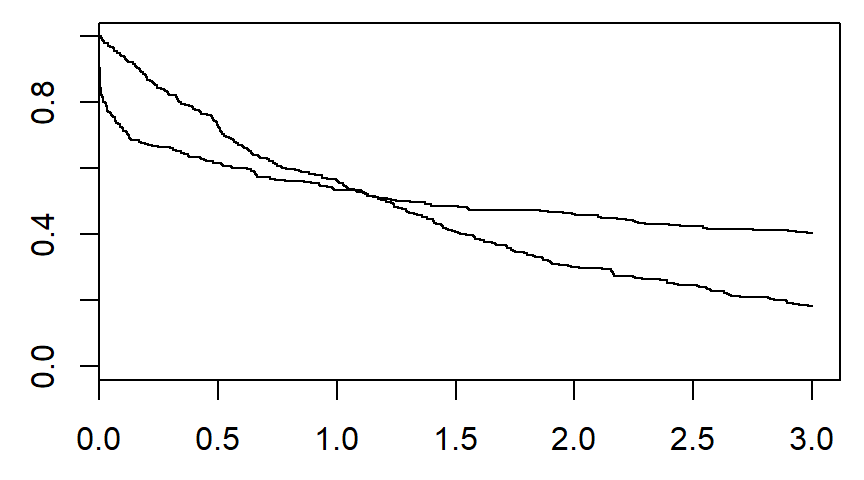
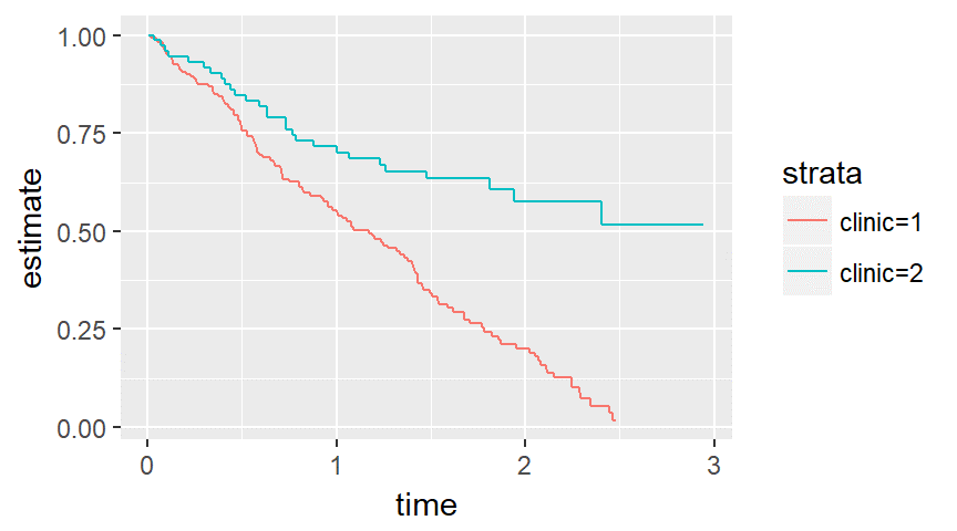
There are several graphical methods for spotting this violation, but the simplest is an examination of the Kaplan-Meier curves.
If the curves cross, as shown below, then you have a problem.
Likewise, if one curve levels off while the other drops to zero, you have a problem.
You can think of non-proportional hazards as an interaction of your independent variable with time. It means that you have to do more work in interpreting your model. If you ignore this problem, you may also experience a serious loss in power.
If you have evidence of non-proportional hazards, don’t despair. There are several fairly simple modifications to the Cox regression model that will work for you.
Nonlinear covariate relationships
The Cox model assumes that each variable makes a linear contribution to the model, but sometimes the relationship may be more complex.
You can diagnose this problem graphically using residual plots. The residual in a Cox regression model is not as simple to compute as the residual in linear regression, but you look for the same sort of pattern as in linear regression.
If you have a nonlinear relationship, you have several options that parallel your choices in a linear regression model.
Lack of independence
Lack of independence is not something that you have to wait to diagnose until your data is collected. Often it is something you are aware from the start because certain features of the design, such as centers in a multi-center study, are likely to produce correlated outcomes. These are the same issues that hound you with a linear regression model in a multi-center study.
There are several ways to account for lack of independence, but this is one problem you don’t want to ignore. An invalid model will ruin all your confidence intervals and p-values.
Why is it we can model non-linear effects in linear regression?
What the heck does it mean for a model to be “linear in the parameters?” (more…)
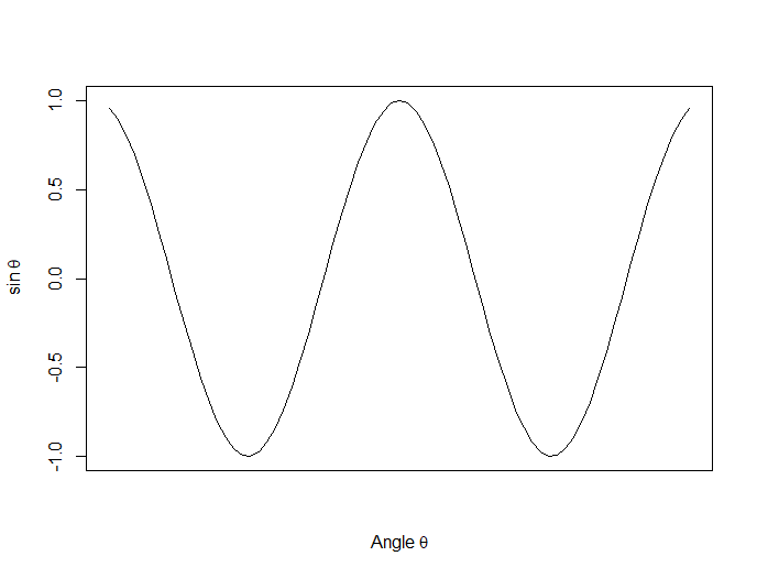
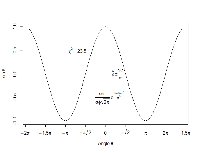
 In this lesson, let’s see how to create mathematical expressions for your graph in R. We’ll use an example of graphing a cosine curve, along with relevant Greek letters as the axis label, and printing the equation right on the graph.
Mathematical expressions, like sine or exponential curves on graphs are made possible through expression(paste()) and substitute().
If you need mathematical symbols as axis labels, switch off the default axes and include Greek symbols by writing them out in English. You can create fractions through the frac() command. Note how we obtain the plus or minus sign through the syntax: %+-%
Here is a nice example. Let’s create a set of 71 values from – 6 to + 6. These values are the horizontal axis values.
x <- seq(-6, 6, len = 71)
Now we plot a cosine function using a continuous curve (using type="l") while suppressing the x axis using the syntax: xaxt="n"
plot(x, cos(x),type="l",xaxt="n",

xlab=expression(paste("Angle ",theta)),

ylab=expression("sin "*theta))
. . . where we have inserted relevant mathematical text for the axis labels using expression(paste()). Here is the graph so far:
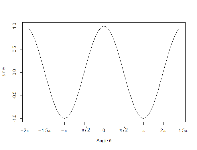
Now we create a horizontal axis to our own specifications, including relevant labels:
axis(1, at = c(-2*pi, -1.5*pi, -pi, -pi/2, 0, pi/2, pi, 1.5*pi, 2*pi),

lab = expression(-2*pi, -1.5*pi, -pi, -pi/2, 0, pi/2, pi, 2*pi, 1.5*pi))
Let’s put in some mathematical expressions, centered appropriately. The first argument within each text() function gives the value along the horizontal axis about which the text will be centered.
text(-0.7*pi,0.5,substitute(chi^2=="23.5"))
text(0.1*pi, -0.5, expression(paste(frac(alpha*omega, sigma*phi*sqrt(2*pi)), ” “,
e^{frac(-(5*x+2*mu)^3, 5*sigma^3)})))
text(0.3*pi,0,expression(hat(z) %+-% frac(se, alpha)))
Here is our graph, complete with mathematical expressions:
That wasn’t so hard! In the next lesson we will discuss using qplot in R to create scatterplots.
About the Author: David Lillis has taught R to many researchers and statisticians. His company, Sigma Statistics and Research Limited, provides both on-line instruction and face-to-face workshops on R, and coding services in R. David holds a doctorate in applied statistics.
See our full R Tutorial Series and other blog posts regarding R programming.