In a previous post we discussed the difficulties of spotting meaningful information when we work with a large panel data set.
Observing the data collapsed into groups, such as quartiles or deciles, is one approach to tackling this challenging task. We showed how this can be easily done in Stata using just 10 lines of code.
As promised, we will now show you how to graph the collapsed data.
There are two commands for graphing panel data in Stata. Stata created the command xtline. The command profileplot was created by a third party. The command xtline has more options and as a result creates more professional graphs.
To use xtline the data must be in long format. To use profileplot the data needs to be in long format. We will use the xtline command.
So the first step is to reshape the data from wide to long. We will use the percentile variable “ptl” as the identifier. We will extract “wage” from each variable containing wage data (wage1985, wage1986 etc). This variable is known as the “stub”. The data in every variable that contains the stub “wage” in its name is transferred into the new variable “wage”.
Next, we decide on a name for the new variable that will contain whatever is to the left of “wage” in the variables containing wage data. In this case it will contain the years 1985, 1986 etc.
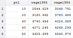
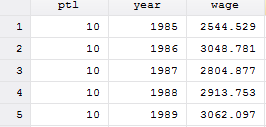
| Wide format | Long format |
 |
 |
Here is the coding for reshaping from wide to long:
reshape long wage, i(ptl) j(year)
Now we have to tell Stata which variable is the “identifier” and which variable is “time”.
xtset ptl year
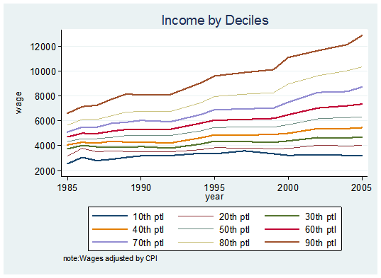
All that is left is creating the graph:
xtline wage, overlay title(Income by Deciles) ylabel(, angle(horizontal))              ///
note("note:Wages adjusted by CPI")  ///
legend( order(1 "10th ptl" 2 "20th ptl" 3 "30th ptl" 4 "40th ptl" 5 "50th ptl" 6 "60th ///
ptl" 7 "70th ptl" 8 "80th ptl" 9 "90th ptl") ) ///
plot1opts(lwidth(medthick)) plot2opts(lwidth(medthin)) plot3opts(lwidth(medthick))  ///
plot4opts(lwidth(medthin)) plot5opts(lwidth(medthick)) plot6opts(lwidth(medthin))  ///
plot7opts(lwidth(medthick)) plot8opts(lwidth(medthin)) plot9opts(lwidth(medthick))  ///
legend(on cols(3))
Several options were used. The number of columns and the text in the legend were changed. For visual effects, the widths of the lines in the graph were staggered between medium and medium thin. A title at the top and notes at the bottom of the graph were also added.

couldn’t we have done that by the option: overlay
First line of the code shows that the overlay option was used.