September 21st, 2018 by Karen Grace-Martin
At The Analysis Factor, we are on a mission to help researchers improve their statistical skills so they can do amazing research.
We all tend to think of “Statistical Analysis” as one big skill, but it’s not.
Over the years of training, coaching, and mentoring data analysts at all stages, I’ve realized there are four fundamental stages of statistical skill:
 Stage 1:
 The Fundamentals

Stage 2: Linear Models

Stage 3: Extensions of Linear Models

Stage 4: Advanced Models
There is also a stage beyond these where the mathematical statisticians dwell. But that stage is required for such a tiny fraction of data analysis projects, we’re going to ignore that one for now.
If you try to master the skill of “statistical analysis” as a whole, it’s going to be overwhelming.
And honestly, you’ll never finish. It’s too big of a field.
But if you can work through these stages, you’ll find you can learn and do just about any statistical analysis you need to. (more…)
October 3rd, 2017 by guest contributer
A few years back the winning t-shirt design in a contest for the American Association of Public Opinion Research read “Weighting is the Hardest Part.” And I don’t think the t-shirt was referring to  anything about patience!
Most statistical methods assume that every individual in the sample has the same chance of selection.
Complex Sample Surveys are different. They use multistage sampling designs that include stratification and cluster sampling. As a result, the assumption that every selected unit has the same chance of selection is not true.
To get statistical estimates that accurately reflect the population, cases in these samples need to be weighted. If not, all statistical estimates and their standard errors will be biased.
But selection probabilities are only part of weighting. (more…)
March 1st, 2017 by Karen Grace-Martin
There are many rules of thumb in statistical analysis that make decision making and understanding results much easier.
Have you ever stopped to wonder where these rules came from, let alone if there is any scientific basis for them? Is there logic behind these rules, or is it propagation of urban legends?
In this webinar, we’ll explore and question the origins, justifications, and some of the most common rules of thumb in statistical analysis, like:
(more…)
January 20th, 2017 by Karen Grace-Martin
One of the many confusing issues in statistics is the confusion between Principal Component Analysis (PCA) and Factor Analysis (FA).
They are very similar in many ways, so it’s not hard to see why they’re so often confused. They appear to be different varieties of the same analysis rather than two different methods. Yet there is a fundamental difference between them that has huge effects on how to use them.
(Like donkeys and zebras. They seem to differ only by color until you try to ride one).
Both are data reduction techniques—they allow you to capture the variance in variables in a smaller set.
Both are usually run in stat software using the same procedure, and the output looks pretty much the same.
The steps you take to run them are the same—extraction, interpretation, rotation, choosing the number of factors or components.
Despite all these similarities, there is a fundamental difference between them: PCA is a linear combination of variables; Factor Analysis is a measurement model of a latent variable.
Principal Component Analysis
PCA’s approach to data reduction is to create one or more index variables from a larger set of measured variables. It does this using a linear combination (basically a weighted average) of a set of variables. The created index variables are called components.
The whole point of the PCA is to figure out how to do this in an optimal way: the optimal number of components, the optimal choice of measured variables for each component, and the optimal weights.
The picture below shows what a PCA is doing to combine 4 measured (Y) variables into a single component, C. You can see from the direction of the arrows that the Y variables contribute to the component variable. The weights allow this combination to emphasize some Y variables more than others.
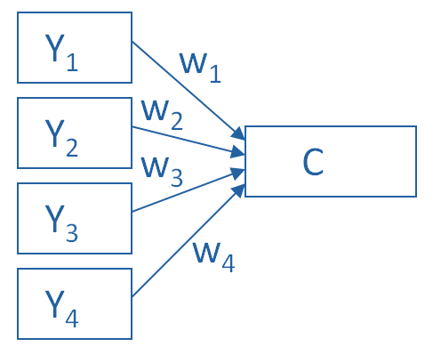
This model can be set up as a simple equation:
C = w1(Y1) + w2(Y2) + w3(Y3) + w4(Y4)
Factor Analysis
A Factor Analysis approaches data reduction in a fundamentally different way. It is a model of the measurement of a latent variable. This latent variable cannot be directly measured with a single variable (think: intelligence, social anxiety, soil health). Instead, it is seen through the relationships it causes in a set of Y variables.
For example, we may not be able to directly measure social anxiety. But we can measure whether social anxiety is high or low with a set of variables like “I am uncomfortable in large groups” and “I get nervous talking with strangers.” People with high social anxiety will give similar high responses to these variables because of their high social anxiety. Likewise, people with low social anxiety will give similar low responses to these variables because of their low social anxiety.
The measurement model for a simple, one-factor model looks like the diagram below. It’s counter intuitive, but F, the latent Factor, is causing the responses on the four measured Y variables. So the arrows go in the opposite direction from PCA. Just like in PCA, the relationships between F and each Y are weighted, and the factor analysis is figuring out the optimal weights.
In this model we have is a set of error terms. These are designated by the u’s. This is the variance in each Y that is unexplained by the factor.
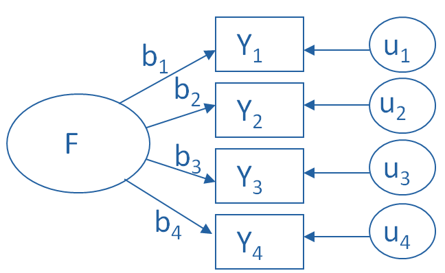
You can literally interpret this model as a set of regression equations:
Y1 = b1*F + u1
Y2 = b2*F + u2
Y3 = b3*F + u3
Y4 = b4*F + u4
As you can probably guess, this fundamental difference has many, many implications. These are important to understand if you’re ever deciding which approach to use in a specific situation.
Go to the next article or see the full series on Easy-to-Confuse Statistical Concepts
November 30th, 2016 by Jeff Meyer

A normally distributed variable can have values without limits in both directions on the number line. While most variables have practical limitations, most of the time, this assumption of infinite tails is quite reasonable as there is no real boundary.
Air temperature is an example of a variable that can extend far from its mean in either direction.
But for other variables, there is a practical beginning or ending point. Age is left-bounded. It starts at zero.
The number of wins that a baseball team can have in a season is bounded on the upper end by the number of games played in a season.
The temperature of water as a liquid is bound on the low end at zero degrees Celsius and on the high end at 100 degrees Celsius.
There are two types of bounded data that have direct implications for how to work with them in analysis: censored and truncated data. Understanding the difference is a critical first step when working with these variables.
Understanding Censored and Truncated Data
Censored Data
Censored data have unknown values beyond a bound on either end of the number line or both. It can exist by design. When the data is observed and reported at the boundary, the researcher has made the decision to restrict the range of the scale.
An example of a lower censoring boundary is the recording of pollutants in our water. The researcher may not care about (or instruments may not be able to detect) the level of pollutants if it falls below a certain threshold (e.g., .005 parts per million). In this case, any pollutant level below .005 ppm is reported as “<.005 ppm.”
An upper censor could be placed on temperature in a science experiment. Once the temperature goes above x degrees the scientist doesn’t care. So s/he measures it as “>x”.
Data can be censored on both ends as well. Income could be reported as “<$20,000” if the actual is below $20,000 and reported as “ >$200,000” if above that level.
There are potential censored data not created by design. Test scores or college admission tests are examples of censored data not created by design, but by the actual bounds. A student cannot score above 100% correct no matter how much better they know the topic than other students. These are bounded by actual results.
Truncated Data
Truncation occurs when values beyond a boundary are either excluded when gathered or excluded when analyzed. For example, if someone conducting a survey asks you if you make more than $100,000, and you answer “yes” and the surveyor says “thanks but no thanks”, then you’ve been truncated.
Or if a number of arrests is measured from police records, then everyone with 0 arrests will, by definition, be excluded from the sample.
Excluding cases from a data set at a preset boundary has the same effect. Creating models on middle income values would involve truncating income above and below specific amounts.
So to summarize, data are censored when we have partial information about the value of a variable—we know it is beyond some boundary, but not how far above or below it.
In contrast, data are truncated when the data set does not include observations in the analysis that are beyond a boundary value. Having a value beyond the boundary eliminates that individual from being in the analysis.
In truncation, it’s not just the variable of interest that we don’t have full data on. It’s all the data from that case.
Jeff Meyer is a statistical consultant with The Analysis Factor, a stats mentor for Statistically Speaking membership, and a workshop instructor. Read more about Jeff here.
Go to the next article or see the full series on Easy-to-Confuse Statistical Concepts
August 13th, 2010 by Karen Grace-Martin
Knowing the right statistical analysis to use in any data situation, knowing how to run it, and being able to understand the output are all really important skills for statistical analysis. Really important.
But they’re not the only ones.
Another is having a system in place to keep track of the analyses. This is especially important if you have any collaborators (or a statistical consultant!) you’ll be sharing your results with. You may already have an effective work flow, but if you don’t, here are some strategies I use. I hope they’re helpful to you.
1. Always use Syntax Code
All the statistical software packages have come up with some sort of easy-to-use, menu-based approach. And as long as you know what you’re doing, there is nothing wrong with using the menus. While I’m familiar enough with SAS code to just write it, I use menus all the time in SPSS.
But even if you use the menus, paste the syntax for everything you do. There are many reasons for using syntax, but the main one is documentation. Whether you need to communicate to someone else or just remember what you did, syntax is the only way to keep track. (And even though, in the midst of analyses, you believe you’ll remember how you did something, a week and 40 models later, I promise you won’t. I’ve been there too many times. And it really hurts when you can’t replicate something).
In SPSS, there are two things you can do to make this seamlessly easy. First, instead of hitting OK, hit Paste. Second, make sure syntax shows up on the output. This is the default in later versions, but you can turn in on in Edit–>Options–>Viewer. Make sure “Display Commands in Log” and “Log” are both checked. (Note: the menus may differ slightly across versions).
2. If your data set is large, create smaller data sets that are relevant to each set of analyses.
First, all statistical software needs to read the entire data set to do many analyses and data manipulation. Since that same software is often a memory hog, running anything on a large data set will s-l-o-w down processing. A lot.
Second, it’s just clutter. It’s harder to find the variables you need if you have an extra 400 variables in the data set.
3. Instead of just opening a data set manually, use commands in your syntax code to open data sets.
Why? Unless you are committing the cardinal sin of overwriting your original data as you create new variables, you have multiple versions of your data set. Having the data set listed right at the top of the analysis commands makes it crystal clear which version of the data you analyzed.
I know you remember today that your variable labeled Mar4cat means marital status in 4 categories and that 0 indicates ‘never married.’ It’s so logical, right? Well, it’s not obvious to your collaborators and it won’t be obvious to you in two years, when you try to re-analyze the data after a reviewer doesn’t like your approach.
Even if you have a separate code book, why not put it right in the data? It makes the output so much easier to read, and you don’t have to worry about losing the code book. It may feel like more work upfront, but it will save time in the long run.
5. Put data manipulation, descriptive analyses, and models in separate syntax files
When I do data analysis, I follow my Steps approach, which means first I create all the relevant variables, then run univariate and bivariate statistics, then initial models, and finally hone the models.
And I’ve found that if I keep each of these steps in separate program files, it makes it much easier to keep track of everything. If you’re creating new variables in the middle of analyses, it’s going to be harder to find the code so you can remember exactly how you created that variable.
6. As you run different versions of models, label them with model numbers
When you’re building models, you’ll often have a progression of different versions. Especially when I have to communicate with a collaborator, I’ve found it invaluable to number these models in my code and print that model number on the output. It makes a huge difference in keeping track of nine different models.
7. As you go along with different analyses, keep your syntax clean, even if the output is a mess.
Data analysis is a bit of an iterative process. You try something, discover errors, realize that variable didn’t work, and try something else. Yes, base it on theory and have a clear analysis plan, but even so, the first analyses you run won’t be your last.
Especially if you make mistakes as you go along (as I inevitably do), your output gets pretty littered with output you don’t want to keep. You could clean it up as you go along, but I find that’s inefficient. Instead, I try to keep my code clean, with only the error-free analyses that I ultimately want to use. It lets me try whatever I need to without worry. Then at the end, I delete the entire output and just rerun all code.
One caveat here: You may not want to go this approach if you have VERY computing intensive analyses, like a generalized linear mixed model with crossed random effects on a large data set. If your code takes more than 20 minutes to run, this won’t be more efficient.
8. Use titles and comments liberally
I’m sure you’ve heard before that you should use lots of comments in your syntax code. But use titles too. Both SAS and SPSS have title commands that allow titles to be printed right on the output. This is especially helpful for naming and numbering all those models in #6.
9. Name output, log, and programs the same
Since you’ve split your programs into separate files for data manipulations, descriptives, initial models, etc. you’re going to end up with a lot of files. What I do is name each output the same name as the program file. (And if I’m in SAS, the log too-yes, save the log).
Yes, that means making sure you have a separate output for each section. While it may seem like extra work, it can make looking at each output less overwhelming for anyone you’re sharing it with.