 A normal probability plot is extremely useful for checking normality assumptions. It’s more precise than a histogram, which can’t pick up subtle deviations. And yet it doesn’t suffer from too much power from large samples with tiny departures from normality or too little power from small samples with large departures from normality, as do tests like Shaprio-Wilkes.
The biggest problem with a normal probability plot is that it’s hard to read, especially if you’re not used to them. So let’s take a moment and walk through exactly how they work and what they tell you.
There are two versions of normal probability plot: Q-Q and P-P. I’ll start with the Q-Q.
The Q-Q Plot
Q-Q stands for Quantile-Quantile.
It plots the quantiles of the data set against the quantile of a standard distribution.
If this doesn’t make sense, you’re not alone. Let’s break it down into less technical terms.
The Q-Q plot plots every observed value in the data set against the values that would come from a standard normal distribution with the same number of points.
We have 111 observations in this data set, and you can see a histogram of the distribution on the right, and the corresponding Q-Q plot on the left.
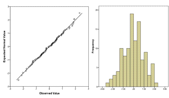
Across the bottom of the Q-Q plot are the observed data values, sorted lowest to highest. You can see that just like on the histogram, the values range from about -2.2 to 2.2. These are standardized residuals, so they already have a mean of 0 and a standard deviation of 1. If they didn’t, the plot would standardize them before plotting.
On the Y axis are the values that you would have gotten if they came from a standard normal distribution with the same number of data points–111.
This concept is a little strange if you’re not used to it, so think through it a bit. Remember back to your intro stats class, when you learned these rules about a standard normal distribution:
- The mean is 0 and the standard deviation is 1
- 34% of points are between the mean and one standard deviation below the mean.
- Another 12.5% are between one and 2 standard deviations below the mean.
- The final 2.5% are beyond 2 standard deviations below the mean.
- Because the distribution is symmetric, these same percentages apply above the mean.
So in a distribution of 111 points with a mean of 0 and standard deviation of 1, the 56th point should have a value of 0. In a normal distribution the median equals the mean.
Only 2.5% of the 111 points—about three of them—should have values at or below -2. So the third value should be right around -2.
Likewise, there is an exact value that the 17th, the 42nd, each of the 111 ordered values would theoretically have under a standard normal distribution. We don’t have easy ways to remember them, but those are the values plotted on the graph.
So if each value is exactly where it should be, if the distribution is perfectly normal, every single point would fall right on the line. The further a point is from the line, the further it is from where a normal distribution would put it.
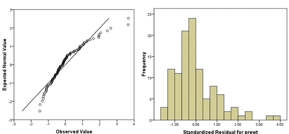
The following Q-Q plot shows a positively skewed distribution. You can see that it’s not matching a normal distribution well at all—there are too many low values close to the mean and too few high values far from the mean.
I find it helpful to always plot a histogram along with the Q-Q plot, to aid interpretation. As you do more of these, you’ll get better at reading them without the histogram.
How do you know what isn’t normal enough?
One of the questions we often get from our Statistically Speaking members is how do you know what’s normal enough and when you have a problem?
And the answer to that is “it depends.” (Sorry!)
First of all, it depends on why you’re doing the plot. We often use Q-Q plots to check assumptions of normality. Some tests, in some conditions, are more robust to departures from normality than others.
The nature of the departure also matters. For example non-normality due to skew is often a bigger problem in linear models than kurtosis.
And of course, the context matters. For example, the assumptions of normality for tests are about the population distribution, not the sample distribution. But a small sample from a normal population distribution won’t necessarily look all that normal.
This is where it can be helpful to have a second opinion from someone who is familiar with these plots, at least until you feel comfortable.
But please do! Every time you interpret a normal probability plot, it gets easier to read.
The P-P Plot
Okay, we’ve talked a lot about Q-Q plots. What about P-P?
The Q-Q is plotting the quantiles—the actual values of X against the theoretical values of X under the normal distribution. That’s what I’ve described above.
A P-P plot, on the other hand, plots the corresponding areas under the curve (cumulative distribution function) for those values. The P-P stands for Probability-Probability.
In both, the points fall right on the line when the distribution is normal. For the most part, the normal P-P plot is better at finding deviations from normality in the center of the distribution, and the normal Q-Q plot is better at finding deviations in the tails.
Q-Q plots tend to be preferred in research situations.
Bonus: you can use both Q-Q and P-P plots for distributions other than normal. And they work the same way. The closer the sample is to the theoretical distribution, the closer the points will be to the line.
Updated 6/19/25 for more details
For this explanation of the normal distribution:
“The mean is 0 and the standard deviation is 1
34% of points are between the mean and one standard deviation below the mean.
Another 12.5% are between one and 2 standard deviations below the mean.
The final 2.5% are beyond 2 standard deviations below the mean.
Because the distribution is symmetric, these same percentages apply above the mean.
So in a distribution of 111 points with a mean of 0 and standard deviation of 1, the 56th point should have a value of 0. In a normal distribution the median equals the mean.”
Wouldn’t the quoted percentages for the below the mean points also apply for the points, similarly, falling above the mean?
Yes! There is a sentence in there, but maybe it wasn’t obvious enough:”Because the distribution is symmetric, these same percentages apply above the mean.”
Thanks for republishing this article. Your explanations are so clear and intuitive on the differences, uses, and interpretation of the P-P and Q-Q plots.
I dont understand what “doesn’t suffer from too much or too little power” is- could you explain this more?
Hi Lauren, have you seen this article? It goes into the Why of power calculations more including why you odn’t want too much: https://www.theanalysisfactor.com/5-reasons-sample-size-calculations/
For convenient a reader in understanding this article, both the term Q-Q plot and P-P plot need to be cleared formerly. Thank a lot.