The normal distribution is so ubiquitous in statistics that those of us who use a lot of statistics tend to forget it’s not always so common in actual data.
And since the normal distribution is continuous, many people describe all numerical variables as continuous. I get it: I’m guilty of using those terms interchangeably, too, but they’re not exactly the same.
Numerical variables can be either continuous or discrete.
The difference? Continuous variables can take any number within a range. Discrete variables can only take on specific values. For numeric discrete data, these are often, but don’t have to be, whole numbers*.
Count variables, as the name implies, are frequencies of some event or state. Number of arrests, fish (more…)
If you have count data you use a Poisson model for the analysis, right?
The key criterion for using a Poisson model is after accounting for the effect of predictors, the mean must equal the variance. If the mean doesn’t equal the variance then all we have to do is transform the data or tweak the model, correct?
Let’s see how we can do this with some real data. A survey was done in Australia during the peak of the flu season. The outcome variable is the total number of times people asked for medical advice from any source over a two-week period.
We are trying to determine what influences people with flu symptoms to seek medical advice. The mean number of times was 0.516 times and the variance 1.79.
The mean does not equal the variance even after accounting for the model’s predictors.
Here are the results for this model: (more…)
 In a simple linear regression model, how the constant (a.k.a., intercept) is interpreted depends upon the type of predictor (independent) variable.
If the predictor is categorical and dummy-coded, the constant is the mean value of the outcome variable for the reference category only. If the predictor variable is continuous, the constant equals the predicted value of the outcome variable when the predictor variable equals zero.
Removing the Constant When the Predictor Is Categorical
When your predictor variable X is categorical, the results are logical. Let’s look at an example. (more…)
A normally distributed variable can have values without limits in both directions on the number line. While most variables have practical limitations, most of the time, this assumption of infinite tails is quite reasonable as there is no real boundary.
Air temperature is an example of a variable that can extend far from its mean in either direction.
But for other variables, there is a practical beginning or ending point. Age is left-bounded. It starts at zero.
The number of wins that a baseball team can have in a season is bounded on the upper end by the number of games played in a season.
The temperature of water as a liquid is bound on the low end at zero degrees Celsius and on the high end at 100 degrees Celsius.
There are two types of bounded data that have direct implications for how to work with them in analysis: censored and truncated data. Understanding the difference is a critical first step when working with these variables.
Understanding Censored and Truncated Data
Censored Data
Censored data have unknown values beyond a bound on either end of the number line or both. It can exist by design. When the data is observed and reported at the boundary, the researcher has made the decision to restrict the range of the scale.
An example of a lower censoring boundary is the recording of pollutants in our water. The researcher may not care about (or instruments may not be able to detect) the level of pollutants if it falls below a certain threshold (e.g., .005 parts per million). In this case, any pollutant level below .005 ppm is reported as “<.005 ppm.”
An upper censor could be placed on temperature in a science experiment. Once the temperature goes above x degrees the scientist doesn’t care. So s/he measures it as “>x”.
Data can be censored on both ends as well. Income could be reported as “<$20,000” if the actual is below $20,000 and reported as “ >$200,000” if above that level.
There are potential censored data not created by design. Test scores or college admission tests are examples of censored data not created by design, but by the actual bounds. A student cannot score above 100% correct no matter how much better they know the topic than other students. These are bounded by actual results.
Truncated Data
Truncation occurs when values beyond a boundary are either excluded when gathered or excluded when analyzed. For example, if someone conducting a survey asks you if you make more than $100,000, and you answer “yes” and the surveyor says “thanks but no thanks”, then you’ve been truncated.
Or if a number of arrests is measured from police records, then everyone with 0 arrests will, by definition, be excluded from the sample.
Excluding cases from a data set at a preset boundary has the same effect. Creating models on middle income values would involve truncating income above and below specific amounts.
So to summarize, data are censored when we have partial information about the value of a variable—we know it is beyond some boundary, but not how far above or below it.
In contrast, data are truncated when the data set does not include observations in the analysis that are beyond a boundary value. Having a value beyond the boundary eliminates that individual from being in the analysis.
In truncation, it’s not just the variable of interest that we don’t have full data on. It’s all the data from that case.
Jeff Meyer is a statistical consultant with The Analysis Factor, a stats mentor for Statistically Speaking membership, and a workshop instructor. Read more about Jeff here.
Go to the next article or see the full series on Easy-to-Confuse Statistical Concepts
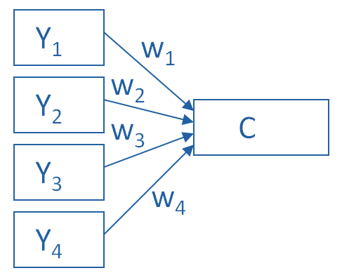
Principal Component Analysis is really, really useful.
You use it to create a single index variable from a set of correlated variables.
In fact, the very first step in Principal Component Analysis is to create a correlation matrix (a.k.a., a table of bivariate correlations). The rest of the analysis is based on this correlation matrix.
You don’t usually see this step — it happens behind the scenes in your software.
Most PCA procedures calculate that first step using only one type of correlations: Pearson.
And that can be a problem. Pearson correlations assume all variables are normally distributed. That means they have to be truly (more…)
Outliers are one of those realities of data analysis that no one can avoid.
Those pesky extreme values cause biased parameter estimates, non-normality in otherwise beautifully normal variables, and inflated variances.
Everyone agrees that outliers cause trouble with parametric analyses. But not everyone agrees that they’re always a problem, or what to do about them even if they are.
Ways to Deal With Outliers
Sometimes a non-parametric or robust alternative is available.
And sometimes not.
There are a number of approaches in statistical analysis for dealing with outliers and the problems they create.
It’s common for committee members or Reviewer #2 to have Very. Strong. Opinions. that there is one and only one good approach.
Two approaches that I’ve commonly seen are:
1) delete outliers from the sample, or
2) winsorize them (i.e., replace the outlier value with one that is less extreme).
Limitations of these Solutions
The problem with both of these “solutions” is that they also cause problems — biased parameter estimates and underweighted or eliminated valid values. (more…)