Let’s use R to explore bivariate relationships among variables.
Part 7 of this series showed how to do a nice bivariate plot, but it’s also useful to have a correlation statistic.
We use a new version of the data set we used in Part 20 of tourists from different nations, their gender, and number of children. Here, we have a new variable – the amount of money they spend while on vacation.
First, if the data object (A) for the previous version of the tourists data set is present in your R workspace, it is a good idea to remove it because it has some of the same variable names as the data set that you are about to read in. We remove A as follows:
rm(A)
Removing the object A ensures no confusion between different data objects that contain variables with similar names.
Now copy and paste the following array into R.
M <- structure(list(COUNTRY = structure(c(3L, 3L, 3L, 3L, 1L, 3L, 2L, 3L, 1L, 3L, 3L, 1L, 2L, 2L, 3L, 3L, 3L, 2L, 3L, 1L, 1L, 3L,

1L, 2L), .Label = c("AUS", "JAPAN", "USA"), class = "factor"),GENDER = structure(c(2L, 1L, 2L, 2L, 1L, 2L, 1L, 2L, 1L, 2L, 2L, 1L, 1L, 1L, 1L, 2L, 1L, 1L, 2L, 2L, 1L, 1L, 1L, 2L), .Label = c("F", "M"), class = "factor"), CHILDREN = c(2L, 1L, 3L, 2L, 2L, 3L, 1L, 0L, 1L, 0L, 1L, 2L, 2L, 1L, 1L, 1L, 0L, 2L, 1L, 2L, 4L, 2L, 5L, 1L), SPEND = c(8500L, 23000L, 4000L, 9800L, 2200L, 4800L, 12300L, 8000L, 7100L, 10000L, 7800L, 7100L, 7900L, 7000L, 14200L, 11000L, 7900L, 2300L, 7000L, 8800L, 7500L, 15300L, 8000L, 7900L)), .Names = c("COUNTRY", "GENDER", "CHILDREN", "SPEND"), class = "data.frame", row.names = c(NA, -24L))
 M

attach(M)
Do tourists with greater numbers of children spend more? Let’s calculate the correlation between CHILDREN and SPEND, using the cor() function.
R <- cor(CHILDREN, SPEND)

[1] -0.2612796
We have a weak correlation, but it’s negative! Tourists with a greater number of children tend to spend less rather than more!
(Even so, we’ll plot this in our next post to explore this unexpected finding).
We can round to any number of decimal places using the round() command.
round(R, 2)

[1] -0.26
The percentage of shared variance (100*r2) is:
100 * (R**2)

[1] 6.826704
To test whether your correlation coefficient differs from 0, use the cor.test() command.
cor.test(CHILDREN, SPEND)

 Pearson's product-moment correlation

data: CHILDREN and SPEND

t = -1.2696, df = 22, p-value = 0.2175

alternative hypothesis: true correlation is not equal to 0

95 percent confidence interval:

-0.6012997 0.1588609

sample estimates:

cor

-0.2612796
The cor.test() command returns the correlation coefficient, but also gives the p-value for the correlation. In this case, we see that the correlation is not significantly different from 0 (p is approximately 0.22).
Of course we have only a few values of the variable CHILDREN, and this fact will influence the correlation. Just how many values of CHILDREN do we have? Can we use the levels() command directly? (Recall that the term “level” has a few meanings in statistics, once of which is the values of a categorical variable, aka “factor“).
levels(CHILDREN)

NULL
R does not recognize CHILDREN as a factor. In order to use the levels() command, we must turn CHILDREN into a factor temporarily, using as.factor().
levels(as.factor(CHILDREN))

[1] "0" "1" "2" "3" "4" "5"
So we have six levels of CHILDREN. CHILDREN is a discrete variable without many values, so a Spearman correlation can be a better option. Let’s see how to implement a Spearman correlation:
cor(CHILDREN, SPEND, method ="spearman")

[1] -0.3116905
We have obtained a similar but slightly different correlation coefficient estimate because the Spearman correlation is indeed calculated differently than the Pearson.
Why not plot the data? We will do so in our next post.
About the Author: David Lillis has taught R to many researchers and statisticians. His company, Sigma Statistics and Research Limited, provides both on-line instruction and face-to-face workshops on R, and coding services in R. David holds a doctorate in applied statistics.
See our full R Tutorial Series and other blog posts regarding R programming.
I mentioned in my last post that R Commander can do a LOT of data manipulation, data analyses, and graphs in R without you ever having to program anything.
Here I want to give you some examples, so you can see how truly useful this is.
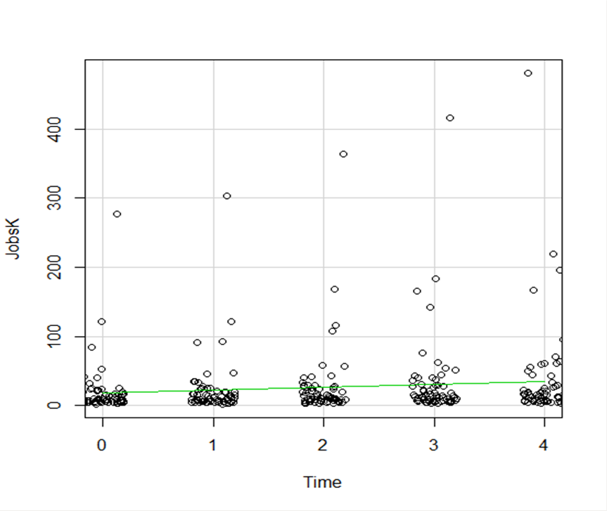
Let’s start with a simple scatter plot between Time and the number of Jobs (in thousands) in 67 counties. Time is measured in decades since 1960.
The green line is the best fit linear regression line.
This wasn’t the default in R Commander (I actually had to remove a few things to get to this), but it’s a useful way to start out.
A few ways we can easily customize this graph:
Jittering
We see here a common issue in scatter plots–because the X values are discrete, the points are all on top of each other.
It’s difficult to tell just how many points there are at the bottom of the graph–it’s just a mass of black.
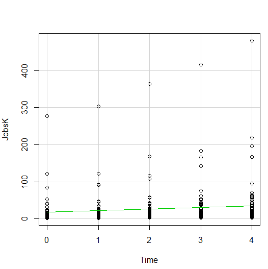
One great way to solve this is by jittering the points.
All this means is that instead of putting identical points right on top of each other, we move it slightly, randomly, in either one or both directions. In this example, I jittered only horizontally:
So while the points aren’t graphed exactly where they are, we can see the trends and we can now see how many points there are in each decade.
How hard is this to do in R Commander? One click:
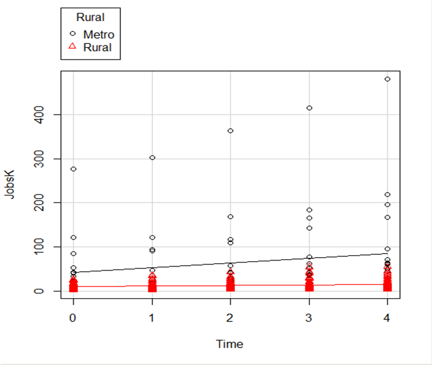
Regression Lines by Group
Another useful change to a scatter plot is to add a separate regression line to the graph based on some sort of factor in the data set.
In this example, the observations are measured for counties and each county is classified as being either Rural or Metropolitan.
If we’d like to see if the growth in jobs over time is different in Rural and Metropolitan counties, we need a separate line for each group.
In R Commander we can do this quite easily. Not only do we get two regression lines, but each point is clearly designated as being from either a Rural or Metropolitan county through its color and shape.
It’s quite clear that not only was there more growth in the number of jobs in Metro counties, there was almost no change at all in the Rural counties.
 And once again, how difficult is this? This time, two clicks.
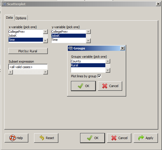
There are quite a few modifications you can make just using the buttons, but of course, R Commander doesn’t do everything.
For example, I could not figure out how to change those red triangles to green rectangles through the menus.
But that’s the best part about R Commander. It works very much like the Paste button in SPSS.
Meaning, it creates the code for you. So I can take the code it created, then edit it to get my graph looking the way I want.
I don’t have to memorize which command creates a scatter plot.
I don’t have to memorize how to pull my SPSS data into R or tell R that Rural is a factor. I can do all that through R Commander, then just look up the option to change the color and shape of the red triangles.
A Science News article from July 2014 was titled “Scientists’ grasp of confidence intervals doesn’t inspire confidence.” Perhaps that is why only 11% of the articles in the 10 leading psychology journals in 2006 reported confidence intervals in their statistical analysis.
How important is it to be able to create and interpret confidence intervals?
The American Psychological Association Publication Manual, which sets the editorial standards for over 1,000 journals in the behavioral, life, and social sciences, has begun emphasizing parameter estimation and de-emphasizing Null Hypothesis Significance Testing (NHST).
Its most recent edition, the sixth, published in 2009, states “estimates of appropriate effect sizes and confidence intervals are the minimum expectations” for published research.
In this webinar, we’ll clear up the ambiguity as to what exactly is a confidence interval and how to interpret them in a table and graph format. We will also explore how they are calculated for continuous and dichotomous outcome variables in various types of samples and understand the impact sample size has on the width of the band. We’ll discuss related concepts like equivalence testing.
By the end of the webinar, we anticipate your grasp of confidence intervals will inspire confidence.
Note: This training is an exclusive benefit to members of the Statistically Speaking Membership Program and part of the Stat’s Amore Trainings Series. Each Stat’s Amore Training is approximately 90 minutes long.
(more…)
Do you remember all those probability rules you learned (or didn’t) in intro stats? You know, things like the P(A|B)?While you may have thought that these rules were only about balls and urns (who pulls balls from urns anyway?), it’s actually not true.
It turns out that having a good understanding of these rules (as well as actually remembering them) does come in handy when you’re doing data analysis.
There are so many situations and methods in statistics that draw directly from those rules. Everything from p-values to logistic regression to maximum likelihood estimation are all direct applications of these rules. In this webinar, we’re going to review those rules, with examples of when they come up in statistical methods that you use and are learning.
Note: This training is an exclusive benefit to members of the Statistically Speaking Membership Program and part of the Stat’s Amore Trainings Series. Each Stat’s Amore Training is approximately 90 minutes long.
About the Instructor

Karen Grace-Martin helps statistics practitioners gain an intuitive understanding of how statistics is applied to real data in research studies.
She has guided and trained researchers through their statistical analysis for over 15 years as a statistical consultant at Cornell University and through The Analysis Factor. She has master’s degrees in both applied statistics and social psychology and is an expert in SPSS and SAS.
Not a Member Yet?
It’s never too early to set yourself up for successful analysis with support and training from expert statisticians.
Just head over and sign up for Statistically Speaking.
You'll get access to this training webinar, 130+ other stats trainings, a pathway to work through the trainings that you need — plus the expert guidance you need to build statistical skill with live Q&A sessions and an ask-a-mentor forum.
In the last lesson, we saw how to use qplot to map symbol colour to a categorical variable. Now we see how to control symbol colours and create legend titles.
M <- structure(list(PATIENT = c("Mary","Dave","Simon","Steve","Sue","Frida","Magnus","Beth","Peter","Guy","Irina","Liz"),

GENDER = c("F","M","M","M","F","F","M","F","M","M","F","F"),

TREATMENT = c("A","B","C","A","A","B","A","C","A","C","B","C"),

AGE =c("Y","M","M","E","M","M","E","E","M","E","M","M"),

WEIGHT_1 = c(79.2,58.8,72.0,59.7,79.6,83.1,68.7,67.6,79.1,39.9,64.7,65.6),

WEIGHT_2 = c(76.6,59.3,70.1,57.3,79.8,82.3,66.8,67.4,76.8,41.4,65.3,63.2),

HEIGHT = c(169,161,175,149,179,177,175,170,177,138,170,165),

SMOKE = c("Y","Y","N","N","N","N","N","N","N","N","N","Y"),

EXERCISE = c(TRUE,FALSE,FALSE,FALSE,TRUE,FALSE,FALSE,TRUE,TRUE,FALSE,FALSE,TRUE),

RECOVER = c(1,0,1,1,1,0,1,1,1,1,0,1)),

.Names = c("PATIENT","GENDER","TREATMENT","AGE","WEIGHT_1","WEIGHT_2","HEIGHT","SMOKE","EXERCISE","RECOVER"),

class = "data.frame", row.names = 1:12)
M
    PATIENT GENDER TREATMENT AGE WEIGHT_1 WEIGHT_2 HEIGHT SMOKE EXERCISE RECOVER
1     Mary      F         A   Y     79.2     76.6    169     Y     TRUE       1
2     Dave      M         B   M     58.8     59.3    161     Y    FALSE       0
3    Simon      M         C   M     72.0     70.1    175     N    FALSE       1
4    Steve      M         A   E     59.7     57.3    149     N    FALSE       1
5      Sue      F         A   M     79.6     79.8    179     N     TRUE       1
6    Frida      F         B   M     83.1     82.3    177     N    FALSE       0
7   Magnus      M         A   E     68.7     66.8    175     N    FALSE       1
8     Beth      F         C   E     67.6     67.4    170     N     TRUE       1
9    Peter      M         A   M     79.1     76.8    177     N     TRUE       1
10     Guy      M         C   E     39.9     41.4    138     N    FALSE       1
11   Irina      F         B   M     64.7     65.3    170     N    FALSE       0
12     Liz      F         C   M     65.6     63.2    165     Y     TRUE       1
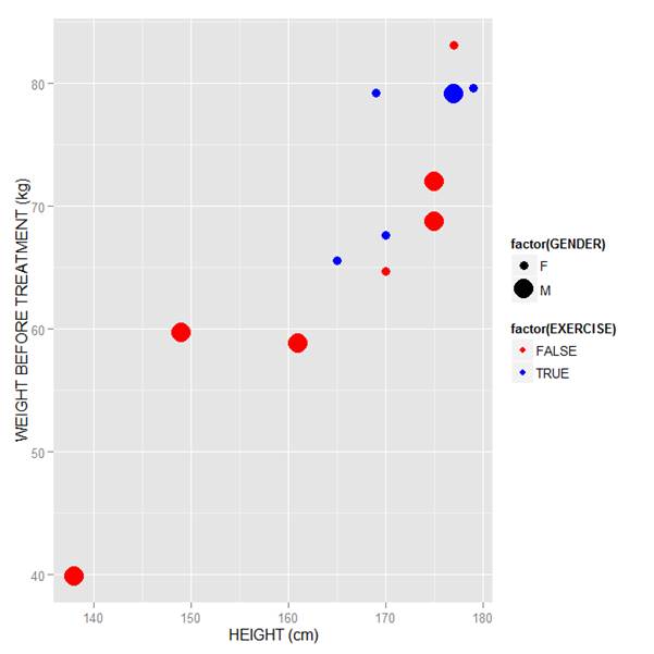
Now let’s map symbol size to GENDER and symbol colour to EXERCISE, but choosing our own colours. To control your symbol colours, use the layer: scale_colour_manual(values = c()) and select your desired colours. We choose red and blue, and symbol sizes 3 and 7.
qplot(HEIGHT, WEIGHT_1, data = M, geom = c("point"), xlab = "HEIGHT (cm)", ylab = "WEIGHT BEFORE TREATMENT (kg)" , size = factor(GENDER), color = factor(EXERCISE)) + scale_size_manual(values = c(3, 7)) + scale_colour_manual(values = c("red", "blue"))
Here is our graph with red and blue points:
Now let’s see how to control the legend title (the title that sits directly above the legend). For this example, we control the legend title through the name argument within the two functions scale_size_manual() and scale_colour_manual(). Enter this syntax in which we choose appropriate legend titles:
qplot(HEIGHT, WEIGHT_1, data = M, geom = c("point"), xlab = "HEIGHT (cm)", ylab = "WEIGHT BEFORE TREATMENT (kg)" , size = factor(GENDER), color = factor(EXERCISE)) + scale_size_manual(values = c(3, 7), name="Gender") + scale_colour_manual(values = c("red","blue"), name="Exercise")
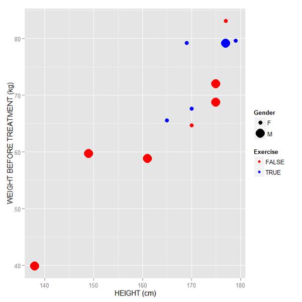
We now have our preferred symbol colour and size, and legend titles of our choosing.
That wasn’t so hard! In our next blog post we will learn about plotting regression lines in R.
About the Author: David Lillis Ph. D. has taught R to many researchers and statisticians. His company, Sigma Statistics and Research Limited, provides both on-line instruction and face-to-face workshops on R, and coding services in R. David holds a doctorate in applied statistics.
See our full R Tutorial Series and other blog posts regarding R programming.
In this lesson, we see how to use qplot to create a simple scatterplot.
The qplot (quick plot) system is a subset of the ggplot2 (grammar of graphics) package which you can use to create nice graphs. It is great for creating graphs of categorical data, because you can map symbol colour, size and shape to the levels of your categorical variable. To use qplot first install ggplot2 as follows:
(more…)