 In Part 7, let’s look at further plotting in R. Try entering the following three commands together (the semi-colon allows you to place several commands on the same line).
Let’s take an example with two variables and enhance it.
X <- c(3, 4, 6, 6, 7, 8, 9, 12)
B1 <- c(4, 5, 6, 7, 17, 18, 19, 22)
B2 <- c(3, 5, 8, 10, 19, 21, 22, 26)
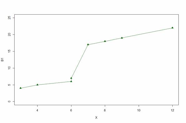
Graph B1 using a y axis from 0 to 25.
plot(X, B1, type="o", pch = 17, cex=1.2, col="darkgreen", ylim=c(0, 25))
(Note: when a larger version of a graphic is available, you can click on the graphics below to see the larger version.)
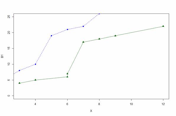
Now superpose a plot of B2.
lines(B2, type="o", pch=16, lty=2, col="blue")
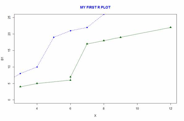
Notice how we plotted the first curve and then added the second using the lines command. Let’s create a title using the title command.
title(main="MY FIRST R PLOT", col.main="blue", font.main=2)
You can look up the various arguments for colour and font type on-line. Note the default labels for the horizontal and vertical axes. However, notice that the second curve did not fit into the plot.
Here is another example, in which we automate the calculation of the y-axis limits. Let’s define three vectors.
B1 <- c(1, 2, 4, 5, 7, 12, 14, 16, 19)
B2 <- c(2, 3, 6, 7, 8, 9, 11, 12, 18)
B3 <- c(0, 1, 7, 3, 2, 2, 7, 9, 13)
Calculate the maximum value of B1, B2 and B3.
yaxismax<- max(B1, B2, B3)
yaxismax
[1] 19
We plot on a vertical axis from 0 to yaxismax. Then we disable the default axes and their annotations, using the arguments axes = FALSE, ann=FALSE, so that we can create our own axes. This approach (disabling the default axes) is very important in plotting with R.
plot(B1, pch = 15, type="o", col="blue", ylim=c(0, yaxismax),axes=FALSE, ann=FALSE)
axis(1, at=1:9, lab=c("A","B","C","D","E", "F", "G","H", "I"))
The first argument in the axis command (1) specifies the horizontal axis. The at argument specifies where to place the axis labels. The vector called lab stores the actual labels. Now create a y axis with horizontal labels that display ticks every 2 marks.
axis(2, las=1, at=2*0: yaxismax)
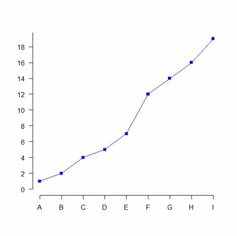
The argument las controls the orientation of the axis labels. Try entering other values. Now create a
box around the plot. Then add in the two new curves using the lines command.
box()
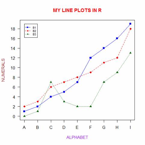
lines(B2, pch = 16, type="o", lty=2, col="red")
lines(B3, pch = 17, type="o", lty=3, col="darkgreen")
Create a title.
title(main="MY LINE PLOTS IN R", col.main="red", font.main=2)
Label the x and y axes.
title(xlab=toupper("ALPHABET"), col.lab="purple")
title(ylab="NUMERALS", col.lab="brown")
Note the toupper command which ensures that text is upper case. The tolower command ensures that text is in lower case.
Create a legend at the location (1, yaxismax).
legend(1, yaxismax, c("B1","B2", "B3"), cex=0.7, col=c("blue", "red", "darkgreen"),
pch=c(15, 16, 17), lty=1:3)
The cex argument gives you control over the size of fonts, where the default is 1. You can check out the parameters pch, type and lty for yourselves. You can find these arguments easily on Google by entering R pch, for example. Here is your plot:
That wasn’t so hard! However, you did have to know some syntax and be ready to experiment. In blog 8 we will look at some analytic techniques in R.
About the Author: David Lillis has taught R to many researchers and statisticians. His company, Sigma Statistics and Research Limited, provides both on-line instruction and face-to-face workshops on R, and coding services in R.
See our full R Tutorial Series and other blog posts regarding R programming.

please tell me how to draw graph by taking an Excel file