 In our last post, we calculated Pearson and Spearman correlation coefficients in R and got a surprising result.
So let’s investigate the data a little more with a scatter plot.
We use the same version of the data set of tourists. We have data on tourists from different nations, their gender, number of children, and how much they spent on their trip.
Again we copy and paste the following array into R.
M <- structure(list(COUNTRY = structure(c(3L, 3L, 3L, 3L, 1L, 3L, 2L, 3L, 1L, 3L, 3L, 1L, 2L, 2L, 3L, 3L, 3L, 2L, 3L, 1L, 1L, 3L,

1L, 2L), .Label = c("AUS", "JAPAN", "USA"), class = "factor"),GENDER = structure(c(2L, 1L, 2L, 2L, 1L, 2L, 1L, 2L, 1L, 2L, 2L, 1L, 1L, 1L, 1L, 2L, 1L, 1L, 2L, 2L, 1L, 1L, 1L, 2L), .Label = c("F", "M"), class = "factor"), CHILDREN = c(2L, 1L, 3L, 2L, 2L, 3L, 1L, 0L, 1L, 0L, 1L, 2L, 2L, 1L, 1L, 1L, 0L, 2L, 1L, 2L, 4L, 2L, 5L, 1L), SPEND = c(8500L, 23000L, 4000L, 9800L, 2200L, 4800L, 12300L, 8000L, 7100L, 10000L, 7800L, 7100L, 7900L, 7000L, 14200L, 11000L, 7900L, 2300L, 7000L, 8800L, 7500L, 15300L, 8000L, 7900L)), .Names = c("COUNTRY", "GENDER", "CHILDREN", "SPEND"), class = "data.frame", row.names = c(NA, -24L))
 M

attach(M)
plot(CHILDREN, SPEND)
(more…)
In the last lesson, we saw how to use qplot to map symbol colour to a categorical variable. Now we see how to control symbol colours and create legend titles.
M <- structure(list(PATIENT = c("Mary","Dave","Simon","Steve","Sue","Frida","Magnus","Beth","Peter","Guy","Irina","Liz"),

GENDER = c("F","M","M","M","F","F","M","F","M","M","F","F"),

TREATMENT = c("A","B","C","A","A","B","A","C","A","C","B","C"),

AGE =c("Y","M","M","E","M","M","E","E","M","E","M","M"),

WEIGHT_1 = c(79.2,58.8,72.0,59.7,79.6,83.1,68.7,67.6,79.1,39.9,64.7,65.6),

WEIGHT_2 = c(76.6,59.3,70.1,57.3,79.8,82.3,66.8,67.4,76.8,41.4,65.3,63.2),

HEIGHT = c(169,161,175,149,179,177,175,170,177,138,170,165),

SMOKE = c("Y","Y","N","N","N","N","N","N","N","N","N","Y"),

EXERCISE = c(TRUE,FALSE,FALSE,FALSE,TRUE,FALSE,FALSE,TRUE,TRUE,FALSE,FALSE,TRUE),

RECOVER = c(1,0,1,1,1,0,1,1,1,1,0,1)),

.Names = c("PATIENT","GENDER","TREATMENT","AGE","WEIGHT_1","WEIGHT_2","HEIGHT","SMOKE","EXERCISE","RECOVER"),

class = "data.frame", row.names = 1:12)
M
    PATIENT GENDER TREATMENT AGE WEIGHT_1 WEIGHT_2 HEIGHT SMOKE EXERCISE RECOVER
1     Mary      F         A   Y     79.2     76.6    169     Y     TRUE       1
2     Dave      M         B   M     58.8     59.3    161     Y    FALSE       0
3    Simon      M         C   M     72.0     70.1    175     N    FALSE       1
4    Steve      M         A   E     59.7     57.3    149     N    FALSE       1
5      Sue      F         A   M     79.6     79.8    179     N     TRUE       1
6    Frida      F         B   M     83.1     82.3    177     N    FALSE       0
7   Magnus      M         A   E     68.7     66.8    175     N    FALSE       1
8     Beth      F         C   E     67.6     67.4    170     N     TRUE       1
9    Peter      M         A   M     79.1     76.8    177     N     TRUE       1
10     Guy      M         C   E     39.9     41.4    138     N    FALSE       1
11   Irina      F         B   M     64.7     65.3    170     N    FALSE       0
12     Liz      F         C   M     65.6     63.2    165     Y     TRUE       1
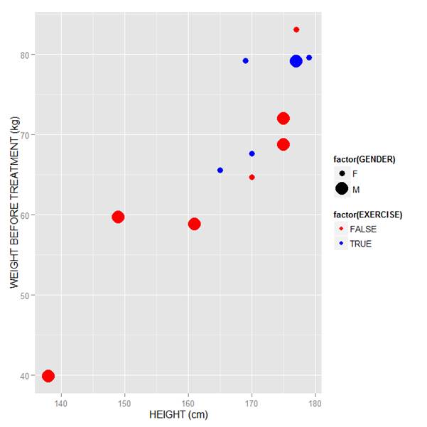
Now let’s map symbol size to GENDER and symbol colour to EXERCISE, but choosing our own colours. To control your symbol colours, use the layer: scale_colour_manual(values = c()) and select your desired colours. We choose red and blue, and symbol sizes 3 and 7.
qplot(HEIGHT, WEIGHT_1, data = M, geom = c("point"), xlab = "HEIGHT (cm)", ylab = "WEIGHT BEFORE TREATMENT (kg)" , size = factor(GENDER), color = factor(EXERCISE)) + scale_size_manual(values = c(3, 7)) + scale_colour_manual(values = c("red", "blue"))
Here is our graph with red and blue points:
Now let’s see how to control the legend title (the title that sits directly above the legend). For this example, we control the legend title through the name argument within the two functions scale_size_manual() and scale_colour_manual(). Enter this syntax in which we choose appropriate legend titles:
qplot(HEIGHT, WEIGHT_1, data = M, geom = c("point"), xlab = "HEIGHT (cm)", ylab = "WEIGHT BEFORE TREATMENT (kg)" , size = factor(GENDER), color = factor(EXERCISE)) + scale_size_manual(values = c(3, 7), name="Gender") + scale_colour_manual(values = c("red","blue"), name="Exercise")
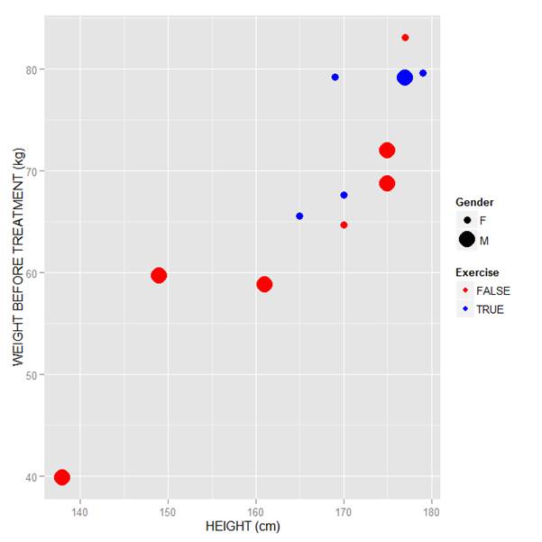
We now have our preferred symbol colour and size, and legend titles of our choosing.
That wasn’t so hard! In our next blog post we will learn about plotting regression lines in R.
About the Author: David Lillis Ph. D. has taught R to many researchers and statisticians. His company, Sigma Statistics and Research Limited, provides both on-line instruction and face-to-face workshops on R, and coding services in R. David holds a doctorate in applied statistics.
See our full R Tutorial Series and other blog posts regarding R programming.
