 In our last post, we calculated Pearson and Spearman correlation coefficients in R and got a surprising result.
So let’s investigate the data a little more with a scatter plot.
We use the same version of the data set of tourists. We have data on tourists from different nations, their gender, number of children, and how much they spent on their trip.
Again we copy and paste the following array into R.
M <- structure(list(COUNTRY = structure(c(3L, 3L, 3L, 3L, 1L, 3L, 2L, 3L, 1L, 3L, 3L, 1L, 2L, 2L, 3L, 3L, 3L, 2L, 3L, 1L, 1L, 3L,

1L, 2L), .Label = c("AUS", "JAPAN", "USA"), class = "factor"),GENDER = structure(c(2L, 1L, 2L, 2L, 1L, 2L, 1L, 2L, 1L, 2L, 2L, 1L, 1L, 1L, 1L, 2L, 1L, 1L, 2L, 2L, 1L, 1L, 1L, 2L), .Label = c("F", "M"), class = "factor"), CHILDREN = c(2L, 1L, 3L, 2L, 2L, 3L, 1L, 0L, 1L, 0L, 1L, 2L, 2L, 1L, 1L, 1L, 0L, 2L, 1L, 2L, 4L, 2L, 5L, 1L), SPEND = c(8500L, 23000L, 4000L, 9800L, 2200L, 4800L, 12300L, 8000L, 7100L, 10000L, 7800L, 7100L, 7900L, 7000L, 14200L, 11000L, 7900L, 2300L, 7000L, 8800L, 7500L, 15300L, 8000L, 7900L)), .Names = c("COUNTRY", "GENDER", "CHILDREN", "SPEND"), class = "data.frame", row.names = c(NA, -24L))
 M

attach(M)
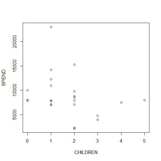
plot(CHILDREN, SPEND)
We get this graph:
That’s useful, but pretty basic. Let’s create a slightly better version by including arguments that control different attributes of the plot.
plot(CHILDREN, SPEND, pch = 16, col = "red", main = "TOURIST SPEND VS. NUMBERS OF CHILDREN")
We get this graph:
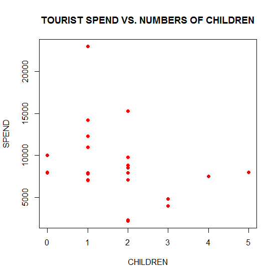
It is clear that the col argument controls the color of the symbols and that the main argument allows you to include a title for your plot, enclosed within quotation marks.
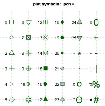
The pch argument allows you to control symbol type. Here is a summary of the available symbol types:
Now we modify different attributes of the plot.
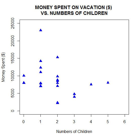
plot(CHILDREN, SPEND, pch = 17, cex = 1.3, col = "blue", main = "MONEY SPENT ON VACATION ($) \nVS. NUMBERS OF CHILDREN", xlim = c(0, 6), ylim = c(0, 25000), xlab = "Numbers of Children" , ylab = "Money Spent ($)" )
This time we used solid triangles and we blew up the symbol size by a factor of 1.3 using the cex argument (short for character expansion).
We also modified the title and included the backslash n to force the succeeding text onto the next line.
In addition we changed the x axis and y axis limits using the xlim and ylim arguments. Finally, we modified the x axis and y axis labels using xlab and ylab.
We get this graph:
If you want to copy and paste your plot into a Word document, simply right click inside the plot, copy as a bitmap and paste into your document.
In our next blog post we will learn how to use R to graph non-linear mathematical expressions.
About the Author: David Lillis has taught R to many researchers and statisticians. His company, Sigma Statistics and Research Limited, provides both on-line instruction and face-to-face workshops on R, and coding services in R. David holds a doctorate in applied statistics.
See our full R Tutorial Series and other blog posts regarding R programming.

The original code was incorrect: It should be
T <- structure(list(COUNTRY = structure(c(3L, 3L, 3L, 3L, 1L, 3L, 2L, 3L, 1L, 3L, 3L, 1L, 2L, 2L, 3L, 3L, 3L, 2L, 3L, 1L, 1L, 3L, 1L, 2L), .Label = c("AUS", "JAPAN", "USA"), class = "factor"),GENDER = structure(c(2L, 1L, 2L, 2L, 1L, 2L, 1L, 2L, 1L, 2L, 2L, 1L, 1L, 1L, 1L, 2L, 1L, 1L, 2L, 2L, 1L, 1L, 1L, 2L), .Label = c("F", "M"), class = "factor"), CHILDREN = c(2L, 1L, 3L, 2L, 2L, 3L, 1L, 0L, 1L, 0L, 1L, 2L, 2L, 1L, 1L, 1L, 0L, 2L, 1L, 2L, 4L, 2L, 5L, 1L), SPEND = c(8500L, 23000L, 4000L, 9800L, 2200L, 4800L, 12300L, 8000L, 7100L, 10000L, 7800L, 7100L, 7900L, 7000L, 14200L, 11000L, 7900L, 2300L, 7000L, 8800L, 7500L, 15300L, 8000L, 7900L)), .Names = c("COUNTRY", "GENDER", "CHILDREN", "SPEND"), class = "data.frame", row.names = c(NA, -24L))
T
attach(T)