It’s really easy to mix up the concepts of association (as measured by correlation) and interaction. Or to assume if two variables interact, they must be associated. But it’s not actually true.
In statistics, they have different implications for the relationships among your variables. This is especially true when the variables you’re talking about are predictors in a regression or ANOVA model.
Association
Association between two variables means the values of one variable relate in some way to the values of the other. It is usually measured by correlation for two continuous variables and by cross tabulation and a Chi-square test for two categorical variables.
Unfortunately, there is no nice, descriptive measure for association between one (more…)
Of all the concepts I see researchers struggle with as they start to learn high-level statistics, the one that seems to most often elicit the blank stare of incomprehension is the Covariance Matrix, and its friend, the Covariance Structure.
And since understanding them is fundamental to a number of statistical analyses, particularly Mixed Models and Structural Equation Modeling, it’s an incomprehension you can’t afford.
So I’m going to explain what they are and how they’re not so different from what you’re used to. I hope you’ll see that once you get to know them, they aren’t so scary after all.
What is a Covariance Matrix?
There are two concepts inherent in a covariance matrix–covariance and matrix. Either one can throw you off.
Let’s start with matrix. If you never took linear algebra, the idea of matrices can be frightening. (And if you still are in school, I highly recommend you take it. Highly). And there are a lot of very complicated, mathematical things you can do with matrices.
The thing to keep in mind when it all gets overwhelming is a matrix is just a table. That’s it.
A Covariance Matrix, like many matrices used in statistics, is symmetric. That means that the table has the same headings across the top as it does along the side.
Start with a Correlation Matrix
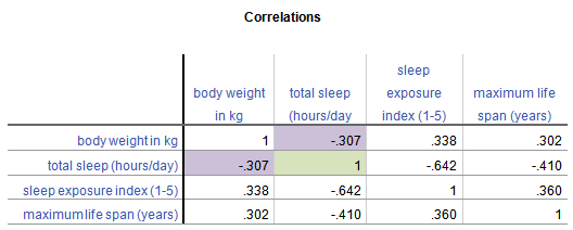
The simplest example, and a cousin of a covariance matrix, is a correlation matrix. It’s just a table in which each variable is listed in both the column headings and row headings, and each cell of the table (i.e. matrix) is the correlation between the variables that make up the column and row headings. Here is a simple example from a data set on 62 species of mammal:
From this table, you can see that the correlation between Weight in kg and Hours of Sleep, highlighted in purple, is -.307. Smaller mammals tend to sleep more.
You’ll notice that this is the same above and below the diagonal. The correlation of Hours of Sleep with Weight in kg is the same as the correlation between Weight in kg and Hours of Sleep.
Likewise, all correlations on the diagonal equal 1, because they’re the correlation of each variable with itself.
If this table were written as a matrix, you’d only see the numbers, without the column headings.
Now, the Covariance Matrix
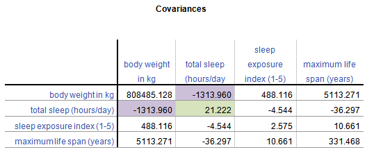
A Covariance Matrix is very similar. There are really two differences between it and the Correlation Matrix. It has this form:
First, we have substituted the correlation values with covariances.
Covariance is just an unstandardized version of correlation. To compute any correlation, we divide the covariance by the standard deviation of both variables to remove units of measurement. So a covariance is just a correlation measured in the units of the original variables.
Covariance, unlike correlation, is not constrained to being between -1 and 1. But the covariance’s sign will always be the same as the corresponding correlation’s. And a covariance=0 has the exact same meaning as a correlation=0: no linear relationship.
Because covariance is in the original units of the variables, variables on scales with bigger numbers and with wider distributions will necessarily have bigger covariances. So for example, Life Span has similar correlations to Weight and Exposure while sleeping, both around .3.
But values of Weight vary a lot (this data set contains both Elephants and Shrews), whereas Exposure is an index variable that ranges from only 1 to 5. So Life Span’s covariance with Weight (5113.27) is much larger than than with Exposure (10.66).
Second, the diagonal cells of the matrix contain the variances of each variable. A covariance of a variable with itself is simply the variance. So you have a context for interpreting these covariance values.
Once again, a covariance matrix is just the table without the row and column headings.
What about Covariance Structures?
Covariance Structures are just patterns in covariance matrices. Some of these patterns occur often enough in some statistical procedures that they have names.
You may have heard of some of these names–Compound Symmetry, Variance Components, Unstructured, for example. They sound strange because they’re often thrown about without any explanation.
But they’re just descriptions of patterns.
For example, the Compound Symmetry structure just means that all the variances are equal to each other and all the covariances are equal to each other. That’s it.
It wouldn’t make sense with our animal data set because each variable is measured on a different scale. But if all four variables were measured on the same scale, or better yet, if they were all the same variable measured under four experimental conditions, it’s a very plausible pattern.
Variance Components just means that each variance is different, and all covariances=0. So if all four variables were completely independent of each other and measured on different scales, that would be a reasonable pattern.
Unstructured just means there is no pattern at all. Each variance and each covariance is completely different and has no relation to the others.
There are many, many covariance structures. And each one makes sense in certain statistical situations. Until you’ve encountered those situations, they look crazy. But each one is just describing a pattern that makes sense in some situations.
One of the most common causes of multicollinearity is when predictor variables are multiplied to create an interaction term or a quadratic or higher order terms (X squared, X cubed, etc.).
Why does this happen? When all the X values are positive, higher values produce high products and lower values produce low products. So the product variable is highly correlated with the component variable. I will do a very simple example to clarify. (Actually, if they are all on a negative scale, the same thing would happen, but the correlation would be negative).
In a small sample, say you have the following values of a predictor variable X, sorted in ascending order:
2, 4, 4, 5, 6, 7, 7, 8, 8, 8
It is clear to you that the relationship between X and Y is not linear, but curved, so you add a quadratic term, X squared (X2), to the model. The values of X squared are:
4, 16, 16, 25, 49, 49, 64, 64, 64
The correlation between X and X2 is .987–almost perfect.
Plot of X vs. X squared
To remedy this, you simply center X at its mean. The mean of X is 5.9. So to center X, I simply create a new variable XCen=X-5.9.
The correlation between XCen and XCen2 is -.54–still not 0, but much more managable. Definitely low enough to not cause severe multicollinearity. This works because the low end of the scale now has large absolute values, so its square becomes large.
The scatterplot between XCen and XCen2 is:
Plot of Centered X vs. Centered X squared
If the values of X had been less skewed, this would be a perfectly balanced parabola, and the correlation would be 0.
Tonight is my free teletraining on Multicollinearity, where we will talk more about it. Register to join me tonight or to get the recording after the call.
The Analysis Factor uses cookies to ensure that we give you the best experience of our website. If you continue we assume that you consent to receive cookies on all websites from The Analysis Factor.
This website uses cookies to improve your experience while you navigate through the website. Out of these, the cookies that are categorized as necessary are stored on your browser as they are essential for the working of basic functionalities of the website. We also use third-party cookies that help us analyze and understand how you use this website. These cookies will be stored in your browser only with your consent. You also have the option to opt-out of these cookies. But opting out of some of these cookies may affect your browsing experience.
Necessary cookies are absolutely essential for the website to function properly. This category only includes cookies that ensures basic functionalities and security features of the website. These cookies do not store any personal information.
Any cookies that may not be particularly necessary for the website to function and is used specifically to collect user personal data via analytics, ads, other embedded contents are termed as non-necessary cookies. It is mandatory to procure user consent prior to running these cookies on your website.