Have you ever worked with a data set that had so many observations and/or variables that you couldn’t see the forest for the trees? You would like to extract some simple information but you can’t quite figure out how to do it.
Get to know Stata’s collapse command–it’s your new friend. Collapse allows you to convert your current data set to a much smaller data set of means, medians, maximums, minimums, count or percentiles (your choice of which percentile).
Let’s take a look at an example. I’m currently looking at a longitudinal data set filled with economic data on all 67 counties in Alabama. The time frame is in decades, from 1960 to 2000. Five time periods by 67 counties give me a total of 335 observations.
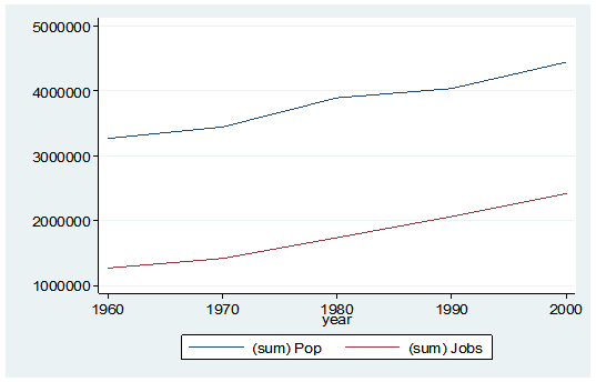
What if I wanted to see some trend information, such as the total population and jobs per decade for all of Alabama? I just want a simple table to see my results as well as a graph. I want results that I can copy and paste into a Word document.
Here’s my code:
preserve

collapse (sum) Pop Jobs, by(year)

graph twoway (line Pop year) (line Jobs year), ylabel(, angle(horizontal))

list
And here is my output:
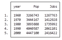
By starting my code with the preserve command it brings my data set back to its original state after providing me with the results I want.
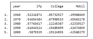
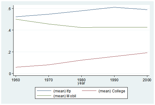
What if I want to look at variables that are in percentages, such as percent of college graduates, mobility and labor force participation rate (lfp)? In this case I don’t want to sum the values because they are in percent.
Calculating the mean would give equal weighting to all counties regardless of size.
Fortunately Stata gives you a very simple way to weight your data based on frequency. You have to determine which variable to use. In this situation I will use the population variable.
Here’s my coding and results:
Preserve

collapse (mean) lfp College Mobil [fw=Pop], by(year)

graph twoway (line lfp year) (line College year) (line Mobil year), ylabel(, angle(horizontal))

list
It’s as easy as that. This is one of the five tips and tricks I’ll be discussing during the free Stata webinar on Wednesday, July 29th.
Jeff Meyer is a statistical consultant with The Analysis Factor, a stats mentor for Statistically Speaking membership, and a workshop instructor. Read more about Jeff here.
 In the last lesson, we saw how to use qplot to map symbol colour to a categorical variable. Now we see how to control symbol colours and create legend titles.
M <- structure(list(PATIENT = c("Mary","Dave","Simon","Steve","Sue","Frida","Magnus","Beth","Peter","Guy","Irina","Liz"),

GENDER = c("F","M","M","M","F","F","M","F","M","M","F","F"),

TREATMENT = c("A","B","C","A","A","B","A","C","A","C","B","C"),

AGE =c("Y","M","M","E","M","M","E","E","M","E","M","M"),

WEIGHT_1 = c(79.2,58.8,72.0,59.7,79.6,83.1,68.7,67.6,79.1,39.9,64.7,65.6),

WEIGHT_2 = c(76.6,59.3,70.1,57.3,79.8,82.3,66.8,67.4,76.8,41.4,65.3,63.2),

HEIGHT = c(169,161,175,149,179,177,175,170,177,138,170,165),

SMOKE = c("Y","Y","N","N","N","N","N","N","N","N","N","Y"),

EXERCISE = c(TRUE,FALSE,FALSE,FALSE,TRUE,FALSE,FALSE,TRUE,TRUE,FALSE,FALSE,TRUE),

RECOVER = c(1,0,1,1,1,0,1,1,1,1,0,1)),

.Names = c("PATIENT","GENDER","TREATMENT","AGE","WEIGHT_1","WEIGHT_2","HEIGHT","SMOKE","EXERCISE","RECOVER"),

class = "data.frame", row.names = 1:12)
M
    PATIENT GENDER TREATMENT AGE WEIGHT_1 WEIGHT_2 HEIGHT SMOKE EXERCISE RECOVER
1     Mary      F         A   Y     79.2     76.6    169     Y     TRUE       1
2     Dave      M         B   M     58.8     59.3    161     Y    FALSE       0
3    Simon      M         C   M     72.0     70.1    175     N    FALSE       1
4    Steve      M         A   E     59.7     57.3    149     N    FALSE       1
5      Sue      F         A   M     79.6     79.8    179     N     TRUE       1
6    Frida      F         B   M     83.1     82.3    177     N    FALSE       0
7   Magnus      M         A   E     68.7     66.8    175     N    FALSE       1
8     Beth      F         C   E     67.6     67.4    170     N     TRUE       1
9    Peter      M         A   M     79.1     76.8    177     N     TRUE       1
10     Guy      M         C   E     39.9     41.4    138     N    FALSE       1
11   Irina      F         B   M     64.7     65.3    170     N    FALSE       0
12     Liz      F         C   M     65.6     63.2    165     Y     TRUE       1
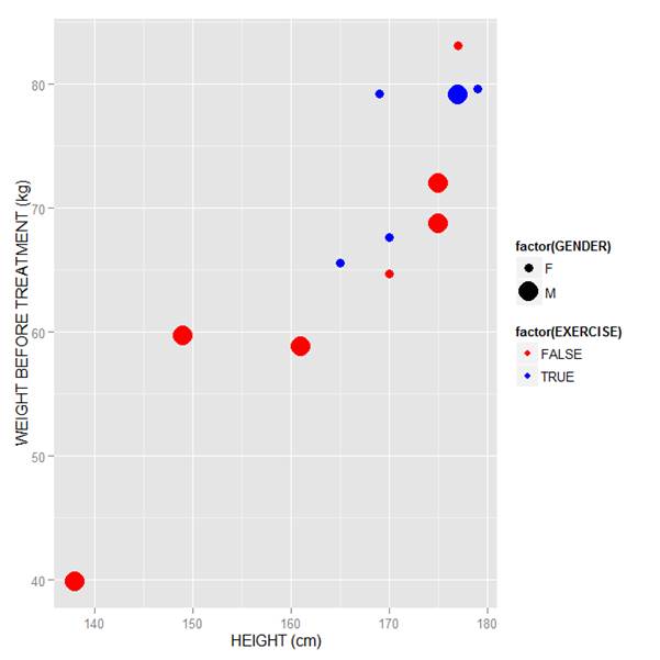
Now let’s map symbol size to GENDER and symbol colour to EXERCISE, but choosing our own colours. To control your symbol colours, use the layer: scale_colour_manual(values = c()) and select your desired colours. We choose red and blue, and symbol sizes 3 and 7.
qplot(HEIGHT, WEIGHT_1, data = M, geom = c("point"), xlab = "HEIGHT (cm)", ylab = "WEIGHT BEFORE TREATMENT (kg)" , size = factor(GENDER), color = factor(EXERCISE)) + scale_size_manual(values = c(3, 7)) + scale_colour_manual(values = c("red", "blue"))
Here is our graph with red and blue points:
Now let’s see how to control the legend title (the title that sits directly above the legend). For this example, we control the legend title through the name argument within the two functions scale_size_manual() and scale_colour_manual(). Enter this syntax in which we choose appropriate legend titles:
qplot(HEIGHT, WEIGHT_1, data = M, geom = c("point"), xlab = "HEIGHT (cm)", ylab = "WEIGHT BEFORE TREATMENT (kg)" , size = factor(GENDER), color = factor(EXERCISE)) + scale_size_manual(values = c(3, 7), name="Gender") + scale_colour_manual(values = c("red","blue"), name="Exercise")
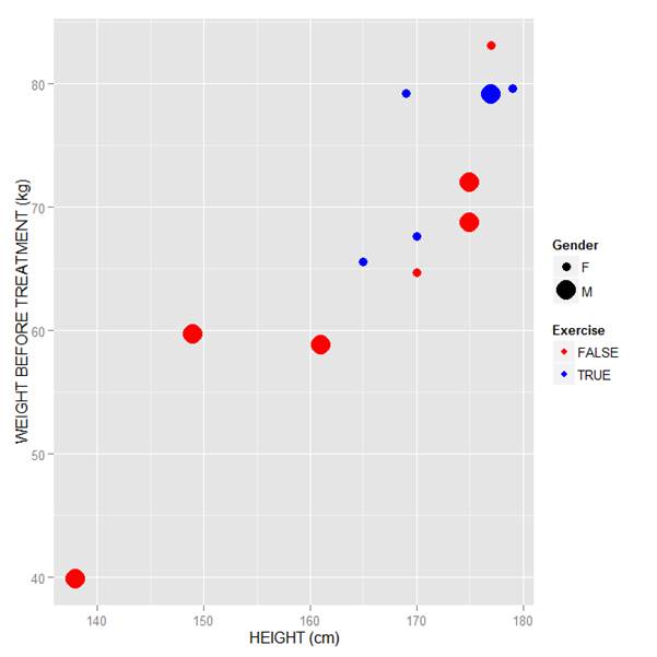
We now have our preferred symbol colour and size, and legend titles of our choosing.
That wasn’t so hard! In our next blog post we will learn about plotting regression lines in R.
About the Author: David Lillis Ph. D. has taught R to many researchers and statisticians. His company, Sigma Statistics and Research Limited, provides both on-line instruction and face-to-face workshops on R, and coding services in R. David holds a doctorate in applied statistics.
See our full R Tutorial Series and other blog posts regarding R programming.
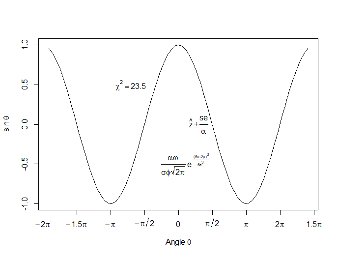
In this lesson, let’s see how to create mathematical expressions for your graph in R. We’ll use an example of graphing a cosine curve, along with relevant Greek letters as the axis label, and printing the equation right on the graph.
Mathematical expressions, like sine or exponential curves on graphs are made possible through expression(paste()) and substitute().
If you need mathematical symbols as axis labels, switch off the default axes and include Greek symbols by writing them out in English. You can create fractions through the frac() command. Note how we obtain the plus or minus sign through the syntax: %+-%
Here is a nice example. Let’s create a set of 71 values from – 6 to + 6. These values are the horizontal axis values.
x <- seq(-6, 6, len = 71)
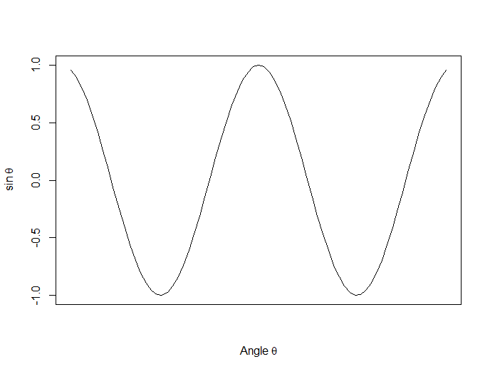
Now we plot a cosine function using a continuous curve (using type="l") while suppressing the x axis using the syntax: xaxt="n"
plot(x, cos(x),type="l",xaxt="n",

xlab=expression(paste("Angle ",theta)),

ylab=expression("sin "*theta))
. . . where we have inserted relevant mathematical text for the axis labels using expression(paste()). Here is the graph so far:
Now we create a horizontal axis to our own specifications, including relevant labels:
axis(1, at = c(-2*pi, -1.5*pi, -pi, -pi/2, 0, pi/2, pi, 1.5*pi, 2*pi),

lab = expression(-2*pi, -1.5*pi, -pi, -pi/2, 0, pi/2, pi, 2*pi, 1.5*pi))
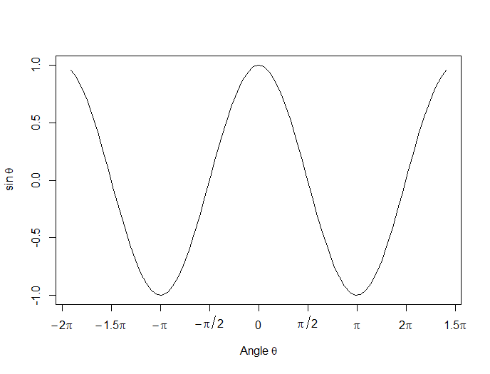
Let’s put in some mathematical expressions, centered appropriately. The first argument within each text() function gives the value along the horizontal axis about which the text will be centered.
text(-0.7*pi,0.5,substitute(chi^2=="23.5"))
text(0.1*pi, -0.5, expression(paste(frac(alpha*omega, sigma*phi*sqrt(2*pi)), ” “,
e^{frac(-(5*x+2*mu)^3, 5*sigma^3)})))
text(0.3*pi,0,expression(hat(z) %+-% frac(se, alpha)))
Here is our graph, complete with mathematical expressions:
That wasn’t so hard! In the next lesson we will discuss using qplot in R to create scatterplots.
About the Author: David Lillis has taught R to many researchers and statisticians. His company, Sigma Statistics and Research Limited, provides both on-line instruction and face-to-face workshops on R, and coding services in R. David holds a doctorate in applied statistics.
See our full R Tutorial Series and other blog posts regarding R programming.
