In my last post I used the glm() command in R to fit a logistic model with binomial errors to investigate the relationships between the numeracy and anxiety scores and their eventual success.
Now we will create a plot for each predictor. This can be very helpful for helping us understand the effect of each predictor on the probability of a 1 response on our dependent variable.
We wish to plot each predictor separately, so first we fit a separate model for each predictor. This isn’t the only way to do it, but one that I find especially helpful for deciding which variables should be entered as predictors.
model_numeracy <- glm(success ~ numeracy, binomial)
 summary(model_numeracy)
Call:
glm(formula = success ~ numeracy, family = binomial)

Deviance Residuals:
   Min       1Q   Median       3Q     Max
-1.5814 -0.9060   0.3207   0.6652   1.8266

Coefficients:
           Estimate Std. Error z value Pr(>|z|)
(Intercept) -6.1414     1.8873 -3.254 0.001138 **
numeracy     0.6243     0.1855   3.366 0.000763 ***
---
Signif. codes: 0 ‘***’ 0.001 ‘**’ 0.01 ‘*’ 0.05 ‘.’ 0.1 ‘ ’ 1

(Dispersion parameter for binomial family taken to be 1)

   Null deviance: 68.029 on 49 degrees of freedom
Residual deviance: 50.291 on 48 degrees of freedom
AIC: 54.291

Number of Fisher Scoring iterations: 5
We do the same for anxiety.
model_anxiety <- glm(success ~ anxiety, binomial)

summary(model_anxiety)
Call:
glm(formula = success ~ anxiety, family = binomial)

Deviance Residuals:
   Min       1Q   Median       3Q     Max
-1.8680 -0.3582   0.1159   0.6309   1.5698

Coefficients:
           Estimate Std. Error z value Pr(>|z|)
(Intercept) 19.5819     5.6754   3.450 0.000560 ***
anxiety     -1.3556    0.3973 -3.412 0.000646 ***
---
Signif. codes: 0 ‘***’ 0.001 ‘**’ 0.01 ‘*’ 0.05 ‘.’ 0.1 ‘ ’ 1

(Dispersion parameter for binomial family taken to be 1)

   Null deviance: 68.029 on 49 degrees of freedom
Residual deviance: 36.374 on 48 degrees of freedom
AIC: 40.374

Number of Fisher Scoring iterations: 6
Now we create our plots. First we set up a sequence of length values which we will use to plot the fitted model. Let’s find the range of each variable.
range(numeracy)
 [1] 6.6 15.7

range(anxiety)
 [1] 10.1 17.7
Given the range of both numeracy and anxiety. A sequence from 0 to 15 is about right for plotting numeracy, while a range from 10 to 20 is good for plotting anxiety.
xnumeracy <-seq (0, 15, 0.01)

ynumeracy <- predict(model_numeracy, list(numeracy=xnumeracy),type="response")
Now we use the predict() function to set up the fitted values. The syntax type = “response” back-transforms from a linear logit model to the original scale of the observed data (i.e. binary).
plot(numeracy, success, pch = 16, xlab = "NUMERACY SCORE", ylab = "ADMISSION")

lines(xnumeracy, ynumeracy, col = "red", lwd = 2)
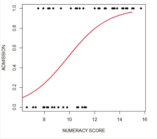 The model has produced a curve that indicates the probability that success = 1 to the numeracy score. Clearly, the higher the score, the more likely it is that the student will be accepted.
Now we plot for anxiety.
xanxiety <- seq(10, 20, 0.1)

yanxiety <- predict(model_anxiety, list(anxiety=xanxiety),type="response")

plot(anxiety, success, pch = 16, xlab = "ANXIETY SCORE", ylab = "SUCCESS")

lines(xanxiety, yanxiety, col= "blue", lwd = 2)
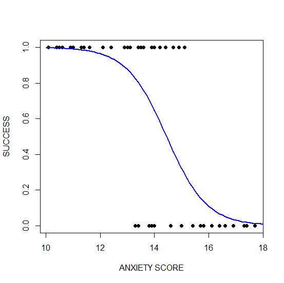 Clearly, those who score high on anxiety are unlikely to be admitted, possibly because their admissions test results are affected by their high level of anxiety.
****
See our full R Tutorial Series and other blog posts regarding R programming.
About the Author: David Lillis has taught R to many researchers and statisticians. His company, Sigma Statistics and Research Limited, provides both on-line instruction and face-to-face workshops on R, and coding services in R. David holds a doctorate in applied statistics.
Great series! I’m new to R and enjoying your approach and examples. I used this code successfully right up until the lines() function. The plot() step just before worked just fine, but at the lines function no lines were displayed. No error code was returned. Any ideas on what to try to resolve this?
Thanks! I’ll try to email you directly in case this comment string isn’t monitored regularly.
How would plot, for example, numeracy and anxiety together?