Here’s a question I get pretty often: In Principal Component Analysis, can loadings be negative and positive?
Answer: Yes.
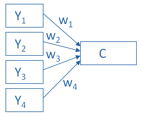
Recall that in PCA, we are creating one index variable (or a few) from a set of variables. You can think of this index variable as a weighted average of the original variables.
The loadings are the correlations between the variables and the component. We compute the weights in the weighted average from these loadings.
The goal of the PCA is to come up with optimal weights. “Optimal” means we’re capturing as much information in the original variables as possible, based on the correlations among those variables.
So if all the variables in a component are positively correlated with each other, all the loadings will be positive.
But if there are some negative correlations among the variables, some of the loadings will be negative too.
An Example of Negative Loadings in Principal Component Analysis
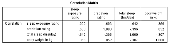
Here’s a simple example that we used in our Principal Component Analysis webinar. We want to combine four variables about mammal species into a single component.
The variables are weight, a predation rating, amount of exposure while sleeping, and the total number of hours an animal sleeps each day.
If you look at the correlation matrix, total hours of sleep correlates negatively with the other 3 variables. Those other three are all positively correlated.
It makes sense — species that sleep more tend to be smaller, less exposed while sleeping, and less prone to predation. Species that are high on these three variables must not be able to afford much sleep.
Think bats vs. zebras.
Likewise, the PCA with one component has positive loadings for three of the variables and a negative loading for hours of sleep.
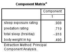
Species with a high component score will be those with high weight, high predation rating, high sleep exposure, and low hours of sleep.
Principal Component Analysis is really, really useful.
You use it to create a single index variable from a set of correlated variables.
In fact, the very first step in Principal Component Analysis is to create a correlation matrix (a.k.a., a table of bivariate correlations). The rest of the analysis is based on this correlation matrix.
You don’t usually see this step — it happens behind the scenes in your software.
Most PCA procedures calculate that first step using only one type of correlations: Pearson.
And that can be a problem. Pearson correlations assume all variables are normally distributed. That means they have to be truly (more…)
An incredibly useful tool in evaluating and comparing predictive models is the ROC curve.
Its name is indeed strange. ROC stands for Receiver Operating Characteristic. Its origin is from sonar back in the 1940s. ROCs were used to measure how well a sonar signal (e.g., from an enemy submarine) could be detected from noise (a school of fish).
ROC curves are a nice way to see how any predictive model can distinguish between the true positives and negatives. (more…)
In the past few months, I’ve gotten the same question from a few clients about using linear mixed models for repeated measures data. They want to take advantage of its ability to give unbiased results in the presence of missing data. In each case the study has two groups complete a pre-test and a post-test measure. Both of these have a lot of missing data.
The research question is whether the groups have different improvements in the dependent variable from pre to post test.
As a typical example, say you have a study with 160 participants.
90 of them completed both the pre and the post test.
Another 48 completed only the pretest and 22 completed only the post-test.
Repeated Measures ANOVA will deal with the missing data through listwise deletion. That means keeping only the 90 people with complete data. This causes problems with both power and bias, but bias is the bigger issue.
Another alternative is to use a Linear Mixed Model, which will use the full data set. This is an advantage, but it’s not as big of an advantage in this design as in other studies.
The mixed model will retain the 70 people who have data for only one time point. It will use the 48 people with pretest-only data along with the 90 people with full data to estimate the pretest mean.
Likewise, it will use the 22 people with posttest-only data along with the 90 people with full data to estimate the post-test mean.
If the data are missing at random, this will give you unbiased estimates of each of these means.
But most of the time in Pre-Post studies, the interest is in the change from pre to post across groups.
The difference in means from pre to post will be calculated based on the estimates at each time point. But the degrees of freedom for the difference will be based only on the number of subjects who have data at both time points.
So with only two time points, if the people with one time point are no different from those with full data (creating no bias), you’re not gaining anything by keeping those 72 people in the analysis.
Compare this to a study I also saw in consulting with 5 time points. Nearly all the participants had 4 out of the 5 observations. The missing data was pretty random–some participants missed time 1, others, time 4, etc. Only 6 people out of 150 had full data. Listwise deletion created a nightmare, leaving only 6 people in the data set.
Each person contributed data to 4 means, so each mean had a pretty reasonable sample size. Since the missingness was random, each mean was unbiased. Each subject fully contributed data and df to many of the mean comparisons.
With more than 2 time points and data that are missing at random, each subject can contribute to some change measurements. Keep that in mind the next time you design a study.
One of the most confusing things about mixed models arises from the way it’s coded in most statistical software. Of the ones I’ve used, only HLM sets it up differently and so this doesn’t apply.
But for the rest of them—SPSS, SAS, R’s lme and lmer, and Stata, the basic syntax requires the same pieces of information.
1. The dependent variable
2. The predictor variables for which to calculate fixed effects and whether those (more…)
There are many types and examples of ordinal variables: percentiles, ranks, likert scale items, to name a few.
These are especially hard to know how to analyze–some people treat them as numerical, others emphatically say not to. Everyone agrees nonparametric tests work, but these are limited to testing only simple hypotheses and designs. So what do you do if you want to test something more elaborate?
In this webinar we’re going to lay out all the options and when each is (more…)