August 26th, 2015 by David Lillis
In my last couple of articles (Part 4, Part 5), I demonstrated a logistic regression model with binomial errors on binary data in R’s glm() function.
But one of wonderful things about glm() is that it is so flexible. It can run so much more than logistic regression models.
The flexibility, of course, also means that you have to tell it exactly which model you want to run, and how.
In fact, we can use generalized linear models to model count data as well.
In such data the errors may well be distributed non-normally and the variance usually increases with the mean values.
As with binary data, we use the glm() command, but this time we specify a Poisson error distribution and the logarithm as the link function.
The natural log is the default link function for the Poisson error distribution. It works well for count data as it forces all of the predicted values to be positive.
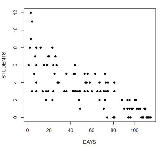
In the following example we fit a generalized linear model to count data using a Poisson error structure. The data set consists of counts of high school students diagnosed with an infectious disease within a period of days from an initial outbreak.
cases <-
structure(list(Days = c(1L, 2L, 3L, 3L, 4L, 4L, 4L, 6L, 7L, 8L,
8L, 8L, 8L, 12L, 14L, 15L, 17L, 17L, 17L, 18L, 19L, 19L, 20L,
23L, 23L, 23L, 24L, 24L, 25L, 26L, 27L, 28L, 29L, 34L, 36L, 36L,
42L, 42L, 43L, 43L, 44L, 44L, 44L, 44L, 45L, 46L, 48L, 48L, 49L,
49L, 53L, 53L, 53L, 54L, 55L, 56L, 56L, 58L, 60L, 63L, 65L, 67L,
67L, 68L, 71L, 71L, 72L, 72L, 72L, 73L, 74L, 74L, 74L, 75L, 75L,
80L, 81L, 81L, 81L, 81L, 88L, 88L, 90L, 93L, 93L, 94L, 95L, 95L,
95L, 96L, 96L, 97L, 98L, 100L, 101L, 102L, 103L, 104L, 105L,
106L, 107L, 108L, 109L, 110L, 111L, 112L, 113L, 114L, 115L),
    Students = c(6L, 8L, 12L, 9L, 3L, 3L, 11L, 5L, 7L, 3L, 8L,
    4L, 6L, 8L, 3L, 6L, 3L, 2L, 2L, 6L, 3L, 7L, 7L, 2L, 2L, 8L,
    3L, 6L, 5L, 7L, 6L, 4L, 4L, 3L, 3L, 5L, 3L, 3L, 3L, 5L, 3L,
    5L, 6L, 3L, 3L, 3L, 3L, 2L, 3L, 1L, 3L, 3L, 5L, 4L, 4L, 3L,
    5L, 4L, 3L, 5L, 3L, 4L, 2L, 3L, 3L, 1L, 3L, 2L, 5L, 4L, 3L,
    0L, 3L, 3L, 4L, 0L, 3L, 3L, 4L, 0L, 2L, 2L, 1L, 1L, 2L, 0L,
    2L, 1L, 1L, 0L, 0L, 1L, 1L, 2L, 2L, 1L, 1L, 1L, 1L, 0L, 0L,
    0L, 1L, 1L, 0L, 0L, 0L, 0L, 0L)), .Names = c("Days", "Students"
), class = "data.frame", row.names = c(NA, -109L))

attach(cases)

head(cases)
    Days Students
1    1      6
2    2      8
3    3     12
4    3      9
5    4      3
6    4      3
The mean and variance are different (actually, the variance is greater). Now we plot the data.
plot(Days, Students, xlab = "DAYS", ylab = "STUDENTS", pch = 16)
Now we fit the glm, specifying the Poisson distribution by including it as the second argument.
model1 <- glm(Students ~ Days, poisson) summary(model1) Call: glm(formula = Students ~ Days, family = poisson) Deviance Residuals: Min 1Q Median 3Q Max -2.00482 -0.85719 -0.09331 0.63969 1.73696 Coefficients: Estimate Std. Error z value Pr(>|z|)
(Intercept)  1.990235   0.083935   23.71   <2e-16 ***
Days        -0.017463   0.001727  -10.11   <2e-16 ***
---
Signif. codes:  0 ‘***’ 0.001 ‘**’ 0.01 ‘*’ 0.05 ‘.’ 0.1 ‘ ’ 1

(Dispersion parameter for poisson family taken to be 1)

    Null deviance: 215.36  on 108  degrees of freedom
Residual deviance: 101.17  on 107  degrees of freedom
AIC: 393.11

Number of Fisher Scoring iterations: 5
The negative coefficient for Days indicates that as days increase, the mean number of students with the disease is smaller.
This coefficient is highly significant (p < 2e-16).
We also see that the residual deviance is greater than the degrees of freedom, so that we have over-dispersion. This means that there is extra variance not accounted for by the model or by the error structure.
This is a very important model assumption, so in my next article we will re-fit the model using quasi poisson errors.
****
See our full R Tutorial Series and other blog posts regarding R programming.
About the Author: David Lillis has taught R to many researchers and statisticians. His company, Sigma Statistics and Research Limited, provides both on-line instruction and face-to-face workshops on R, and coding services in R. David holds a doctorate in applied statistics.
August 23rd, 2015 by David Lillis
In my last post I used the glm() command in R to fit a logistic model with binomial errors to investigate the relationships between the numeracy and anxiety scores and their eventual success.
Now we will create a plot for each predictor. This can be very helpful for helping us understand the effect of each predictor on the probability of a 1 response on our dependent variable.
We wish to plot each predictor separately, so first we fit a separate model for each predictor. This isn’t the only way to do it, but one that I find especially helpful for deciding which variables should be entered as predictors.
model_numeracy <- glm(success ~ numeracy, binomial)
 summary(model_numeracy)
Call:
glm(formula = success ~ numeracy, family = binomial)

Deviance Residuals:
   Min       1Q   Median       3Q     Max
-1.5814 -0.9060   0.3207   0.6652   1.8266

Coefficients:
           Estimate Std. Error z value Pr(>|z|)
(Intercept) -6.1414     1.8873 -3.254 0.001138 **
numeracy     0.6243     0.1855   3.366 0.000763 ***
---
Signif. codes: 0 ‘***’ 0.001 ‘**’ 0.01 ‘*’ 0.05 ‘.’ 0.1 ‘ ’ 1

(Dispersion parameter for binomial family taken to be 1)

   Null deviance: 68.029 on 49 degrees of freedom
Residual deviance: 50.291 on 48 degrees of freedom
AIC: 54.291

Number of Fisher Scoring iterations: 5
We do the same for anxiety.
model_anxiety <- glm(success ~ anxiety, binomial)

summary(model_anxiety)
Call:
glm(formula = success ~ anxiety, family = binomial)

Deviance Residuals:
   Min       1Q   Median       3Q     Max
-1.8680 -0.3582   0.1159   0.6309   1.5698

Coefficients:
           Estimate Std. Error z value Pr(>|z|)
(Intercept) 19.5819     5.6754   3.450 0.000560 ***
anxiety     -1.3556    0.3973 -3.412 0.000646 ***
---
Signif. codes: 0 ‘***’ 0.001 ‘**’ 0.01 ‘*’ 0.05 ‘.’ 0.1 ‘ ’ 1

(Dispersion parameter for binomial family taken to be 1)

   Null deviance: 68.029 on 49 degrees of freedom
Residual deviance: 36.374 on 48 degrees of freedom
AIC: 40.374

Number of Fisher Scoring iterations: 6
Now we create our plots. First we set up a sequence of length values which we will use to plot the fitted model. Let’s find the range of each variable.
range(numeracy)
 [1] 6.6 15.7

range(anxiety)
 [1] 10.1 17.7
Given the range of both numeracy and anxiety. A sequence from 0 to 15 is about right for plotting numeracy, while a range from 10 to 20 is good for plotting anxiety.
xnumeracy <-seq (0, 15, 0.01)

ynumeracy <- predict(model_numeracy, list(numeracy=xnumeracy),type="response")
Now we use the predict() function to set up the fitted values. The syntax type = “response” back-transforms from a linear logit model to the original scale of the observed data (i.e. binary).
plot(numeracy, success, pch = 16, xlab = "NUMERACY SCORE", ylab = "ADMISSION")

lines(xnumeracy, ynumeracy, col = "red", lwd = 2)
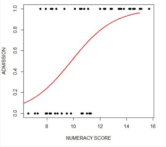 The model has produced a curve that indicates the probability that success = 1 to the numeracy score. Clearly, the higher the score, the more likely it is that the student will be accepted.
Now we plot for anxiety.
xanxiety <- seq(10, 20, 0.1)

yanxiety <- predict(model_anxiety, list(anxiety=xanxiety),type="response")

plot(anxiety, success, pch = 16, xlab = "ANXIETY SCORE", ylab = "SUCCESS")

lines(xanxiety, yanxiety, col= "blue", lwd = 2)
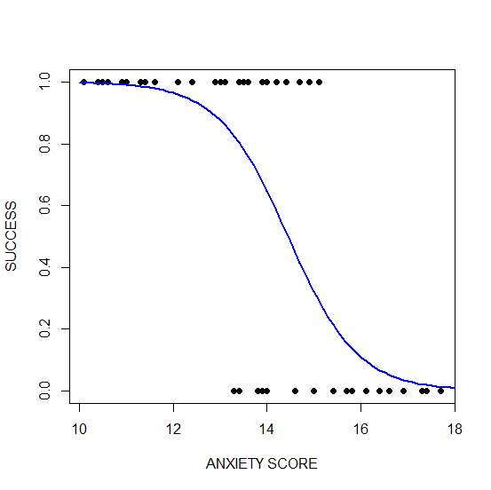 Clearly, those who score high on anxiety are unlikely to be admitted, possibly because their admissions test results are affected by their high level of anxiety.
****
See our full R Tutorial Series and other blog posts regarding R programming.
About the Author: David Lillis has taught R to many researchers and statisticians. His company, Sigma Statistics and Research Limited, provides both on-line instruction and face-to-face workshops on R, and coding services in R. David holds a doctorate in applied statistics.
August 20th, 2015 by David Lillis
Last year I wrote several articles (GLM in R 1, GLM in R 2, GLM in R 3) that provided an introduction to Generalized Linear Models (GLMs) in R.
As a reminder, Generalized Linear Models are an extension of linear regression models that allow the dependent variable to be non-normal.
In our example for this week we fit a GLM to a set of education-related data.
Let’s read in a data set from an experiment consisting of numeracy test scores (numeracy), scores on an anxiety test (anxiety), and a binary outcome variable (success) that records whether or not the students eventually succeeded in gaining admission to a prestigious university through an admissions test.
We will use the glm() command to run a logistic regression, regressing success on the numeracy and anxiety scores.
A <- structure(list(numeracy = c(6.6, 7.1, 7.3, 7.5, 7.9, 7.9, 8,
8.2, 8.3, 8.3, 8.4, 8.4, 8.6, 8.7, 8.8, 8.8, 9.1, 9.1, 9.1, 9.3,
9.5, 9.8, 10.1, 10.5, 10.6, 10.6, 10.6, 10.7, 10.8, 11, 11.1,
11.2, 11.3, 12, 12.3, 12.4, 12.8, 12.8, 12.9, 13.4, 13.5, 13.6,
13.8, 14.2, 14.3, 14.5, 14.6, 15, 15.1, 15.7), anxiety = c(13.8,
14.6, 17.4, 14.9, 13.4, 13.5, 13.8, 16.6, 13.5, 15.7, 13.6, 14,
16.1, 10.5, 16.9, 17.4, 13.9, 15.8, 16.4, 14.7, 15, 13.3, 10.9,
12.4, 12.9, 16.6, 16.9, 15.4, 13.1, 17.3, 13.1, 14, 17.7, 10.6,
14.7, 10.1, 11.6, 14.2, 12.1, 13.9, 11.4, 15.1, 13, 11.3, 11.4,
10.4, 14.4, 11, 14, 13.4), success = c(0L, 0L, 0L, 1L, 0L, 1L,
0L, 0L, 1L, 0L, 1L, 1L, 0L, 1L, 0L, 0L, 0L, 0L, 0L, 1L, 0L, 0L,
1L, 1L, 1L, 0L, 0L, 0L, 1L, 0L, 1L, 0L, 0L, 1L, 1L, 1L, 1L, 1L,
1L, 1L, 1L, 1L, 1L, 1L, 1L, 1L, 1L, 1L, 1L, 1L)), .Names = c("numeracy",
"anxiety", "success"), row.names = c(NA, -50L), class = "data.frame")
attach(A)
names(A)
[1] "numeracy" "anxiety"  "success"
head(A)
    numeracy anxiety  success
1      6.6    13.8       0
2      7.1    14.6       0
3      7.3    17.4       0
4      7.5    14.9       1
5      7.9    13.4       0
6      7.9    13.5       1
The variable ‘success’ is a binary variable that takes the value 1 for individuals who succeeded in gaining admission, and the value 0 for those who did not. Let’s look at the mean values of numeracy and anxiety.
mean(numeracy)
[1] 10.722
mean(anxiety)
[1] 13.954
We begin by fitting a model that includes interactions through the asterisk formula operator. The most commonly used link for binary outcome variables is the logit link, though other links can be used.
model1 <- glm(success ~ numeracy * anxiety, binomial)
glm() is the function that tells R to run a generalized linear model.
Inside the parentheses we give R important information about the model. To the left of the ~ is the dependent variable: success. It must be coded 0 & 1 for glm to read it as binary.
After the ~, we list the two predictor variables. The * indicates that not only do we want each main effect, but we also want an interaction term between numeracy and anxiety.
And finally, after the comma, we specify that the distribution is binomial. The default link function in glm for a binomial outcome variable is the logit. More on that below.
We can access the model output using summary().
summary(model1)
Call:
glm(formula = success ~ numeracy * anxiety, family = binomial)
Deviance Residuals:
     Min        1Q    Median        3Q       Max
-1.85712  -0.33055   0.02531   0.34931   2.01048
Coefficients:
                 Estimate Std. Error z value Pr(>|z|)
(Intercept)       0.87883   46.45256   0.019    0.985
numeracy          1.94556    4.78250   0.407    0.684
anxiety          -0.44580    3.25151  -0.137    0.891
numeracy:anxiety -0.09581    0.33322  -0.288    0.774
(Dispersion parameter for binomial family taken to be 1)
    Null deviance: 68.029  on 49  degrees of freedom
Residual deviance: 28.201  on 46  degrees of freedom
AIC: 36.201

Number of Fisher Scoring iterations: 7
The estimates (coefficients of the predictors – numeracy and anxiety) are now in logits. The coefficient of numeracy is: 1.94556, so that a one unit change in numeracy produces approximately a 1.95 unit change in the log odds (i.e. a 1.95 unit change in the logit).
From the signs of the two predictors, we see that numeracy influences admission positively, but anxiety influences admission negatively.
We can’t tell much more than that as most of us can’t think in terms of logits. Instead we can convert these logits to odds ratios.
We do this by exponentiating each coefficient. (This means raise the value e –approximately 2.72–to the power of the coefficient. e^b).
So, the odds ratio for numeracy is:
OR = exp(1.94556) = 6.997549
However, in this version of the model the estimates are non-significant, and we have a non-significant interaction. Model1 produces the following relationship between the logit (log odds) and the two predictors:
logit(p) = 0.88 + 1.95* numeracy - 0.45 * anxiety - .10* interaction term
The output produced by glm() includes several additional quantities that require discussion.
We see a z value for each estimate. The z value is the Wald statistic that tests the hypothesis that the estimate is zero. The null hypothesis is that the estimate has a normal distribution with mean zero and standard deviation of 1. The quoted p-value, P(>|z|), gives the tail area in a two-tailed test.
For our example, we have a Null Deviance of about 68.03 on 49 degrees of freedom. This value indicates poor fit (a significant difference between fitted values and observed values). Including the independent variables (numeracy and anxiety) decreased the deviance by nearly 40 points on 3 degrees of freedom. The Residual Deviance is 28.2 on 46 degrees of freedom (i.e. a loss of three degrees of freedom).
About the Author: David Lillis has taught R to many researchers and statisticians. His company, Sigma Statistics and Research Limited, provides both on-line instruction and face-to-face workshops on R, and coding services in R. David holds a doctorate in applied statistics.
See our full R Tutorial Series and other blog posts regarding R programming.
April 23rd, 2015 by David Lillis
 Last time we created two variables and used the lm() command to perform a least squares regression on them, and diagnosing our regression using the plot() command.
Just as we did last time, we perform the regression using lm(). This time we store it as an object M. (more…)
April 21st, 2015 by David Lillis
by David Lillis, Ph.D.
Last time we created two variables and added a best-fit regression line to our plot of the variables. Here are the two variables again. (more…)
April 10th, 2015 by David Lillis
Today let’s re-create two variables and see how to plot them and include a regression line. We take height to be a variable that describes the heights (in cm) of ten people. (more…)