new blog post: Member Training: The Dark Side of Data Science

Previous Posts
The normal distribution is so ubiquitous in statistics that those of us who use a lot of statistics tend to forget it's not always so common in actual data. And since the normal distribution is continuous, many people describe all numerical variables as continuous. I get it: I'm guilty of using those terms interchangeably, too, but they're not exactly the same. Numerical variables can be either continuous or discrete. The difference? Continuous variables can take any number within a range. Discrete variables can only be whole numbers.
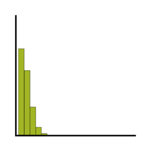
If you have count data we use a Poisson model for our analysis, right? The key criterion for using a Poisson model is after accounting for the effect of predictors, the mean must equal the variance. If the mean doesn’t equal the variance then all we have to do is transform the data or tweak the model, correct? Let’s see how we can do this with some real data.
In a simple linear regression model how the constant (aka, intercept) is interpreted depends upon the type of predictor (independent) variable. If the predictor is categorical and dummy-coded, the constant is the mean value of the outcome variable for the reference category only. If the predictor variable is continuous, the constant equals the predicted value of the outcome variable when the predictor variable equals zero.
Generalized linear mixed models (GLMMs) are incredibly useful tools for working with complex, multi-layered data. But they can be tough to master. In this follow-up to October’s webinar (“A Gentle Introduction to Generalized Linear Mixed Models – Part 1”), you’ll learn the major issues involved in working with GLMMs and how to incorporate these models into your own work.
There are two types of bounded data that have direct implications for how to work with them in analysis: censored and truncated data. Understanding the difference is a critical first step when undertaking a statistical analysis.
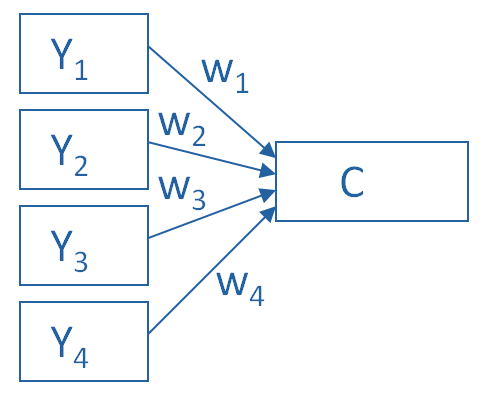
Principal Component Analysis is really, really useful. You use it to create a single index variable from a set of correlated variables. In fact, the very first step in Principal Component Analysis is to create a correlation matrix (a.k.a., a table of bivariate correlations). The rest of the analysis is based on this correlation matrix. You don't usually see this step -- it happens behind the scenes in your software. Most PCA procedures calculate that first step using only one type of correlations: Pearson. And that can be a problem. Pearson correlations assume all variables are normally distributed. That means they have to be truly quantitative, symmetric, and bell shaped. And unfortunately, many of the variables that we need PCA for aren't. Likert Scale items are a big one.
Outliers are one of those realities of data analysis that no one can avoid. Those pesky extreme values cause biased parameter estimates, non-normality in otherwise beautifully normal variables, and inflated variances. Everyone agrees that outliers cause trouble with parametric analyses. But not everyone agrees that they’re always a problem, or what to do about them even if they are. Sometimes a nonparametric or robust alternative is available--and sometimes not. There are a number of approaches in statistical analysis for dealing with outliers and the problems they create.
The LASSO model (Least Absolute Shrinkage and Selection Operator) is a recent development that allows you to find a good fitting model in the regression context. It avoids many of the problems of overfitting that plague other model-building approaches. In this month's Statistically Speaking webinar, guest instructor Steve Simon, PhD, will explain what overfitting is -- and why it's a problem.
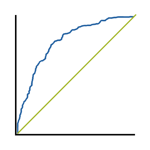
An incredibly useful tool in evaluating and comparing predictive models is the ROC curve. Its name is indeed strange. ROC stands for receiver operating characteristic. Its origin is from sonar back in the 1940s; ROCs were used to measure how well a sonar signal (e.g., from a submarine) could be detected from noise (a school of fish). In its current usage, ROC curves are a nice way to see how any predictive model can distinguish between the true positives and negatives. In order to do this, a model needs to not only correctly predict a positive as a positive, but also a negative as a negative. The ROC curve does this by plotting sensitivity, the probability of predicting a real positive will be a positive, against 1-specificity, the probability of predicting a real negative will be a positive. (A previous newsletter article covered the specifics of sensitivity and specificity, in case you need a review about what they mean--and why it's important to know how accurately the model is predicting positives and negatives separately.) The best decision rule is high on sensitivity and low on 1-specificity. It's a rule that predicts most true positives will be a positive and few true negatives will be a positive. I've been talking about decision rules, but what about models?
In this webinar, we’ll provide a gentle introduction to generalized linear mixed models (or GLMMs). You’ll become familiar with the major issues involved in working with GLMMs so you can more easily transition to using these models in your work.
 stat skill-building compass