Author: Trent Buskirk, PhD.
In my last article, we got a bit comfortable with the notion of errors in surveys. We discussed sampling errors, which occur because we take a random sample rather than a complete census.
If you ever had to admit error, sampling error is the type to admit. Polls admit this sort of error frequently by reporting the margin of error. Margin of error is the sampling error multiplied by a distributional value that can be used to create a confidence interval.
But there are some other types of error that can occur in the survey context that, while influential, are a bit more invisible. They are generally referred to as non-sampling error.
These types of errors are not associated with sample-to-sample variability but to sources like selection biases, frame coverage issues, and measurement errors. These are not the kind of errors you want in your survey.
In theory, it is possible to have an estimator that has little sampling error associated with it. That looks good on the surface, but this estimator may yield poor information due to non-sampling errors.
For example, a high rate of non-response may mean that some participants are opting out and biasing estimates.
Likewise, a scale or set of items on the survey could have known measurement error. They may be imprecise in their measurement of the construct of interest or they may measure that construct better for some populations than others. Again, this can bias estimates.
Frame coverage error occurs when the sampling frame does not quite match the target population. This leads to the sample including individuals who aren’t in the target population, missing individuals who are, or both.
A perspective called the Total Survey Error Framework allows researchers to evaluate estimates on errors that come from sampling and those that don’t. It can be very useful in choosing a sampling design that minimizes errors as a whole.
So when you think about errors and how they might come about in surveys, don’t forget about the non-sampling variety – those that could come as a result of non-response, measurement, or coverage.
 In the last lesson, we saw how to use qplot to map symbol colour to a categorical variable. Now we see how to control symbol colours and create legend titles.
M <- structure(list(PATIENT = c("Mary","Dave","Simon","Steve","Sue","Frida","Magnus","Beth","Peter","Guy","Irina","Liz"),

GENDER = c("F","M","M","M","F","F","M","F","M","M","F","F"),

TREATMENT = c("A","B","C","A","A","B","A","C","A","C","B","C"),

AGE =c("Y","M","M","E","M","M","E","E","M","E","M","M"),

WEIGHT_1 = c(79.2,58.8,72.0,59.7,79.6,83.1,68.7,67.6,79.1,39.9,64.7,65.6),

WEIGHT_2 = c(76.6,59.3,70.1,57.3,79.8,82.3,66.8,67.4,76.8,41.4,65.3,63.2),

HEIGHT = c(169,161,175,149,179,177,175,170,177,138,170,165),

SMOKE = c("Y","Y","N","N","N","N","N","N","N","N","N","Y"),

EXERCISE = c(TRUE,FALSE,FALSE,FALSE,TRUE,FALSE,FALSE,TRUE,TRUE,FALSE,FALSE,TRUE),

RECOVER = c(1,0,1,1,1,0,1,1,1,1,0,1)),

.Names = c("PATIENT","GENDER","TREATMENT","AGE","WEIGHT_1","WEIGHT_2","HEIGHT","SMOKE","EXERCISE","RECOVER"),

class = "data.frame", row.names = 1:12)
M
    PATIENT GENDER TREATMENT AGE WEIGHT_1 WEIGHT_2 HEIGHT SMOKE EXERCISE RECOVER
1     Mary      F         A   Y     79.2     76.6    169     Y     TRUE       1
2     Dave      M         B   M     58.8     59.3    161     Y    FALSE       0
3    Simon      M         C   M     72.0     70.1    175     N    FALSE       1
4    Steve      M         A   E     59.7     57.3    149     N    FALSE       1
5      Sue      F         A   M     79.6     79.8    179     N     TRUE       1
6    Frida      F         B   M     83.1     82.3    177     N    FALSE       0
7   Magnus      M         A   E     68.7     66.8    175     N    FALSE       1
8     Beth      F         C   E     67.6     67.4    170     N     TRUE       1
9    Peter      M         A   M     79.1     76.8    177     N     TRUE       1
10     Guy      M         C   E     39.9     41.4    138     N    FALSE       1
11   Irina      F         B   M     64.7     65.3    170     N    FALSE       0
12     Liz      F         C   M     65.6     63.2    165     Y     TRUE       1
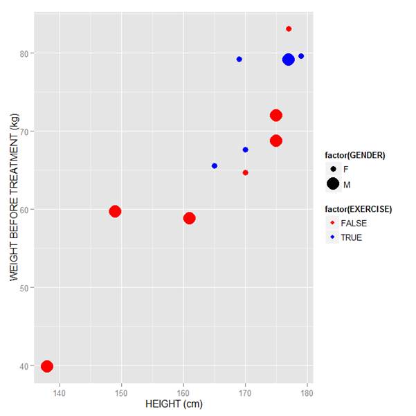
Now let’s map symbol size to GENDER and symbol colour to EXERCISE, but choosing our own colours. To control your symbol colours, use the layer: scale_colour_manual(values = c()) and select your desired colours. We choose red and blue, and symbol sizes 3 and 7.
qplot(HEIGHT, WEIGHT_1, data = M, geom = c("point"), xlab = "HEIGHT (cm)", ylab = "WEIGHT BEFORE TREATMENT (kg)" , size = factor(GENDER), color = factor(EXERCISE)) + scale_size_manual(values = c(3, 7)) + scale_colour_manual(values = c("red", "blue"))
Here is our graph with red and blue points:

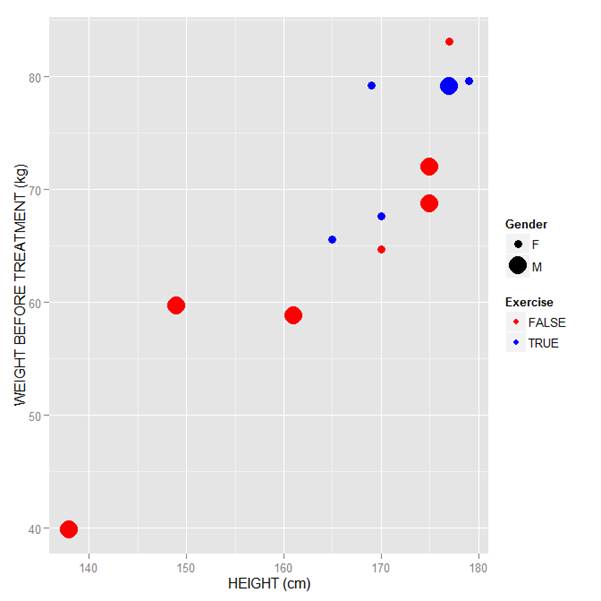
Now let’s see how to control the legend title (the title that sits directly above the legend). For this example, we control the legend title through the name argument within the two functions scale_size_manual() and scale_colour_manual(). Enter this syntax in which we choose appropriate legend titles:
qplot(HEIGHT, WEIGHT_1, data = M, geom = c("point"), xlab = "HEIGHT (cm)", ylab = "WEIGHT BEFORE TREATMENT (kg)" , size = factor(GENDER), color = factor(EXERCISE)) + scale_size_manual(values = c(3, 7), name="Gender") + scale_colour_manual(values = c("red","blue"), name="Exercise")

We now have our preferred symbol colour and size, and legend titles of our choosing.
That wasn’t so hard! In our next blog post we will learn about plotting regression lines in R.
About the Author: David Lillis Ph. D. has taught R to many researchers and statisticians. His company, Sigma Statistics and Research Limited, provides both on-line instruction and face-to-face workshops on R, and coding services in R. David holds a doctorate in applied statistics.
See our full R Tutorial Series and other blog posts regarding R programming.


