Need to run a logistic regression in SPSS? Turns out, SPSS has a number of procedures for running different types of logistic regression.
Some types of logistic regression can be run in more than one procedure. For some unknown reason, some procedures produce output others don’t. So it’s helpful to be able to use more than one.
Logistic Regression
 Logistic Regression can be used only for binary dependent (more…)
One of the most confusing things about statistical analysis is the different vocabulary used for the same, or nearly-but-not-quite-the-same, concepts.

Sometimes this happens just because the same analysis was developed separately within different fields and named twice.
So people in different fields use different terms for the same statistical concept. Try to collaborate with a colleague in a different field and you may find yourself awed by the crazy statistics they’re insisting on.
Other times, there is a level of detail that is implied by one term that isn’t true of the wider, more generic term. This level of detail is often about how the role of variables or effects affects the interpretation of output. (more…)
In Part 14, let’s see how to create pie charts in R. Let’s create a simple pie chart using the pie() command. As always, we set up a vector of numbers and then we plot them.
B <- c(2, 4, 5, 7, 12, 14, 16) (more…)
One of our instructors–David Lillis–recently gave a talk in front of the Wellington R Users Group highlighting 15 Tips for using the R statistical programming language aimed at the beginner.
Below is a video recording of his presentation…
In Part 13, let’s see how to create box plots in R. Let’s create a simple box plot using the boxplot() command, which is easy to use. First, we set up a vector of numbers and then we plot them.
Box plots can be created for individual variables or for variables by group (more…)
I’m sure you’ve heard that R creates beautiful graphics.
It’s true, and it doesn’t have to be hard to do so. Let’s start with a simple histogram using the hist() command, which is easy to use, but actually quite sophisticated.
First, we set up a vector of numbers and then we create a histogram.
B <- c(2, 4, 5, 7, 12, 14, 16)
hist(B)
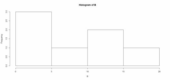
That was easy, but you need more from your histogram. (more…)