 In Part 13, let’s see how to create box plots in R. Let’s create a simple box plot using the boxplot() command, which is easy to use. First, we set up a vector of numbers and then we plot them.
Box plots can be created for individual variables or for variables by group. The syntax is boxplot(x, data=), where x is a formula and data denotes the data frame providing the data. An example of a formula is: y~group, where you create a separate box plot for each value of group.
Use varwidth=TRUE to make box plot widths proportional to the square root of the sample sizes. Use horizontal=TRUE to reverse the axis orientation.
The Standard Box Plot does not indicate outliers. The Modified Box Plot highlights outliers. The Modified Box plot is the default in R.
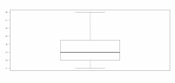
A <- c(3, 2, 5, 6, 4, 8, 1, 2, 3, 2, 4)
boxplot(A)
 [Click image to see it larger]
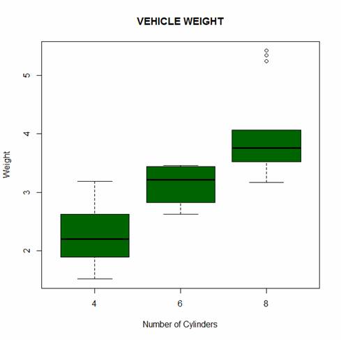
Look at the built-in dataset mtcars.
print(mtcars)
Now create a box plot for vehicle weight for each type of car.
boxplot(wt~cyl, data=mtcars, main=toupper("Vehicle Weight"), font.main=3, cex.main=1.2, xlab="Number of Cylinders", ylab="Weight", font.lab=3, col="darkgreen")
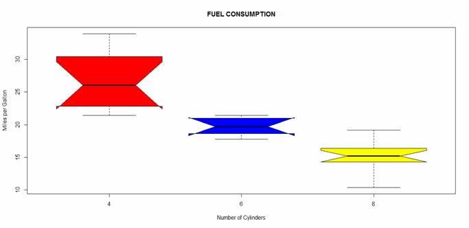
Let’s create a notched box plot of miles per gallon for each type of car, with different colours for each box. Notched box plots help us to to make a visual comparison across levels and check for equality of medians. If the notches of two boxes do not overlap, this will provide evidence of a statistically significant difference between the medians
boxplot(mpg~cyl, data=mtcars, main= toupper("Fuel Consumption"), font.main=3, cex.main=1.2, col=c("red","blue", "yellow"), xlab="Number of Cylinders", ylab="Miles per Gallon", font.lab=3, notch=TRUE, range = 0)
 [Click image to see it larger]
The notches do not overlap, so we have evidence for a difference in the medians.
NOTE: The range argument determines how far the plot whiskers extend out from the box. If range is positive, the whiskers extend to the datum that is no more than range times the interquartile range from the box. The argument range = 0 ensures that the whiskers extend to the data extremes. The argument horizontal=TRUE creates horizontal bars.
That wasn’t so hard! In Part 14 we will look at further plotting techniques in R.
About the Author: David Lillis has taught R to many researchers and statisticians. His company, Sigma Statistics and Research Limited, provides both on-line instruction and face-to-face workshops on R, and coding services in R. David holds a doctorate in applied statistics.
See our full R Tutorial Series and other blog posts regarding R programming.
I’ve spent a day and a half trying ot show all the ticks on the y axis of my boxplot. How can this be so hard?
Could you tell me, How to set two set data range (scale) in a boxplot.
Hi,
Can you show how to have data labels in each of these plots. I would like to see the quartile values in the plot.
thanks
heidi
font.main=3 is for an italic type, but thats not visible in the picture. why?