 A normal probability plot is extremely useful for testing normality assumptions. It’s more precise than a histogram, which can’t pick up subtle deviations, and doesn’t suffer from too much or too little power, as do tests of normality.
There are two versions of normal probability plots: Q-Q and P-P. I’ll start with the Q-Q. The Q-Q plot plots every observed value against a standard normal distribution with the same number of points. We have 111 observations in this data set, and you can see a histogram of the distribution on the right, and the corresponding Q-Q plot on the left.
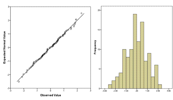
Across the bottom are the observed data values, sorted lowest to highest. You can see that just like on the histogram, the values range from about -2.2 to 2.2. (Note, these are standardized residuals, so they already have a mean of 0 and a standard deviation of 1. If they didn’t, the plot would standardize them before plotting).
On the Y axis are the values that you would have gotten if they came from a standard normal distribution with the same number of data points–111.
This concept is a little strange if you’re not used to it, so think through it a bit. Remember back to your intro stats class, when you learned these rules about a standard normal distribution:
- The mean is 0 and the standard deviation is 1
- 34% of points are between the mean and one standard deviation below the mean.
- Another 12.5% are between one and 2 standard deviations below the mean.
- The final 2.5% are above 2 standard deviations below the mean.
- Because the distribution is symmetric, these same percentages apply above the mean.
So in a distribution of 111 points with a mean of 0 and standard deviation of 1, we know that the 56th point must have a value of 0—in a normal distribution the median equals the mean.
Only 2.5% of the 111 points—about 3 of them—should have values at or below -2. So the 3rd value should be right around -2.
Likewise, there is an exact value that the 17th, the 42nd, each of the 111 ordered values would have under a standard normal distribution. We don’t have easy ways to remember them, but those are the values plotted on the graph.
So if each value is exactly where it should be, if the distribution is perfectly normal, every single point would fall right on the line. The further a point is from the line, the further it is from where a normal distribution would put it.
The following Q-Q plot shows a positively skewed distribution. You can see that it’s not matching a normal distribution well at all—there are too many low values and too few high values.
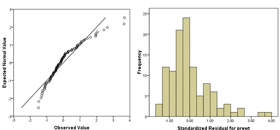
I find it helpful to always plot a histogram along with the Q-Q plot, to aid interpretation. As you do more of these, you’ll get better at reading them without the histogram.
Q-Q vs. P-P
The Q-Q is plotting the quantiles—the actual values of X against the theoretical values of X under the normal distribution. That’s what I’ve described above.
A P-P plot, one the other hand, plots the corresponding areas under the curve (cumulative distribution function) for those values.
In both, the points fall right on the line when normality has been met. For the most part, the normal P-P plot is better at finding deviations from normality in the center of the distribution, and the normal Q-Q plot is better at finding deviations in the tails. Q-Q plots tend to be preferred in research situations.
Both Q-Q and P-P plots can be used for distributions other than normal.

I dont understand what “doesn’t suffer from too much or too little power” is- could you explain this more?
Hi Lauren, have you seen this article? It goes into the Why of power calculations more including why you odn’t want too much: https://www.theanalysisfactor.com/5-reasons-sample-size-calculations/
For convenient a reader in understanding this article, both the term Q-Q plot and P-P plot need to be cleared formerly. Thank a lot.