by David Lillis, Ph.D.
Last time we created two variables and added a best-fit regression line to our plot of the variables. Here are the two variables again.
height = c(176, 154, 138, 196, 132, 176, 181, 169, 150, 175)
bodymass = c(82, 49, 53, 112, 47, 69, 77, 71, 62, 78)
Today we learn how to obtain useful diagnostic information about a regression model and then how to draw residuals on a plot. As before, we perform the regression.
lm(height ~ bodymass)
Call:
lm(formula = height ~ bodymass)

Coefficients:
(Intercept)     bodymass
   98.0054       0.9528
Now we can use several R diagnostic plots and influence statistics to diagnose how well our model is fitting the data. In our next article we’ll eliminate an outlier to see how this changes the model fit.
These diagnostics include:
- Residuals vs. fitted values
- Q-Q plots
- Scale Location plots
- Cook’s distance plots.
To use R’s regression diagnostic plots, we set up the regression model as an object and create a plotting environment of two rows and two columns. Then we use the plot() command, treating the model as an argument.
model <- lm(height ~ bodymass)

     par(mfrow = c(2,2))
plot(model)
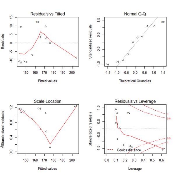
The first plot (residuals vs. fitted values) is a simple scatterplot between residuals and predicted values. It should look more or less random.
This is more or less what what we see here, with the exception of a single outlier in the bottom right corner.
The second plot (normal Q-Q) is a normal probability plot. It will give a straight line if the errors are distributed normally, but points 4, 5 and 6 deviate from the straight line.
The third plot (Scale-Location), like the the first, should look random. No patterns. Ours does not–we have a strange V-shaped pattern.
The last plot (Cook’s distance) tells us which points have the greatest influence on the regression (leverage points). We see that points 2, 4 and 5 have great influence on the model.
Next time we will see what happens to the model if we remove one of these outliers.
About the Author: David Lillis has taught R to many researchers and statisticians. His company, Sigma Statistics and Research Limited, provides both on-line instruction and face-to-face workshops on R, and coding services in R. David holds a doctorate in applied statistics.
See our full R Tutorial Series and other blog posts regarding R programming.
I would like to learn more about R statistics
how do you undo this function? I can’t see a normal scatterplot because it only shows these plots now.
I do not understand this sentence:
“Ours does not–we have a strange V-shaped pattern.”
I see a clear V-shaped pattern in the scla-location plot.
Igor, “Ours does not” refers to the previous sentence. “Ours does not have no pattern and look random.”