Lately, I’ve gotten a lot of questions about learning how to run models for repeated measures data that isn’t continuous.
Mostly categorical. But once in a while discrete counts.
A typical study is in linguistics or psychology where (more…)
Lately, I’ve gotten a lot of questions about learning how to run models for repeated measures data that isn’t continuous.
Mostly categorical. But once in a while discrete counts.
A typical study is in linguistics or psychology where (more…)
A Science News article from July 2014 was titled “Scientists’ grasp of confidence intervals doesn’t inspire confidence.” Perhaps that is why only 11% of the articles in the 10 leading psychology journals in 2006 reported confidence intervals in their statistical analysis.
How important is it to be able to create and interpret confidence intervals?
The American Psychological Association Publication Manual, which sets the editorial standards for over 1,000 journals in the behavioral, life, and social sciences, has begun emphasizing parameter estimation and de-emphasizing Null Hypothesis Significance Testing (NHST).
Its most recent edition, the sixth, published in 2009, states “estimates of appropriate effect sizes and confidence intervals are the minimum expectations” for published research.
In this webinar, we’ll clear up the ambiguity as to what exactly is a confidence interval and how to interpret them in a table and graph format. We will also explore how they are calculated for continuous and dichotomous outcome variables in various types of samples and understand the impact sample size has on the width of the band. We’ll discuss related concepts like equivalence testing.
By the end of the webinar, we anticipate your grasp of confidence intervals will inspire confidence.
Note: This training is an exclusive benefit to members of the Statistically Speaking Membership Program and part of the Stat’s Amore Trainings Series. Each Stat’s Amore Training is approximately 90 minutes long.
Not too long ago, a colleague mentioned that while he does a lot of study design these days, he no longer does much data analysis.
His main reason was that 80% of the work in data analysis is preparing the data for analysis. Data preparation is s-l-o-w and he found that few colleagues and clients understood this.
Consequently, he was running into expectations that he should analyze a raw data set in an hour or so.
You know, by clicking a few buttons.
I see this as well with researchers new to data analysis. While they know it will take longer than an hour, they still have unrealistic expectations about how long it takes.
So I am here to tell you, the time-consuming part is preparing the data. Weeks is a realistic time frame. Hours is not.
(Feel free to send this to your colleagues who want instant results.)
There are three parts to preparing data: cleaning it, creating necessary variables, and formatting all variables.
Data cleaning means finding and eliminating errors in the data. How you approach it depends on how large the data set is, but the kinds of things you’re looking for are: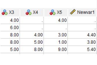
You can’t avoid data cleaning and it always takes a while, but there are ways to make it more efficient. For example, rather than search through the data set for impossible values, print a table of data values outside a normal range, along with subject ids.
This is where learning how to code in your statistical software of choice really helps. You’ll need to subset your data using IF statements to find those impossible values.
But if your data set is anything but small, you can also save yourself a lot of time, code, and errors by incorporating efficiencies like loops and macros so that you can perform some of these checks on many variables at once.
Once the data are free of errors, you need to set up the variables that will directly answer your research questions.
It’s a rare data set in which every variable you need is measured directly.
So you may need to do a lot of recoding and computing of variables.
Examples include:
And of course, part of creating each new variable is double-checking that it worked correctly.
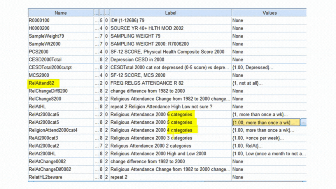
Both original and newly created variables need to be formatted correctly for two reasons:
First, so your software works with them correctly. Failing to format a missing value code or a dummy variable correctly will have major consequences for your data analysis.
Second, it’s much faster to run the analyses and interpret results if you don’t have to keep looking up which variable Q156 is.
Examples include:
All of these steps require a solid knowledge of how to manage data in your statistical software. Each one approaches them a little differently.
It’s also very important to keep track of and be able to easily redo all your steps. Always assume you’ll have to redo something. So use (or record) syntax, not only menus.
Count variables are common dependent variables in many fields. For example:
Although they are numerical and look like they should work in linear models, they often don’t.
Not only are they discrete instead of continuous (you can’t have 7.2 eggs hatching!), they can’t go below 0. And since 0 is often the most common value, they’re often highly skewed — so skewed, in fact, that transformations don’t work.
There are, however, generalized linear models that work well for count data. They take into account the specific issues inherent in count data. They should be accessible to anyone who is familiar with linear or logistic regression.
In this webinar, we’ll discuss the different model options for count data, including how to figure out which one works best. We’ll go into detail about how the models are set up, some key statistics, and how to interpret parameter estimates.
Note: This training is an exclusive benefit to members of the Statistically Speaking Membership Program and part of the Stat’s Amore Trainings Series. Each Stat’s Amore Training is approximately 90 minutes long.

Karen Grace-Martin helps statistics practitioners gain an intuitive understanding of how statistics is applied to real data in research studies.
She has guided and trained researchers through their statistical analysis for over 15 years as a statistical consultant at Cornell University and through The Analysis Factor. She has master’s degrees in both applied statistics and social psychology and is an expert in SPSS and SAS.
Just head over and sign up for Statistically Speaking.
You'll get access to this training webinar, 130+ other stats trainings, a pathway to work through the trainings that you need — plus the expert guidance you need to build statistical skill with live Q&A sessions and an ask-a-mentor forum.
Do you remember all those probability rules you learned (or didn’t) in intro stats? You know, things like the P(A|B)?While you may have thought that these rules were only about balls and urns (who pulls balls from urns anyway?), it’s actually not true.
It turns out that having a good understanding of these rules (as well as actually remembering them) does come in handy when you’re doing data analysis.
There are so many situations and methods in statistics that draw directly from those rules. Everything from p-values to logistic regression to maximum likelihood estimation are all direct applications of these rules. In this webinar, we’re going to review those rules, with examples of when they come up in statistical methods that you use and are learning.
Note: This training is an exclusive benefit to members of the Statistically Speaking Membership Program and part of the Stat’s Amore Trainings Series. Each Stat’s Amore Training is approximately 90 minutes long.
Karen Grace-Martin helps statistics practitioners gain an intuitive understanding of how statistics is applied to real data in research studies.
She has guided and trained researchers through their statistical analysis for over 15 years as a statistical consultant at Cornell University and through The Analysis Factor. She has master’s degrees in both applied statistics and social psychology and is an expert in SPSS and SAS.
Just head over and sign up for Statistically Speaking. You'll get access to this training webinar, 130+ other stats trainings, a pathway to work through the trainings that you need — plus the expert guidance you need to build statistical skill with live Q&A sessions and an ask-a-mentor forum.Not a Member Yet?
It’s never too early to set yourself up for successful analysis with support and training from expert statisticians.
Analysis of Covariance (ANCOVA) is a type of linear model that combines the best abilities of linear regression with the best of Analysis of Variance.
It allows you to test differences in group means and interactions, just like ANOVA, while covarying out the effect of a continuous covariate.
Through examples and graphs, we’ll talk about what it really means to covary out the effect of a continuous variable and how to interpret results.
Primary to the discussion will be when ANCOVA is and is not appropriate and how correlations and interactions between the covariate and the independent variables affect interpretation.
Note: This training is an exclusive benefit to members of the Statistically Speaking Membership Program and part of the Stat’s Amore Trainings Series. Each Stat’s Amore Training is approximately 90 minutes long.
Karen Grace-Martin helps statistics practitioners gain an intuitive understanding of how statistics is applied to real data in research studies.
She has guided and trained researchers through their statistical analysis for over 15 years as a statistical consultant at Cornell University and through The Analysis Factor. She has master’s degrees in both applied statistics and social psychology and is an expert in SPSS and SAS.
Just head over and sign up for Statistically Speaking. You'll get access to this training webinar, 130+ other stats trainings, a pathway to work through the trainings that you need — plus the expert guidance you need to build statistical skill with live Q&A sessions and an ask-a-mentor forum.Not a Member Yet?
It’s never too early to set yourself up for successful analysis with support and training from expert statisticians.