What’s a good method for interpreting the results of a model with two continuous predictors and their interaction?
Let’s start by looking at a model without an interaction. In the model below, we regress a subject’s hip size on their weight and height. Height and weight are centered at their means.
Imagine you have a group of people with the same height, but varying weights. Logically we would expect people’s hip sizes to be larger if they are heavier. In other words, “keeping height constant, as weight increases, hip size increases”.
Likewise, imagine a group of people with the same weight, but varying heights. Logically we would expect hip sizes to be smaller if they are taller (remember, they’re all the same weight. For a taller person to be the same weight, they are going to be thinner). This interpretation can be, “keeping weight constant, as height increases hip size decreases.
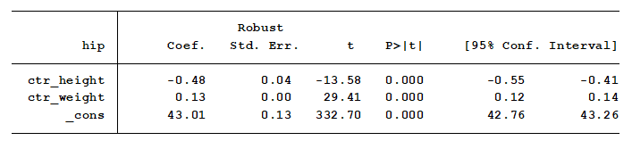
Indeed, we see these logical results. We see from the output that keeping weight constant, for every one unit increase in height, hip size decreases by 0.48 inches.
In addition, keeping height constant, increasing weight by one pound increases hip size by 0.13 inches.
But this model requires that the effect of increasing weight on hip size is constant at each height. Maybe it’s not. Is the change in hip size per one pound change in weight the same for people that are 60 inches tall as it is for people that are 72 inches tall? We need to add an interaction to determine that.
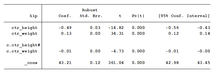
Indeed, we have a small but significant interaction. This tells us that the effect of an additional pound of weight on hip size is not the same for each height.
As height increases each inch, the effect of an additional pound of weight on hip size decreases by .01 inches. But what does that mean?
This is a situation where a graph can be worth a thousand words. Let’s graph these results using a contour graph.
The graph below is the predicted hip size for the 403 subjects in the data set. Ranges of predicted hip size are color coded to help interpret the relationship that weight and height have on hip size. The color coded scale is shown on the right side of the graph.
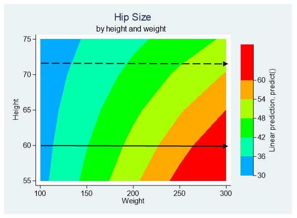
Each color represents a 6” range of predicted values. Blue represents the smallest hip sizes and red represents the largest.
We can see from the graph that the rate of change from one range of hip size to the next is lower for taller people as compared to shorter people.
For example, people who are 60” tall have quickly increasing hip sizes as weight increases a pound. Start at the left side of the graph along the solid line and move to the right as weight increases. Hip sizes quickly go from the blue range (30-36”) to green, and on to red (60” plus). So a one-pound increase in weight has a large impact on the hip size of short people.
That’s not true for tall people. For example, people who are 72” tall (six feet), move more slowly from one hip size to the next. Start at the left side of the graph along the dashed grey line and move to the right as weight increases. The color bands are wider because a one-pound increase in weight doesn’t affect their hip size as much. In fact, people who are taller than 70 inches have a maximum hip size of 54 inches.
Explaining interactions between continuous variables to those not well versed on the subject or understanding them yourself can be a cause for sweaty palms and increased heart rate. But, if you use this visual method for interpretation of your results, your only known side effects will be “a sense of calm and tranquility.”
Jeff Meyer is a statistical consultant with The Analysis Factor, a stats mentor for Statistically Speaking membership, and a workshop instructor. Read more about Jeff here.
Can you share the SPSS code for this?
It will be challenging to recreate this graph using SPSS. SAS and R should be able to create this type of graph. Stata, R and SAS allow using multiple values of the continuous predictors within one marginal means code (emmeans, margins commands) to produce the predicted marginal means. SPSS only allows you to use one value at a time. The key is to output the marginal means for a series of values for each of the continuous predictors. The combinations of the predictor values combined with the predicted marginal means are then graphed. Stata’s command for this type of graph is twoway contour. R and SAS should have a similar type of graph.
Great information!
How can we do this in Excel?
(Asking for a friend 🙂 )
This is all done within the statistical software. The predicted outcomes are generated by the statistical model and are then graphed using the statistical software. I’m not sure if Excel can accurately produce this type of analysis.
Does ggplot in r offer such a plot?
2D contours of a 3D surface
https://ggplot2.tidyverse.org/reference/geom_contour.html
Hi Jeff,
I agree with Polly. This is an interesting and very useful graph. Could you please share the Stata code for creating this graph?
Many Thanks.
Farhan
Hi,
Here is a link to a demonstration of how to produce graphs with output from the margins command:
https://www.stata.com/stata-news/news32-1/spotlight/
Jeff
Hello Jeff,
Any link for SAS or R users? Thanks
Saiful
Hi Jeff,
This is an interesting and useful graph. What do you use to make the graph? Can you share the codes? Thanks.
Cheers,
Polly